
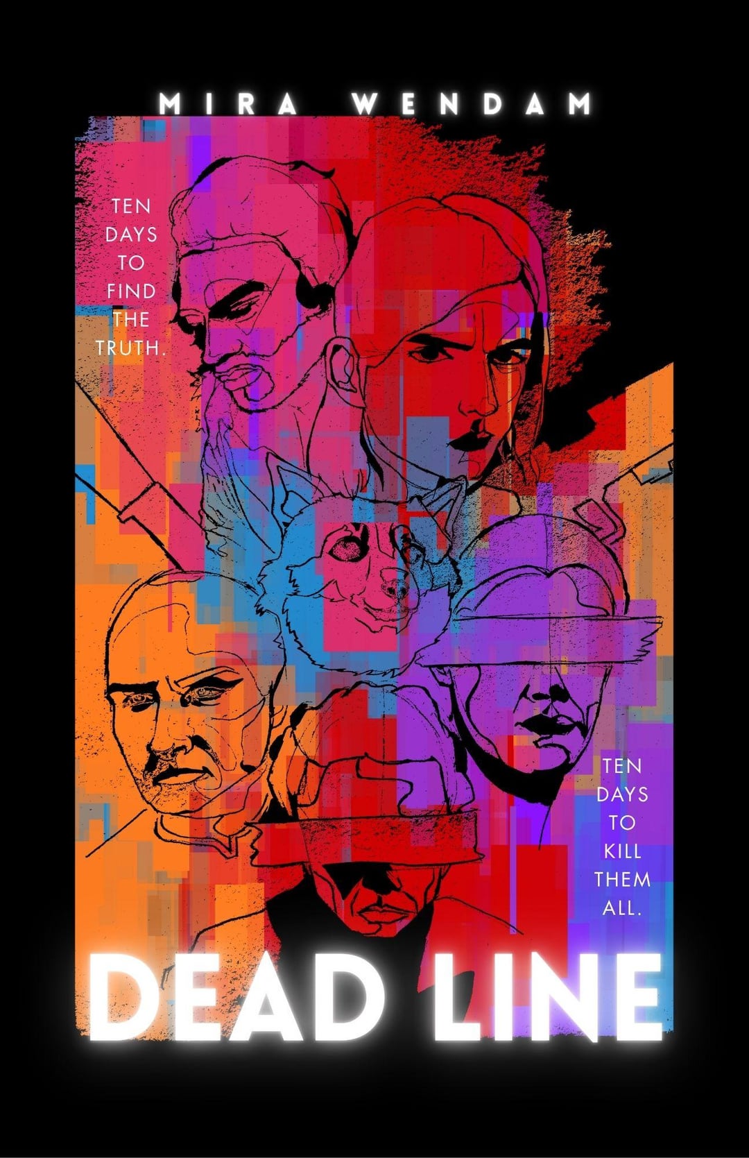
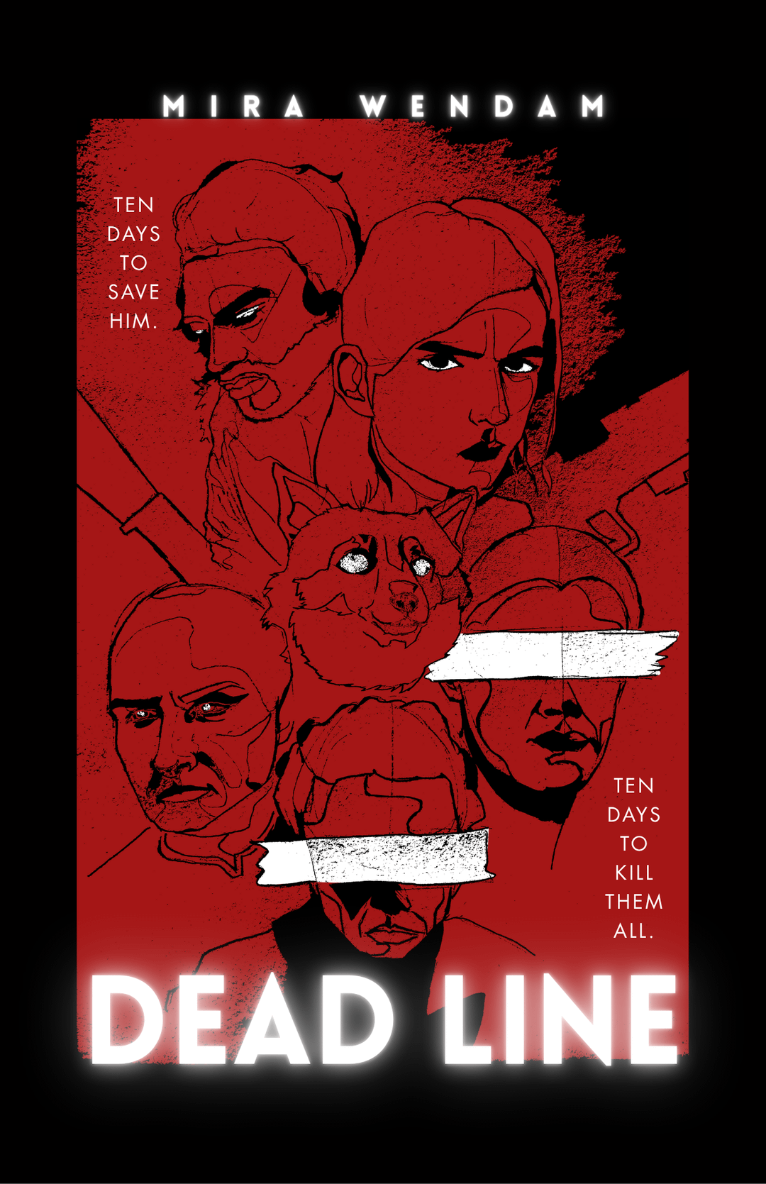
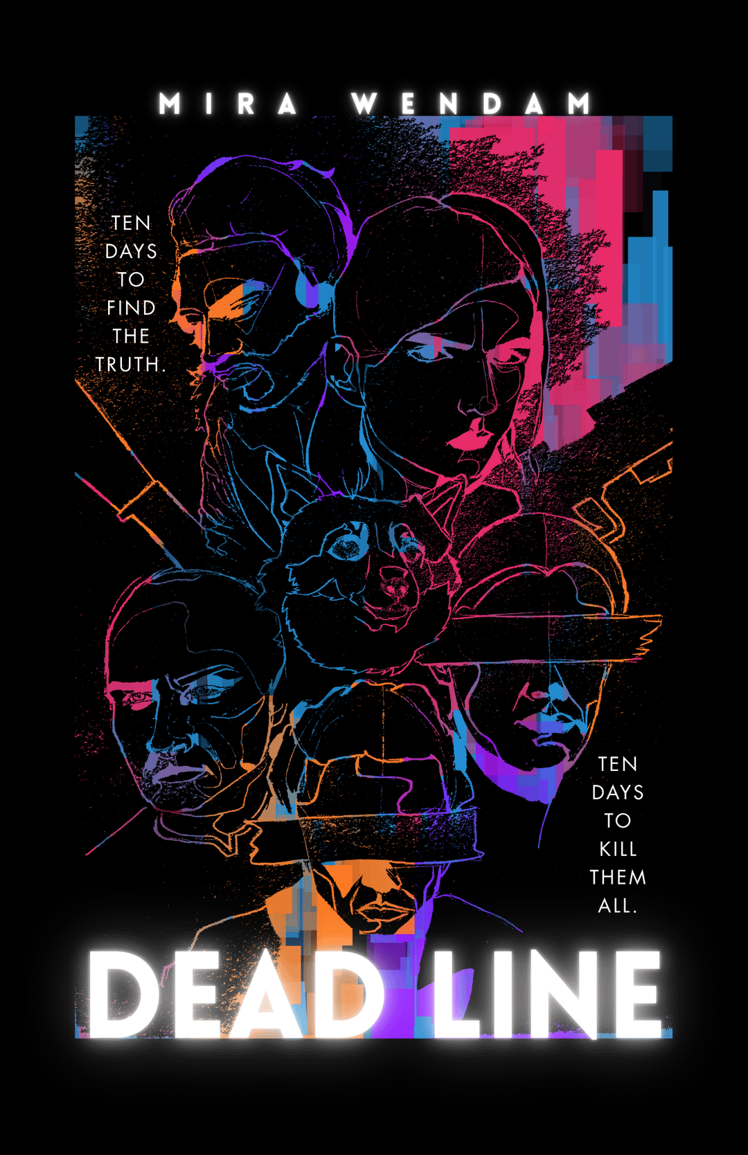
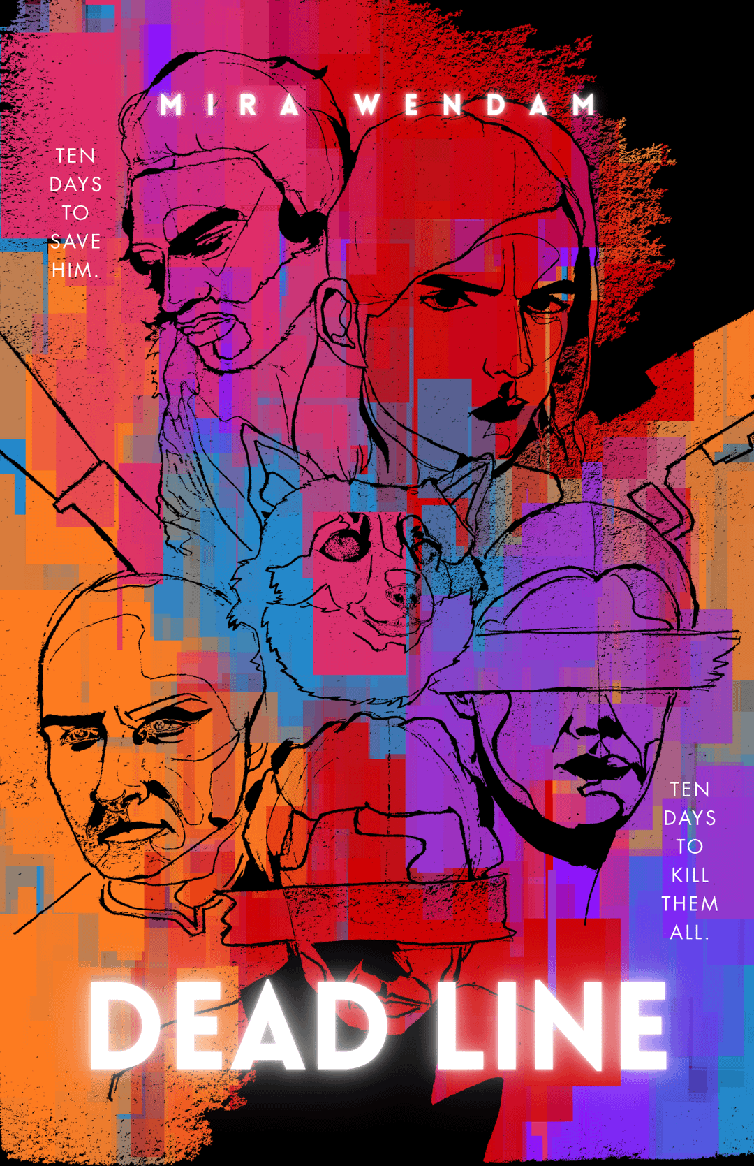
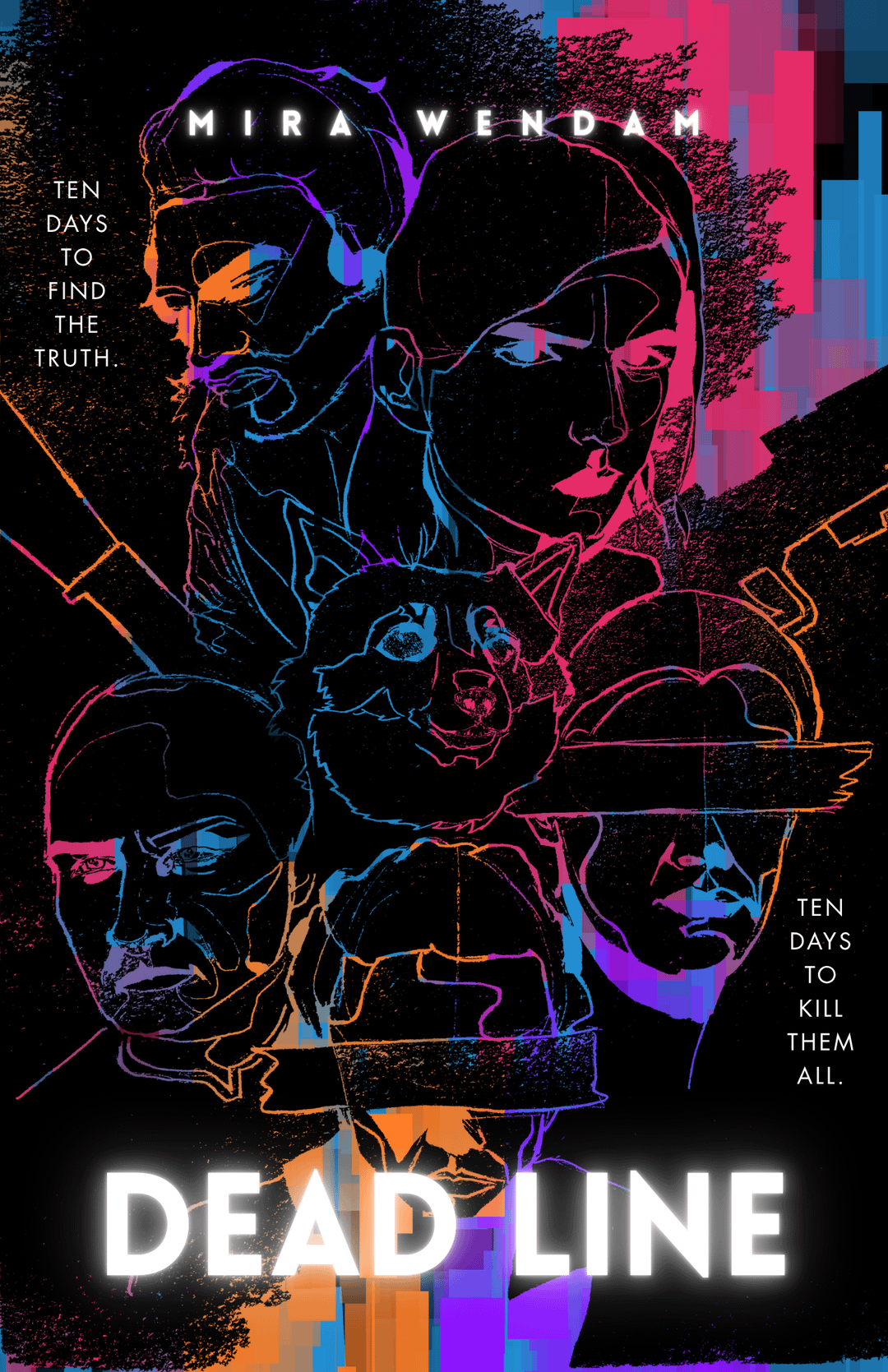
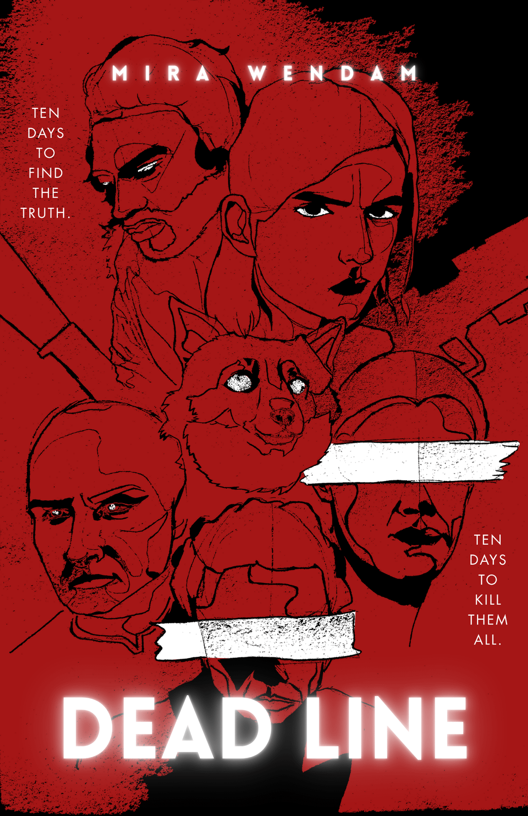
Been working on my cover for ages. The first is my current one. Went for a lot of neon, but someone really close said it looks bad without explaining. I’m struggling with the cyberpunk aspect and prefer subtle, ‘hinting’ covers. Thoughts? Other images are other variations.
6 Comments
First one looks fine, but I am getting a strong vibe that you are trying too hard and overthinking it. Time to step back and take a break.
The first two are very strong. The glitchy colour looks great.
I love it! Love that first one. Don’t change a thing. Trust your gut. You knew what you were doing when you made this. Don’t look at it or think about it for a month. You will come back and love it.
First one looks really good. Your pal is welcome to his own opinion, but consider mine the counterweight.
First one works best. The only confusing bits are the tape (looks like tape) covering the eyes of the two people. Is it a paint or marker stroke? A little texture, or making it more of a solid fill might help communicate better with what’s going on there.
The colours could afford to punch up a bit for screen, particularly the oranges, but if you’re printing this then I wouldn’t worry much.
Otherwise this is communicating well for a cover.
what’s wrong with #3? anyway i like it, prefer 80s and 90s scifi cover maximalism and actual scenes from the worlds and hate the current trend of just abstract multi color art, though yours is very colorful i think #3 is more subtle or intriguing