
Hey everyone! I’ve been messing around with a new UI/HUD redesign for Counter-Strike 2 and wanted to share what I came up with.
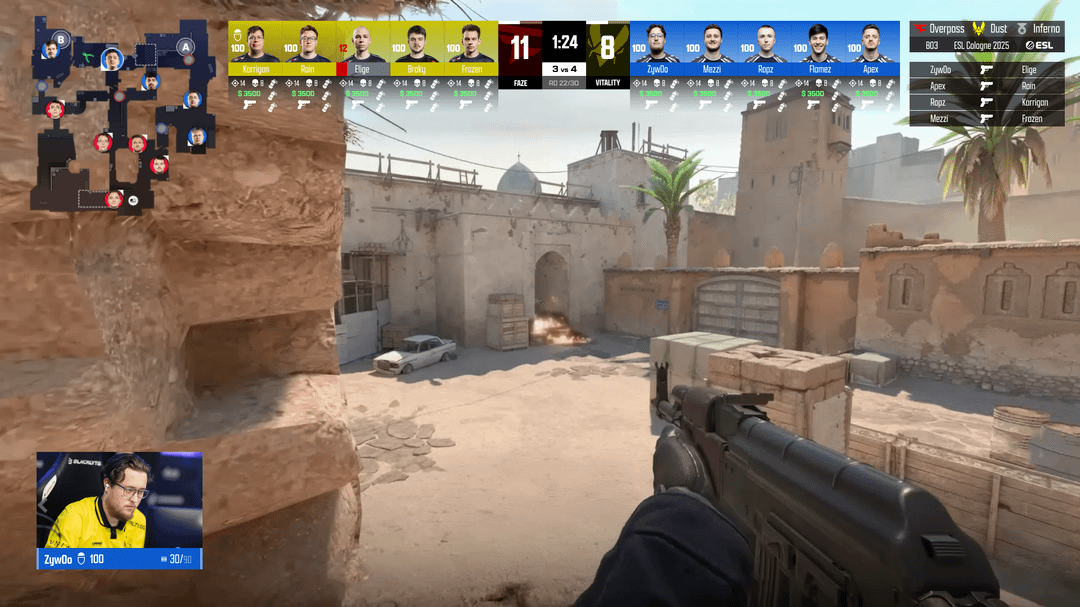
In my version, I moved the player cards to the top of the screen, mainly because I love being able to see the guns and skins more clearly during gameplay, and I thought clearing out the center/mid area could help with that.
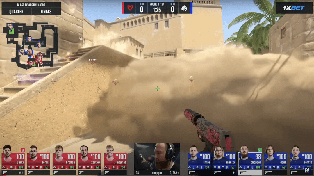
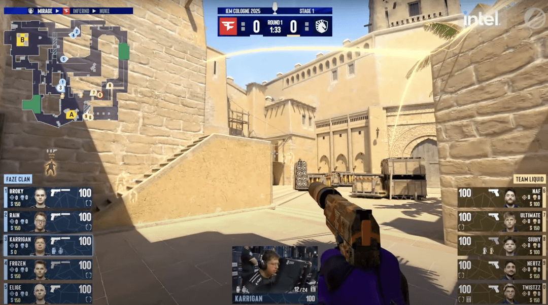
To compare styles, I also added examples from BLAST (they put player cards at the bottom) and ESL (on the sides). I’m curious what you all prefer when watching or playing. Top? Bottom? Sides?
The layout I designed is inspired by a really talented designer, Ondřej Lebeda, whose work I found on Behance. I tweaked a few parts I felt could be improved. Shoutout to him.
35 Comments
3rd one
2 > 3 > 1
3 > 2 >>>>> 1
Iem cologne one is the best and not even close!!!!!
The CS community is allergic to any change. Don’t forget that.
That being said I love the redesign.
Haven’t even considered the possibility of player cards at the top and it makes so much sense in hindsight.
Utility is readable enough, only thing I’m wondering is the bomb.
I’m guessing it’s in T spawn next to faveN?
Where would that go in the HUD if a player picks it up?
All in all very solid. Skin crowd will be happy that guns are fully visible, and top of the screen for the players frees up a lot of space on the sides/bottom.
I hope TO’s in the future see and consider this.
2 and 3 are fine. 1 is cursed
3 > 1 > 2
3 cause it looks like the classic csgo spectator thing
1 cause it looks like in game
2 last cause that sucks
Summit UI/HUD clears all
i think the 3rd one is the best
I like one actually lol
the issue with 2 is the color border around the cam of the currently spectated player is easily lost because you have both colors immediately to the side of it. 3 has a bigger gap between the team widget and the player cam allowing the border to have clearer, more obvious contrast
1 and 3 are nice
iem is far and beyond the best
absolutely 2
esl has perfected huds, no question
BLAST PARIS BEST UI EVER
I like 1 and 3 bc I prefer things to be mostly all on top vs bottom as it’s less likely to cover anything important. Things across the bottom feels distracting to me.
never cook again
Wtf is that first UI
3, but I’ll take 2, get one the fuck out of here.
ESL is the best. Centered player cam and infos is a must, more pleasing to have the crosshair and player cam in the same area on the screen when you want to focus on the play.
Vertical players cards looks better imo, easier to read and compare HP, K/D and money, because it looks more like any in-game stat tab.
The only thing I dislike is not using players portraits on the minimap, using numbers is really not the most optimal way to show players positions.
Color wise, I’m not against more flashy colors like the 1st one.
Problem with cards on top is that players are more likely to be above you than below you when looking straight ahead. For them to be below you, you’d have to be at a ledge which is pretty rare. They are above you quite often like D2 window when approaching B doors, everywhere on nuke, heaven on B overpass, etc. If the audience can’t see these, it will take away from the experience.
3 > 2=1
ESL nade icons are simply disgusting and so hard to recognize at a glance. your HUD is quite fresh, I would just move the player cam to the middle so it is symmetrical. can’t forget that TOs these days are also thinking about vertical video appeal, and that would help it immensely.
All the info on top is nice aesthetically but the eyes always follow the center of the screen making it easier to read information thats below the eyeline think like reading subtitles.
I like 2 and 3, with a slight preference for 2 as it does not reduce the width of the screen too much. The bad thing is that it sometimes hide the skin whereas 1 does not .
I absolutely HATE blasts colored ui and even after seeing it for years it still takes me seconds to spot who’s playing on which side. Absolutely no reason to reinvent the wheel here, blue for ct and beige for t worked just fine.
first
my portfolio: [https://www.behance.net/ifernandoleite](https://www.behance.net/ifernandoleite)
Much prefer 2 out of all of them. Less claustrophobic and crammed, and i prefer the larger portraits
Too much going on in the first one.
3 is prob the best, 2 is nice as well
2 -> 3
1,3,2
The Austin one felt way too distracting and claustrophobic, the one with all the info at the top is the best imo.
3rd one. 2nd is a close second.
why not all 10 live cams all the time? 😀
Honestly, what are the problems with the ESL ui? I feel like it’s very easy to tell it a glance everything that you would want to know about the map, and everything that’s going on in that particular moment at the round. Sure it’s nice to feel like you have a wider peripheral vision, but if that has to come at the cost of readability at a glance then I don’t think it’s worth it.