Whichever one makes it through YouTube’s algorithm.
ROFLnator217
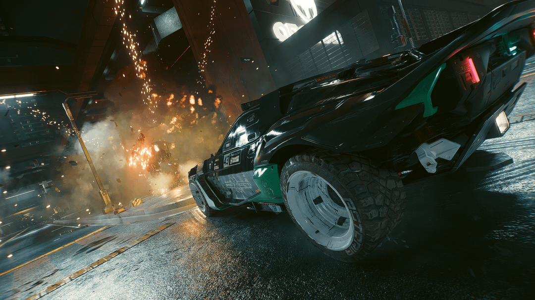
Number 3 with a certain reshade can be edited into cover art for a certain 2005 videogame lol.
Shot_Kick_7756
Number 3
switchboxhero
3 definitely
YeetusMg33tus
The Dutch angle one is the best
friendly-survivor
2nd or 3rd in that order for me
Comedian_Then
I prefer the third one. I will say something other people didnt said it. Add some saturation to the explosion it’s the only thing missing compared to other screenshots, it’s the fire intensity you know, small detail.
manlisten
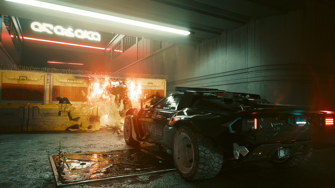
3 is definitely the most striking, but 2 having the Arasaka logo in it makes it more obvious at a glance that it’s a Cyberpunk 2077 thumbnail
joeengland
Three. It’s a dynamic focus on the car. The others are a little confused.
EasyKay2084
3rd cuz low dutch angle with the explosion is really well composed and impactful at a glance

42 Comments
I think 3 feels the most eye catching for a thumbnail
3rd for sure. Most dynamic and eye catching.
3rd by far.
If you can cut around the car, add a drop shadow to it, gives it an even bigger lift.
3rd
That one right there
The third one, definitely
Honestly I like the third one best
Love the angle on the third
Not enough giant red circles and useless arrows and surprised faces.
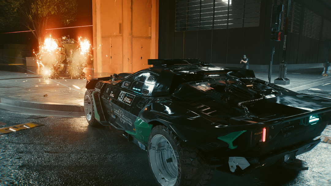
Last one
2 or 4 for me.
3 for me
I like the second one personally.
3rd looks so cool
I’d like 3 more if it weren’t so tilted. Either way, it kind of depends how you’re going to lay out everything else in the thumbnail.
2 because you can see the “Arasaka” logo. i didn’t recognize the car and had to check what sub this post was from
#3 and it’s not even close. Both the composition, contrast and even the reflections are superior in that one.
2 or 3, if you go for 2 I’d highlight the arasaka sign more somehow
it would kind depend on the video is about
Pick numbers three my lord!!!
3,
my fav is the third but the second is also pretty dope
idk why but the first one just screams youtube
God I love the Hoon, thing’s a beast.
Definitely number 3
Scond image
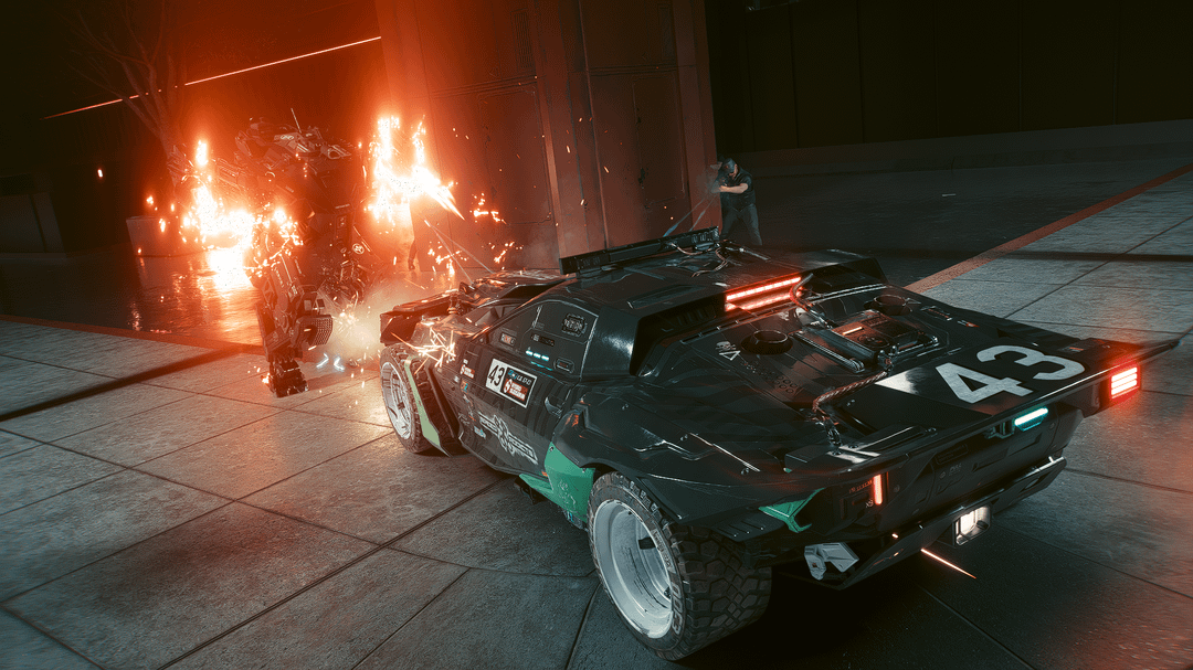
#1 for sure, it’s composed pretty well and feels more dynamic.
For youtube, need a giant face with an open mouth reacting to something
3 for sure
Do a more front 3/4 view showing the car through the explosions
this one
https://preview.redd.it/3kvlm8m95rcf1.png?width=920&format=png&auto=webp&s=0deede4881ad178a08b5161c1de9fb433da0a6fe
number 3 for sure
Whichever one makes it through YouTube’s algorithm.
Number 3 with a certain reshade can be edited into cover art for a certain 2005 videogame lol.
Number 3
3 definitely
The Dutch angle one is the best
2nd or 3rd in that order for me
I prefer the third one. I will say something other people didnt said it. Add some saturation to the explosion it’s the only thing missing compared to other screenshots, it’s the fire intensity you know, small detail.
3 is definitely the most striking, but 2 having the Arasaka logo in it makes it more obvious at a glance that it’s a Cyberpunk 2077 thumbnail
Three. It’s a dynamic focus on the car. The others are a little confused.
3rd cuz low dutch angle with the explosion is really well composed and impactful at a glance