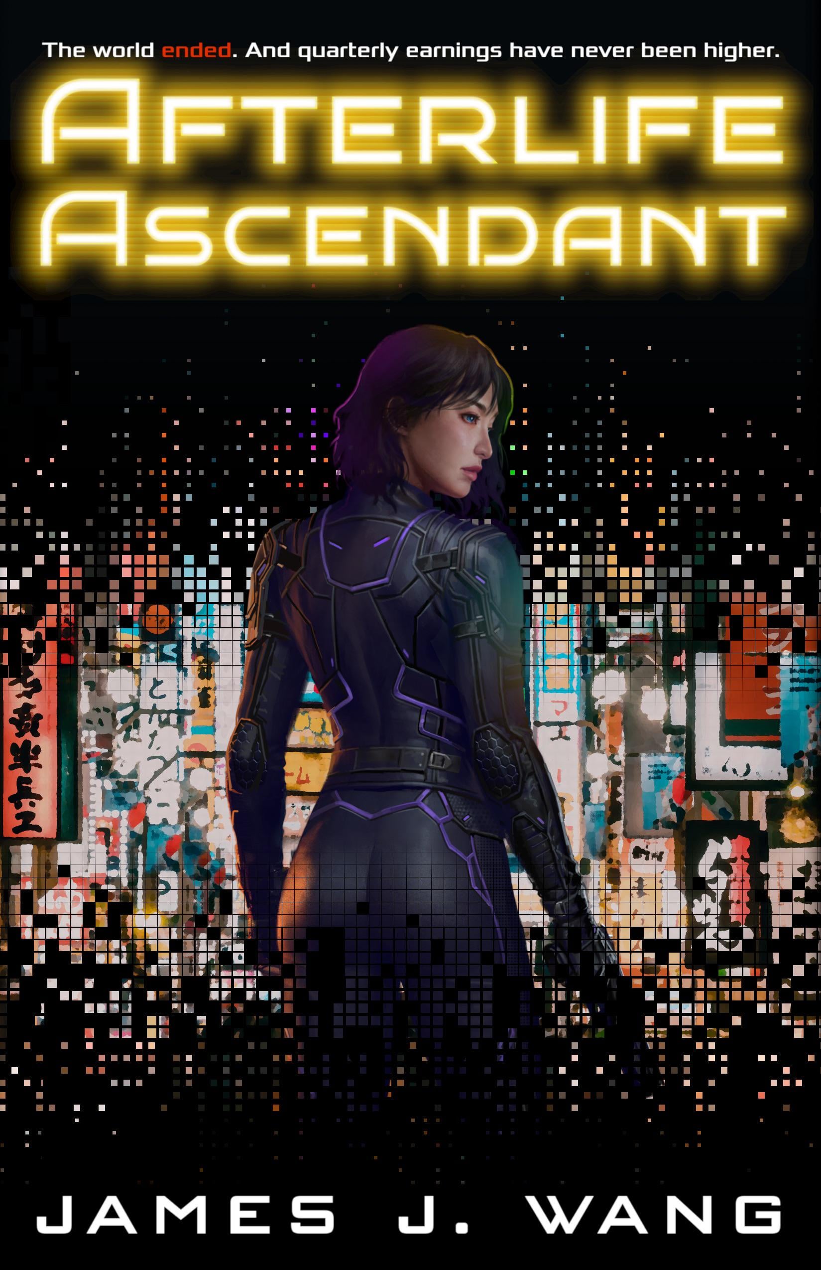
Character art by u/zefanyamacarious
Design by me.
No AI gen used in the cover (or novel, heh.)
(Available 6/17!)

Character art by u/zefanyamacarious
Design by me.
No AI gen used in the cover (or novel, heh.)
(Available 6/17!)
6 Comments
Looks intriguing, I’m curious what the cover design would look like with a more muted text color for the title, maybe it’s just the yellow, but something about it feels like it clashes and contrasts a bit much for the rest of the design. But, that’s just my subjective opinion of course.
This is so cool!! I’m interested in the blurb!
Excellent illustration, although highly influenced by the character of Motoko Kusanagi. In my opinion.
If I were you, I’d check what it looked like
* without the glow on the title
* with your name and the title written with the same font (one of them could be a different color)
* with that pixelated layer removed (or at least removed from either the top or from the bottom, this way it now makes the entire image look flat, the woman seems to be a sticker)
* (if you leave the bottom pixelated thing there) I’d try and either remove the filled pixels from (around) her bottom or use more to cover it even more (but see the point above)
* with the outline of the woman’s hair less contrastedly visible, or fully removed (because now she looks, again, like a sticker)
* (if you have the woman’s image in high enough resolution) with her brought much closer, only her upper half or upper third (from the shoulders up) visible.
I’m not saying these would def help, but they may, would be worth checking.
What’s the story about?
Where are you releasing, is it only to Amazon?