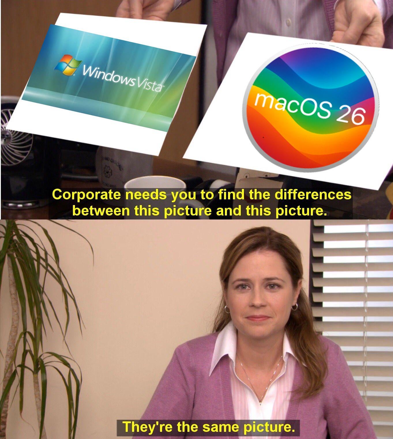
It’s like they switched side. Windows now seems to be copying Apple OS, and vica versa.
That said, I want Aero back. It was the best damn looking UI to this day!
Alexandratta
Vista’s only good thing was the Aero UI….
It was everything else under it that made Vista a steaming pile of shit.
Windows 8… however….
hfs
Gastunba24
I really hope we can come back into Frutiger Aero aesthetics. I’m a little bit tired of flat and minimalist looks.
JPSWAG37
Hey man, if it’s bringing Frutiger Aero back in style I do not care who does it.
TimeToHack
you say that like it’s a bad thing? Vista looked awesome it just broke everything else
lowwalker
Meanwhile, Windows 11 is matte dark mode and continuously moves their design more toward OSX styles, whatever
TehDrunknMunky
I know it’s just a meme but OS X had glass UI elements at the same time as Vista (and before), but who lets facts get in the way.
TheGyattDevil_Yoru
I love that aesthetic of old pc ui
So much Whimsy
Where have you gone
Graham_Wellington3
Can I just have the windows 2000 theme? Grey border, teal background.
toonguy84
Sorry to bring linux up but you could give linux (gnome/kde) that translucent look in the early 2000’s. It was cool for a day and then it got distracting and I never used it again. 25 years later people are debating this on Windows and MacOS is just kind of funny.
The difference is that Vista was actually more constrained and better to read.
BenniRoR
Come on Microsoft, now give us some official and easy way to get that whole glassy Aero look back. I hate this flat pastel look on Windows 11 and pretty much everything else nowadays. Windows 7 and the PS3 XMB menu were absolute peak in that regard. Better times.
Pristine_Bag_609
1) Aero was the best part of Vista for me and made me almost obsessed with nice blur effects in software.
2) I get the joke and comparison for sure but I think the Liquid Glass effect is much more dynamic and “sophisticated,” dare I say, than with the blur of Aero. The way the blur and saturation is applied at the edges is different than the rest, for example, which gives a more 3D lensed blur effect than anything Aero could do.
_barat_
Also – in 20 years they went from PowerPC transition into x86_x64 and back to custom M1 (ARM) doing a cycle.
theswansson
Tahoe would’ve been right at home on one of those clamshell iBooks or an iMac G4.

33 Comments
I find it funnier they say changing colors in taskbar and folders is a new feature. I have been personalizing Windows since 95 lol
Apple is shit can’t beleive people still fall for it
I’m so happy with it. I LOVED vista (aside from its performance on lacking hardware) it was a BEAUTIFUL OS.
it’s evolving, just backwards?
I might just buy a mac.
Nah they started this with Aqua in 2000, Microsoft copied it but that was pretty Intel area so people forget that.
I’d love Aero Glass/Frutiger Aero on W11. Fuck this minimalism, corporate style clean look. Give me my elegant glass back.
Vista was just glass, not “liquid glass”. It didn’t have light bending effects and liquid animations.
Gotta remember, Pam failed art school. Of course she thinks it’s the same.
The same meme over and over, by people who don’t remember or never knew that Aero was inspired by Aqua.
that vista loading/login screen always got me excited. but using vista sucked.
Thank god. Windows Vista was the best looking OS.
Hopefully all the glass stuff is optional setting, i love and prefer minimalist solids/blurs
https://preview.redd.it/l7kr75oki36f1.jpeg?width=2185&format=pjpg&auto=webp&s=2889d35f76e1db70a58288ce9d72ae928118034b
It’s like they switched side. Windows now seems to be copying Apple OS, and vica versa.
That said, I want Aero back. It was the best damn looking UI to this day!
Vista’s only good thing was the Aero UI….
It was everything else under it that made Vista a steaming pile of shit.
Windows 8… however….
hfs
I really hope we can come back into Frutiger Aero aesthetics. I’m a little bit tired of flat and minimalist looks.
Hey man, if it’s bringing Frutiger Aero back in style I do not care who does it.
you say that like it’s a bad thing? Vista looked awesome it just broke everything else
Meanwhile, Windows 11 is matte dark mode and continuously moves their design more toward OSX styles, whatever
I know it’s just a meme but OS X had glass UI elements at the same time as Vista (and before), but who lets facts get in the way.
I love that aesthetic of old pc ui
So much Whimsy
Where have you gone
Can I just have the windows 2000 theme? Grey border, teal background.
Sorry to bring linux up but you could give linux (gnome/kde) that translucent look in the early 2000’s. It was cool for a day and then it got distracting and I never used it again. 25 years later people are debating this on Windows and MacOS is just kind of funny.
https://preview.redd.it/w5asm3t4u36f1.jpeg?width=600&format=pjpg&auto=webp&s=18aac9a4cb9abea88c68e6dedacb169acb367cd7
Apple ‘innovation’: spinning wheel 2.0.
Finally, Vista is getting the love it never got
Everything old is new again
The difference is that Vista was actually more constrained and better to read.
Come on Microsoft, now give us some official and easy way to get that whole glassy Aero look back. I hate this flat pastel look on Windows 11 and pretty much everything else nowadays. Windows 7 and the PS3 XMB menu were absolute peak in that regard. Better times.
1) Aero was the best part of Vista for me and made me almost obsessed with nice blur effects in software.
2) I get the joke and comparison for sure but I think the Liquid Glass effect is much more dynamic and “sophisticated,” dare I say, than with the blur of Aero. The way the blur and saturation is applied at the edges is different than the rest, for example, which gives a more 3D lensed blur effect than anything Aero could do.
Also – in 20 years they went from PowerPC transition into x86_x64 and back to custom M1 (ARM) doing a cycle.
Tahoe would’ve been right at home on one of those clamshell iBooks or an iMac G4.