I seriously don’t get it, why do they have to reinvent the wheel every single time. Just keep the old readable HUD, I swear they just make it worse on purpose so people can complain and they can ‘improve’ on feedback
Hi guys, I’m the HUD guy at BLAST Major. I wanted to express how honored I am to be the first blind designer at a CS2 tournament in history. Thank you BLAST for this amazing opportunity, and I’ll try my best!!
funserious1
agreed , especially the red T names are blending so badly , especially since the yt stream is only 1080p …
randomvale
Why do we have to go through this ridiculous live beta test of HUDs almost every single event.
Also please don’t put up ad borders in the middle of a round – it’s distracting when the screen suddenly starts shifting. Do it in the freeze time if you have to.
ZeffoLyou
I definitely agree with if it’s not broke don’t fix it. But I don’t have any issues with the kill feed, I can read/interpret it fine. Maybe it’s just me
Resident_Nautilus102
They’re using a display font where they should be using normal body font imo, too many little words.
bemorethanaverage
The blast font is sh!t. Seriously. How did this ever get approved.
Tankette55
They decided to copy esl and make a HUD rework that only is unnecessary but also terrible.
OwenLeftTheBuilding
it’s horrible, blast fell off so much. the matches were delayed two times already, wtf
mlllerlee
in that fight HUD Designer lost to fonts library
AbjectMycologist614
AMAZING!
love the SHARP EDGES, fuck NORMIES and their FRIENDLY ROUNDED EDGES
the font is DOGSHIT though
snafubarr
Yeh what the fuck is that ugly ass HUD
holliss
Blast really saw the new ESL font and thought it was a good idea to copy it.
AlludedNuance
All caps, narrow, bold font with cramped kerning.
The people designing this stuff do this for a living, supposedly.
Quacky33
Its almost impressive to be able to design a font that jpgs itself even at the highest quality.
w0oster
thought it was in chinese at first while watching in my phone. blast doing the absolute most when you really just need the least
12850MulhollandDrive
it’s so bad. who approves this shit?
RobinVanPersi3
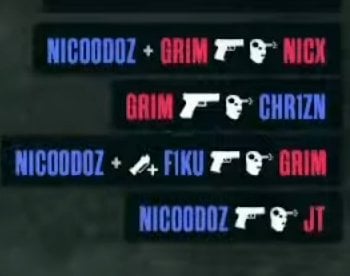
All I read is nicodoz over and over. Bug?
deadlyeffect
The defusing HUD/graphic is also bad. I didn’t even notice it at first. Literally just changing things to change things for no reason is so weird.
AbbreviationsKey__
BLAST are seriously getting annoying as a TO
AEliteAutist
The numbers mason every number looks ljke a 1 to me on mobile
trphqcdat
I genuinely like BLAST’s round win streak graphic concept of being “on fire”, but this one they’re using is so dreadful looking, cheap GIFy ahhh layer in front of the team logo I can’t.
hyperiob
And no player cams..??
JahodovyKrtko
Real I was so mad when I put on the stream and saw this ugly ass UI. The old one was great ffs..
k123cp
Nearly unreadable on a 7-inch phone, can’t any of these TOs hire a single decent UI/UX designer?
Woullie_26
I don’t get the hate it looks perfectly fine to me
Truval_
Watching the NRG game right now, genuinely thought Jeorge’s name was in Korean or something, on a small screen it’s near impossible to see who’s doing what. They already invented the wheel man, why do they gotta change shit
Vawqer
Even just changing it not be all caps would help a lot. It might not be too readable still, but would be a lot more differentiable between players.
Fuibo2k
Y’all gotta be trolling at this point. It’s a perfectly readable font with clear and distinct characters, they’re not even stylized, just a little elongated. I’m watching at 480p and it’s still perfectly fine.
Rhed0x
The font is used everywhere in the new HUD and its terrible.

31 Comments
I seriously don’t get it, why do they have to reinvent the wheel every single time. Just keep the old readable HUD, I swear they just make it worse on purpose so people can complain and they can ‘improve’ on feedback
[blast pls](https://imgur.com/gallery/tiny-piece-of-paper-GgGuUyl)
Hi guys, I’m the HUD guy at BLAST Major. I wanted to express how honored I am to be the first blind designer at a CS2 tournament in history. Thank you BLAST for this amazing opportunity, and I’ll try my best!!
agreed , especially the red T names are blending so badly , especially since the yt stream is only 1080p …
Why do we have to go through this ridiculous live beta test of HUDs almost every single event.
Also please don’t put up ad borders in the middle of a round – it’s distracting when the screen suddenly starts shifting. Do it in the freeze time if you have to.
I definitely agree with if it’s not broke don’t fix it. But I don’t have any issues with the kill feed, I can read/interpret it fine. Maybe it’s just me
They’re using a display font where they should be using normal body font imo, too many little words.
The blast font is sh!t. Seriously. How did this ever get approved.
They decided to copy esl and make a HUD rework that only is unnecessary but also terrible.
it’s horrible, blast fell off so much. the matches were delayed two times already, wtf
in that fight HUD Designer lost to fonts library
AMAZING!
love the SHARP EDGES, fuck NORMIES and their FRIENDLY ROUNDED EDGES
the font is DOGSHIT though
Yeh what the fuck is that ugly ass HUD
Blast really saw the new ESL font and thought it was a good idea to copy it.
All caps, narrow, bold font with cramped kerning.
The people designing this stuff do this for a living, supposedly.
Its almost impressive to be able to design a font that jpgs itself even at the highest quality.
thought it was in chinese at first while watching in my phone. blast doing the absolute most when you really just need the least
it’s so bad. who approves this shit?
All I read is nicodoz over and over. Bug?
The defusing HUD/graphic is also bad. I didn’t even notice it at first. Literally just changing things to change things for no reason is so weird.
BLAST are seriously getting annoying as a TO
The numbers mason every number looks ljke a 1 to me on mobile
I genuinely like BLAST’s round win streak graphic concept of being “on fire”, but this one they’re using is so dreadful looking, cheap GIFy ahhh layer in front of the team logo I can’t.
And no player cams..??
Real I was so mad when I put on the stream and saw this ugly ass UI. The old one was great ffs..
Nearly unreadable on a 7-inch phone, can’t any of these TOs hire a single decent UI/UX designer?
I don’t get the hate it looks perfectly fine to me
Watching the NRG game right now, genuinely thought Jeorge’s name was in Korean or something, on a small screen it’s near impossible to see who’s doing what. They already invented the wheel man, why do they gotta change shit
Even just changing it not be all caps would help a lot. It might not be too readable still, but would be a lot more differentiable between players.
Y’all gotta be trolling at this point. It’s a perfectly readable font with clear and distinct characters, they’re not even stylized, just a little elongated. I’m watching at 480p and it’s still perfectly fine.
The font is used everywhere in the new HUD and its terrible.