It’s so bad, how in the hell did they come to this? Their previous HUDs were always so good.
Kzati
Certainly a choice
hoIymind
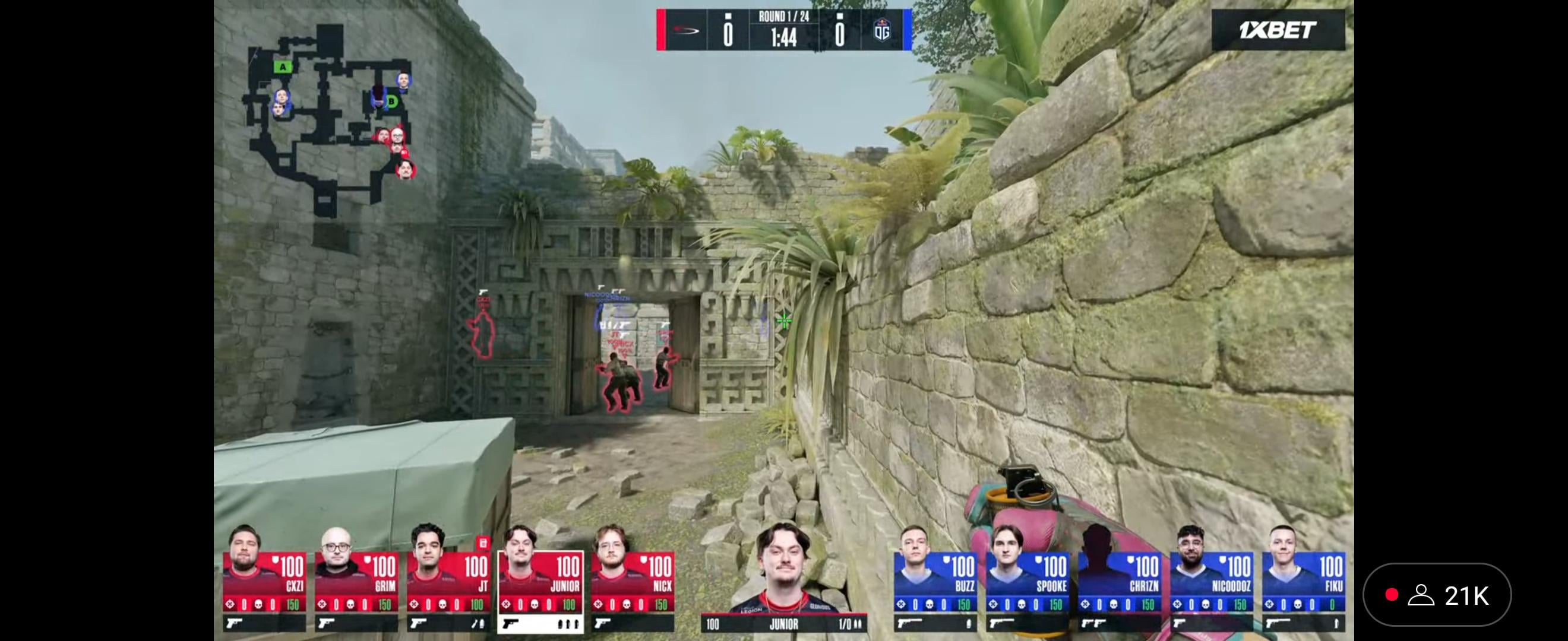
Using a condensed font for the killfeed is such a poor decision. So hard to read
EscapingKid
The only thing I would change is the killfeed font – it’s hard to read at a glance. Apart from that it’s fine.
J-rdn
Did someone in their first day of video design make this? Tf is this?
ArnaudF
The killfeed font is insanely bad, my god. Honestly, the rest is ok, fine even.
saiik
What the hell is this, the font on this one is so hard to read if you watch it on a TV. Like blast come on
No-Method7888
their old hud was good why would they change it during the biggest tournament
feelssuccman
Horrendous! Well done blast 👏
Acceptable-Love-703
Why do tournament organizers do this every year? What is their major malfunction?
the445566x
Looks awful color and text are bad. Why do they keep trying to reinvent the wheel?
Afjoo
I don’t think it’s THAT bad but the font and the killfeed are terrible.
chiefofthepolice
No map name and no team name is killing me. There are lots of teams in this stage especially whom casual viewers won’t recognize from just their logos
Dannystator
I think it’s fine from a detail perspective on the playercards at the bottom, and I’m used to the HUD being at the bottom at this stage from previous Blast events.
Just not a fan of the blocky look of it. Their Rivals/Bounty HUD was, imo, pretty good and definitely easier on the eyes.
Killfeed font is absolute shit from a butt though.
InternetAnon94
Why dont they understand simplicity = better?
thatjosiahburns
They have had damn near perfect huds in the past, why would they change to this?
Constricktor
the off-center headshots bro, just why?
Assaulter
why do TOs ALWAYS and i mean ALWAYS fuck with the hud for NO reason? It’s literally just an excuse to keep the guy responsible for UI on the payroll by making him re-do it constantly and after community complains they have to spend the whole tournament fixing it
Lucifer_xX
BLAST always changes the HUD for their biggest tournament . but should’ve experimented at BLAST spring final or something not at the major . Too hard to read
SPAR4S
PGL NO.1 in 2025
schoki560
I dislike the font but overall it’s fine
rauben
Not sure why every TO keeps changing the HUD layout, just stick with the vertical player alignment.
Vishtiga
I know at the moment it is bo1 but once it gets to bo3, there needs to be somewhere that it shows who’s map pick it is, and I’m worried there isn’t anywhere that is going to be shown.
Beautiful-Friend-893
This is so insanely bad
1/5th of the screen is the players heads and an awful killfeed lol.
Just copy paste PGL or something with some added awful blast colors as usual and move on.
myyrc
Do they not test those things? How amateur do you have to be as a company to put out something like this and for the Major too.
Also, how can they not have a pic of chr1zn? I don’t want to judge after 30 minutes, but with everything so far this isn’t a promising start.
I_AM_CR0W
The font is a little compressed, but I do like the red vs. blue theme. Reminds me of Halo and some of the older 1.6 tournaments that did the same thing.


28 Comments
It’s so bad, how in the hell did they come to this? Their previous HUDs were always so good.
Certainly a choice
Using a condensed font for the killfeed is such a poor decision. So hard to read
The only thing I would change is the killfeed font – it’s hard to read at a glance. Apart from that it’s fine.
Did someone in their first day of video design make this? Tf is this?
The killfeed font is insanely bad, my god. Honestly, the rest is ok, fine even.
What the hell is this, the font on this one is so hard to read if you watch it on a TV. Like blast come on
their old hud was good why would they change it during the biggest tournament
Horrendous! Well done blast 👏
Why do tournament organizers do this every year? What is their major malfunction?
Looks awful color and text are bad. Why do they keep trying to reinvent the wheel?
I don’t think it’s THAT bad but the font and the killfeed are terrible.
No map name and no team name is killing me. There are lots of teams in this stage especially whom casual viewers won’t recognize from just their logos
I think it’s fine from a detail perspective on the playercards at the bottom, and I’m used to the HUD being at the bottom at this stage from previous Blast events.
Just not a fan of the blocky look of it. Their Rivals/Bounty HUD was, imo, pretty good and definitely easier on the eyes.
Killfeed font is absolute shit from a butt though.
Why dont they understand simplicity = better?
They have had damn near perfect huds in the past, why would they change to this?
the off-center headshots bro, just why?
why do TOs ALWAYS and i mean ALWAYS fuck with the hud for NO reason? It’s literally just an excuse to keep the guy responsible for UI on the payroll by making him re-do it constantly and after community complains they have to spend the whole tournament fixing it
BLAST always changes the HUD for their biggest tournament . but should’ve experimented at BLAST spring final or something not at the major . Too hard to read
PGL NO.1 in 2025
I dislike the font but overall it’s fine
Not sure why every TO keeps changing the HUD layout, just stick with the vertical player alignment.
I know at the moment it is bo1 but once it gets to bo3, there needs to be somewhere that it shows who’s map pick it is, and I’m worried there isn’t anywhere that is going to be shown.
This is so insanely bad
1/5th of the screen is the players heads and an awful killfeed lol.
Just copy paste PGL or something with some added awful blast colors as usual and move on.
Do they not test those things? How amateur do you have to be as a company to put out something like this and for the Major too.
Also, how can they not have a pic of chr1zn? I don’t want to judge after 30 minutes, but with everything so far this isn’t a promising start.
The font is a little compressed, but I do like the red vs. blue theme. Reminds me of Halo and some of the older 1.6 tournaments that did the same thing.
The top bar looks like something from CCT
also why don’t we have player cams?
terrible hahahaha