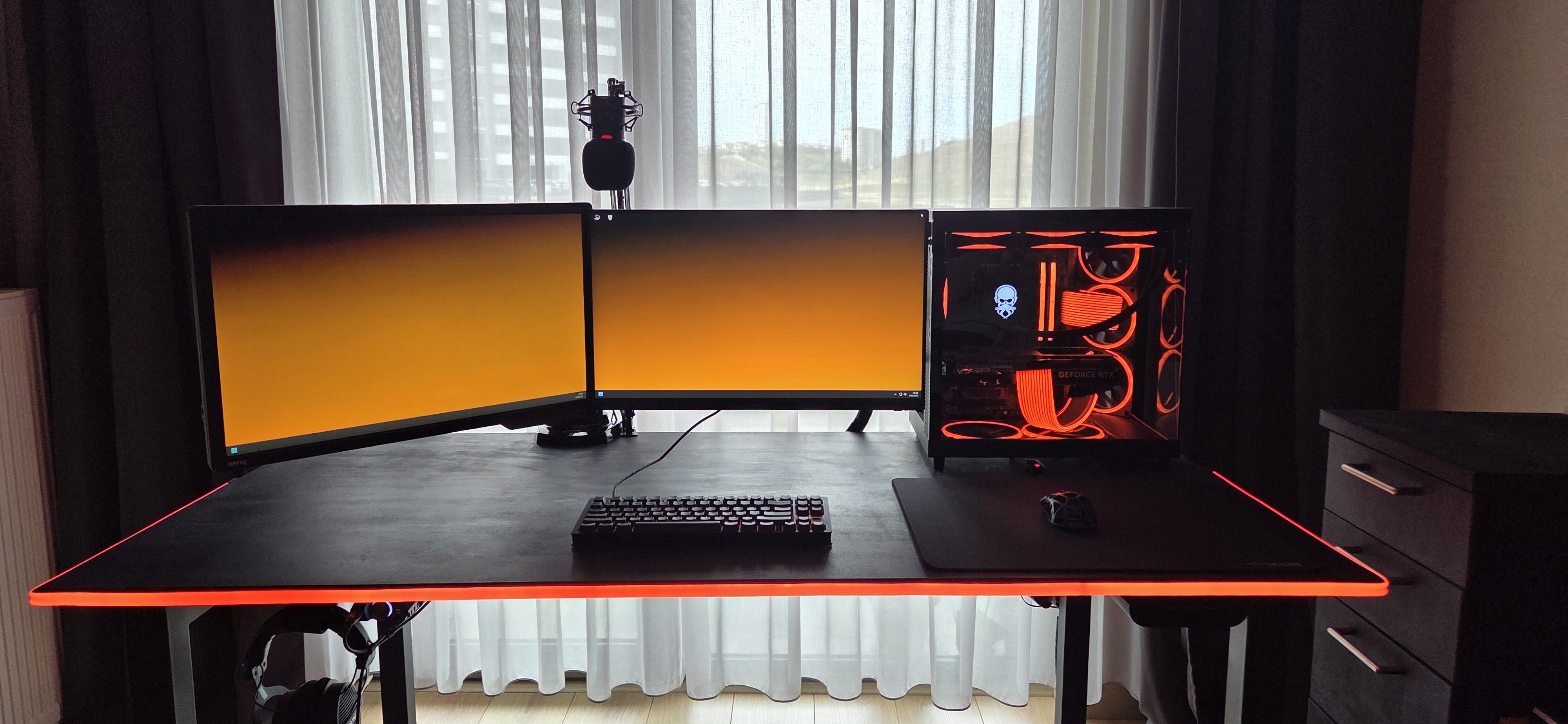
Not much room for improvement. Maybe same type of display, different bezels always annoy me personally. Looks solid tho
koechzzzn
I feel like the orange and red are biting one another a bit.* I’d go with a fully red wallpaper as well, or with a more complimentary color. The red is a good choice for complimenting the black desk.
* May be an artifact of my phone screen/ your photo and look better in real life.
Elcucuy054
I like the colors and it looks clean but it also looks empty I don’t what can fit there but maybe some decoration below the screens
Ionic-Nova
I think the main issue aesthetically is it’s too minimal/monotonous. Theres a lot of unoccupied space that makes the setup feel empty or without character.
A deskpad would help with breaking up the empty space of the desk itself if you’re ok with the lowered mouse real estate. Printed deskpads with designs could help with additional color/patterns.
Since you have the available desk space: a headphone stand could be placed at the left hand side of the of the desk or on the drawers on the right. I would say in general too that the left hand side feels unbalanced relative to the right side which has the PC that draws most of the attention. You could add more visual weight on that side with a medium sized item/trinket, like a RGB geometric lamp, digital clock or the aforementioned headphone stand.
A coiled keyboard cable could also add some extra visual flare and texture to the setup.
From a personal perspective, I find the identical heights of the monitors and PC tower to be a bit plain and dramatically lowers the “verticality” of the setups aesthetics. I realize for your workflow/use case it might not be practical, but I think elevating your central monitor slightly and changing the orientation of the secondary to a vertical setup would help alleviate this aspect.
I would also consider changing up the wallpaper, maybe to something with geometric design language if you’d like to keep the more gamery aesthetic.


4 Comments
Not much room for improvement. Maybe same type of display, different bezels always annoy me personally. Looks solid tho
I feel like the orange and red are biting one another a bit.* I’d go with a fully red wallpaper as well, or with a more complimentary color. The red is a good choice for complimenting the black desk.
* May be an artifact of my phone screen/ your photo and look better in real life.
I like the colors and it looks clean but it also looks empty I don’t what can fit there but maybe some decoration below the screens
I think the main issue aesthetically is it’s too minimal/monotonous. Theres a lot of unoccupied space that makes the setup feel empty or without character.
A deskpad would help with breaking up the empty space of the desk itself if you’re ok with the lowered mouse real estate. Printed deskpads with designs could help with additional color/patterns.
Since you have the available desk space: a headphone stand could be placed at the left hand side of the of the desk or on the drawers on the right. I would say in general too that the left hand side feels unbalanced relative to the right side which has the PC that draws most of the attention. You could add more visual weight on that side with a medium sized item/trinket, like a RGB geometric lamp, digital clock or the aforementioned headphone stand.
A coiled keyboard cable could also add some extra visual flare and texture to the setup.
From a personal perspective, I find the identical heights of the monitors and PC tower to be a bit plain and dramatically lowers the “verticality” of the setups aesthetics. I realize for your workflow/use case it might not be practical, but I think elevating your central monitor slightly and changing the orientation of the secondary to a vertical setup would help alleviate this aspect.
I would also consider changing up the wallpaper, maybe to something with geometric design language if you’d like to keep the more gamery aesthetic.