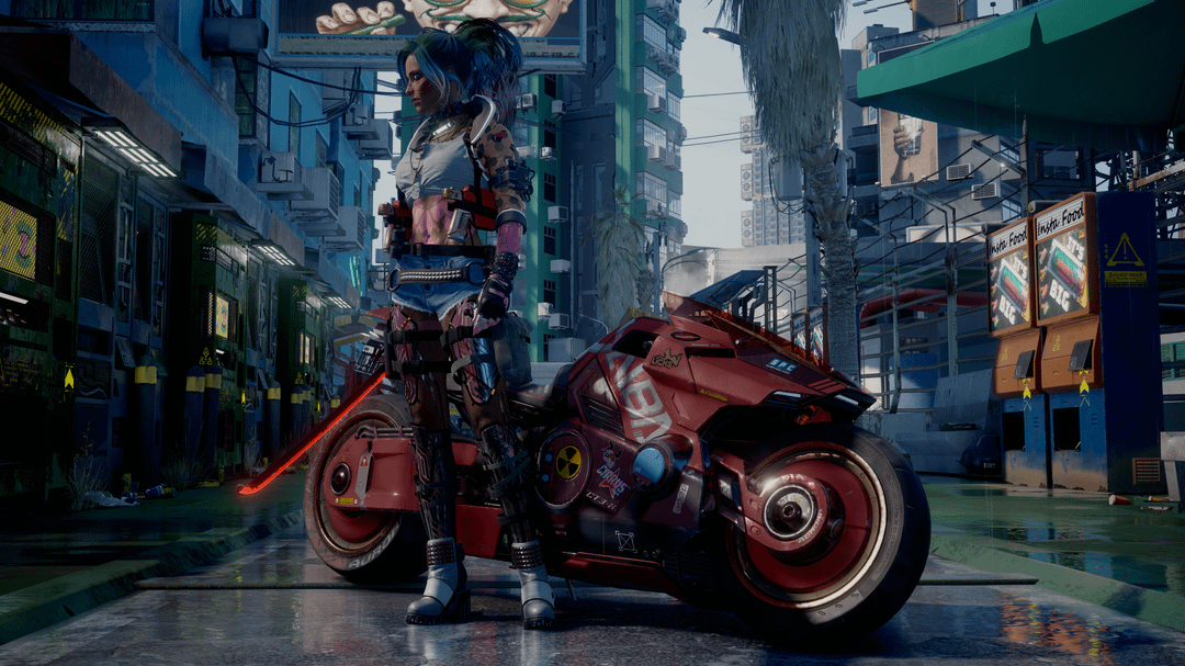
Share Facebook Twitter Pinterest LinkedIn Which filter looks best? Also slight DoF or no Dof Cyberpunkcyberpunk 2077cyberpunk game 18 Comments Sculpdozer 2 years ago On the second one blues work better with reds, imo. Cyber_Templar 2 years ago 2nd one seems more vibrant and pops the colours more I find. fadijec 2 years ago Second one is more vibrant, it encapsulates better Cyberpunk’ aesthetic. baddorox 2 years ago 1st Gravity616 2 years ago Is this a screenshot from the game with mods? Cause holy Dapper_Ad4155 2 years ago 2/3 I like mistabnanas 2 years ago its the third pic for me Joe_Khopeshi 2 years ago 1st one for me. Also those are some nice mods. Feels rare that modders lean more into the cyberpunk aesthetic from what I usually see. readyeddyy 2 years ago The third one 👌🏼 GoodLoveCapture 2 years ago 3rd one 100% and with DoF Foreign_Kale8773 2 years ago 2 is my favorite Foreign_Kale8773 2 years ago 2 is my favorite Michaeli_Starky 2 years ago 1st. 2nd is too cartoonish. Notta_Doggo 2 years ago Second Jefffresh 2 years ago 1st fuzzyborne 2 years ago 2’s contrast is nice and the subject stands out the most against the background. RealDingleBungle 2 years ago 2nd looks the best imo they’re all good though justanotherchoom51 2 years ago 3rd one Write A CommentYou must be logged in to post a comment.
Joe_Khopeshi 2 years ago 1st one for me. Also those are some nice mods. Feels rare that modders lean more into the cyberpunk aesthetic from what I usually see.
fuzzyborne 2 years ago 2’s contrast is nice and the subject stands out the most against the background.

18 Comments
On the second one blues work better with reds, imo.
2nd one seems more vibrant and pops the colours more I find.
Second one is more vibrant, it encapsulates better Cyberpunk’ aesthetic.
1st
Is this a screenshot from the game with mods? Cause holy
2/3 I like
its the third pic for me
1st one for me. Also those are some nice mods. Feels rare that modders lean more into the cyberpunk aesthetic from what I usually see.
The third one 👌🏼
3rd one 100% and with DoF
2 is my favorite
2 is my favorite
1st. 2nd is too cartoonish.
Second
1st
2’s contrast is nice and the subject stands out the most against the background.
2nd looks the best imo they’re all good though
3rd one