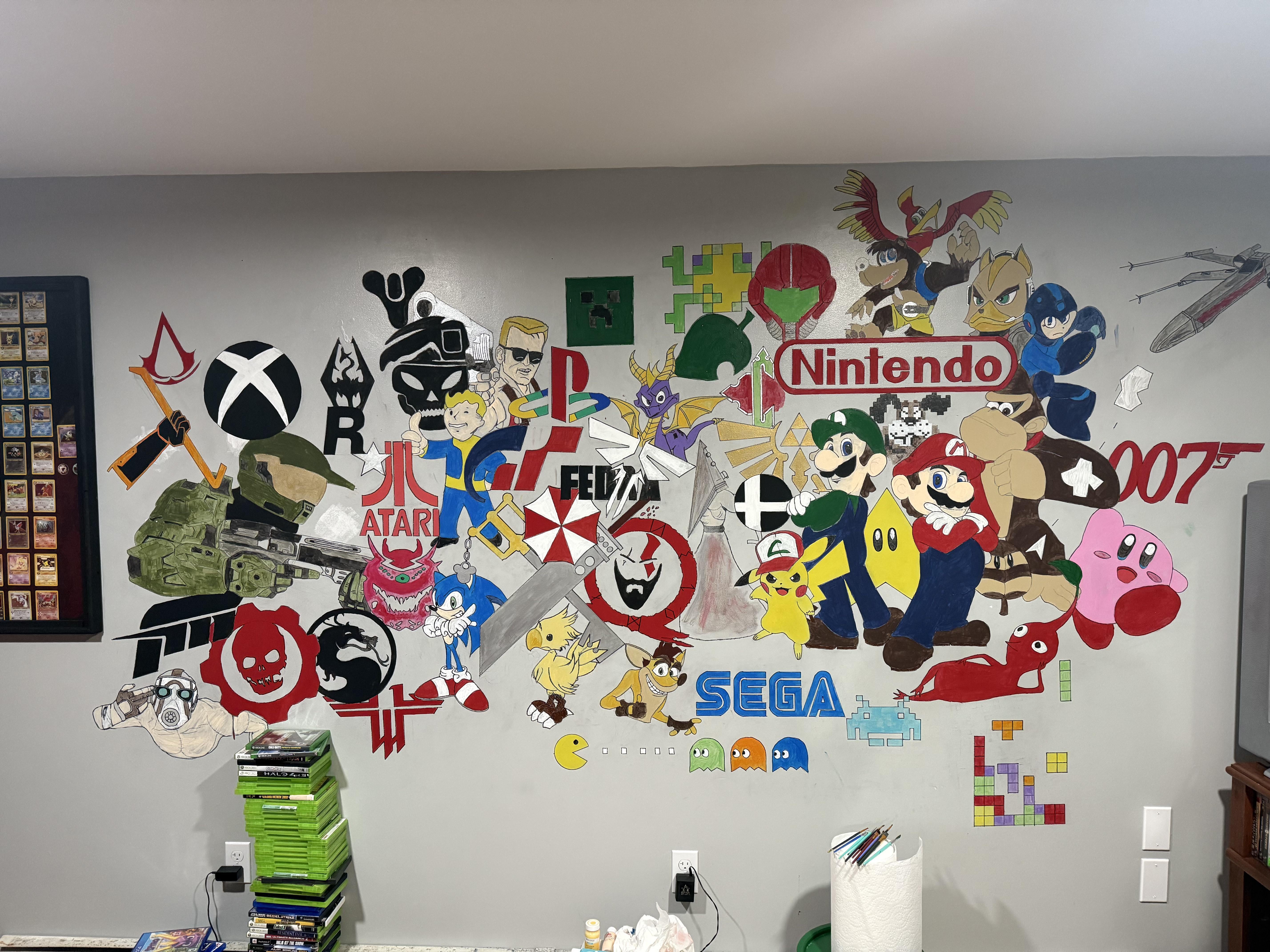
I’m not an artistic person – but decided to paint a mural in our game room. It’s almost done. Needs additional coats and lines redrawn.


I’m not an artistic person – but decided to paint a mural in our game room. It’s almost done. Needs additional coats and lines redrawn.
26 Comments
It’s pretty! How much time did it took?
Sick. I kinda want one now
That’s amazing, I think you should now consider yourself an artistic person
Say sike right now
Careful Nintendo might have their lawyers come after you and make you take that down
Really good.
It looks a bit too cluttered for my taste. Otherwise it’s great!
I think you’re pretty damn artistic! This looks awesome! I got hit wth the nostalgia
SEGA is forever in my heart
Bro is getting a C&D letter from Nintendo any time soon
Way better than the murals on the side of bodegas and appliance shops in the hood
“I’m not an artistic person”
Proceeds to make one of the coolest things I’ve ever seen
Oh, I’m envious, and I have just the wall to do this as well. If only I had any talent.
Looks like a grade 9s art project
This is awesome!!
Also Pac-Man is in danger
“I’m not an artistic person”
Proceeds to make art far better than I ever could.
Looks like 28 counterstrike players sprayed game logo’s on the wall
Very cool indeed.
this is cool lots of banger games in tehre from my childhood
You need an AstroBot in there for PlayStation! 🙂 New Mascot is fucking DOPE, that game is awesome.
Add background drop or some effects and should mesh this piece together nicely. Great job!
It’s a BAZAR but it’s very classy, I really like it!!!
How much do you wanna suck corporate cock that you even voluntarily paint advertisment into your living space for free?
Yes!
Dude this is awesome!!
The Duke Nukem is funny as hell – still looks good but has a MAD TV vibe to him.
The dog from Duck Hunt is my fave
The whole piece is lacking coherence… It feels like you just started painting symbols in one corner and just expanded from there. I think the “Nintendo” logo should probably be centered as it’s the first thing people’s eye will be drawn to. The actual art itself looks pretty great and most of the characters are really on model, but yeah, a planning phase would have done a lot of justice here.