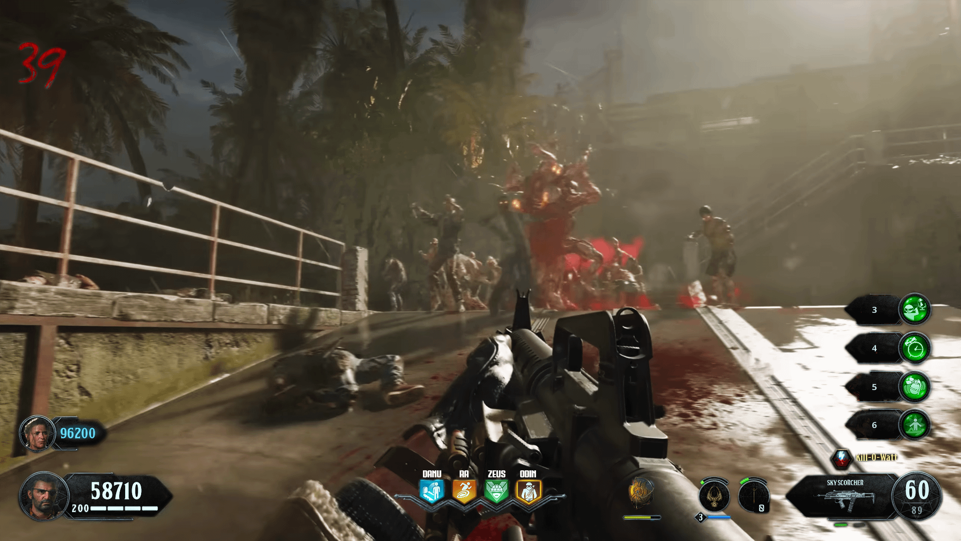
Unironically better than what BO6 currently looks like.
EDIT: don’t get it twisted this is still ugly.
Hammer-The-Lard

HideyHoh
Honestly still better than the base BO6 HUD
Pandachoko
I take BO4 HUD over the latest COD “HULU TV” inspired menus. Navigation has been a nightmare since MWII.
originsspeedrunner
Good one
timecop115
This hud is atleast more tailored-made for zombies. BO6 on the other hands…
Superyoshiegg
The BO4 HUD is way overhated. The only bad part is that the Elixirs protrude a bit too much towards the centre of the screen, and this only applies to the console version of the game.
Having a health bar on your shield is super convenient. I know BO3 had it too, but it was a depleting gauge on a tiny symbol that is hard to see instead of an easy to read bar.
Havin the game tell you which weapon is in which slot is nice. *Especially* if you’re running Mule Kick. It shouldn’t have taken five years to get an icon indicating which weapon is in your Mule Kick slot (five years instead of seven because Infinite Warfare did it first).
Player health bar. Always nice, no more vague ‘I’ve been hit several times but not red screened, how close am I *really* to going down?’
If I *had* to adjust anything, I would move the perks down to the bottom left, and hide your elixirs into the Scoreboard tab like BO3 did with Gobblegums.

8 Comments
Make it go away please
Unironically better than what BO6 currently looks like.
EDIT: don’t get it twisted this is still ugly.

Honestly still better than the base BO6 HUD
I take BO4 HUD over the latest COD “HULU TV” inspired menus. Navigation has been a nightmare since MWII.
Good one
This hud is atleast more tailored-made for zombies. BO6 on the other hands…
The BO4 HUD is way overhated. The only bad part is that the Elixirs protrude a bit too much towards the centre of the screen, and this only applies to the console version of the game.
Having a health bar on your shield is super convenient. I know BO3 had it too, but it was a depleting gauge on a tiny symbol that is hard to see instead of an easy to read bar.
Havin the game tell you which weapon is in which slot is nice. *Especially* if you’re running Mule Kick. It shouldn’t have taken five years to get an icon indicating which weapon is in your Mule Kick slot (five years instead of seven because Infinite Warfare did it first).
Player health bar. Always nice, no more vague ‘I’ve been hit several times but not red screened, how close am I *really* to going down?’
If I *had* to adjust anything, I would move the perks down to the bottom left, and hide your elixirs into the Scoreboard tab like BO3 did with Gobblegums.