
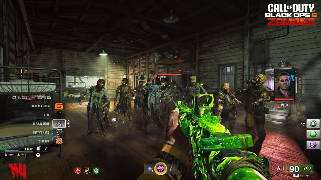
Sorry if this post seems nitpicky but I really want this game to be as great as possible. Treyarch has also confirmed that the HUD elements will not be completely customizable and we will only be able to choose their presets which is why I'm making this post.
-
The field upgrades/lethals/tacticals should be moved back to the right just as it was in the classic games (B03 HUD in post for reference)
-
The perk icons should be moved completely to the left as in the classic games (The current placement just looks super odd imo)
-
The gobblegum section should also be reworked, the bright grey background is just out of place and distracting, especially in the dark setting of Terminus Island
-
Finally, I don't expect this to happen but I would love for the HUD's artstyle to be more personalized and tailored to each map as they were in B02, I feel that this would add to the atmosphere of each map very nicely
Overall, I really hope this HUD can be reworked as it detracts from the visuals and ambience of the maps in its current state and can definitely be polished up more.
20 Comments
If they can’t change it, then let us do that!
Couldn’t agree more I really hope they change it
They now have some space for the perks when you have them all. It’s probably designed to fit them all if they add more next year. Like Going from 6 to 10 in Cold War. It’ll probably somewhat fill out. Eventually.
Good points, I hope it can happen.
It’s seriously so ugly. I honestly wish they didn’t even bother showing off the HUD at all when it’s filled with crappy placeholders and looks terrible in general.
You can custom tweak it. Be the change you want to see.
It would be nice to just get a good HUD that is custom for zombies, if we really can’t get that for some reason in 4 years of development, at least give us better presets
I hope I can get rid of the health bar for points and armor.
I hope I can make my hud numbers larger. The font is way too small for me 🙁
At least today’s [COD Blog post](https://www.callofduty.com/blog/2024/08/call-of-duty-black-ops-6-zombies-deep-dive-terminus-map-intel) points out there will be a lot of flexibility with HUDs. There will be “a variety of HUD layouts,” plus there will be HUD features you can turn on/off, and you can even adjust HUD colors. It may not be perfect, but at least we should have a decent amount of control over our preferred HUD layout.
Weird, all the videos I saw today had the HUD disabled.
I hate how small the points are in this and MW/Vanguard. Why do I need a magnifying glass to see one of the most important pieces of information on the HUD?
The emote menu on the left is horrendous please tell me you can take that off
They’ve seemed really communicative and receptive to community thoughts this year, here’s hoping they go above and beyond and listen to this serious concern.
I honest to god thought this was the basic hud and we haven’t seen the legacy one yet lmao, this is ass dude how do they keep missing with it
I wish they offered a legacy option for us classic fans
Why does every thing look like it was made in a hour or so, like someone made this based off what someone saw?
hot take, the bo3 primus hud is kind of dumb and only really worked for the giant/der eisendrache. hud in bo6 is already confirmed to be customizable, but skins would be nice for it if it really matters that much to you
After all this gameplay came out I’ve lost all hype for bo6 the zombies just looks like cold war 2 and I already hate cold war with a passion so it’s just more shit I don’t like
Damn, why does that bo3 screen shot also look so much better than the new game still…