The one where its not 2 fucking pixels wide so I can actually click it
Man_in_Kilt
2006,9 for me
golddilockk
1998 <3
WalkAroundWorld
Scroll bars have gone to shit nowadays. 2 pixel wide, slight gradient difference to show scroll progress and hiding of scrollbar just makes it that much difficult to do what should be done at a glance.
I hate bringing my mouse to right corner just for scroll bar to enlarge and to clearly see where I am in the article.
atakariax
2001
Warm-Preference-4187
98
Sprizys
1998 for me
VulpesIncendium
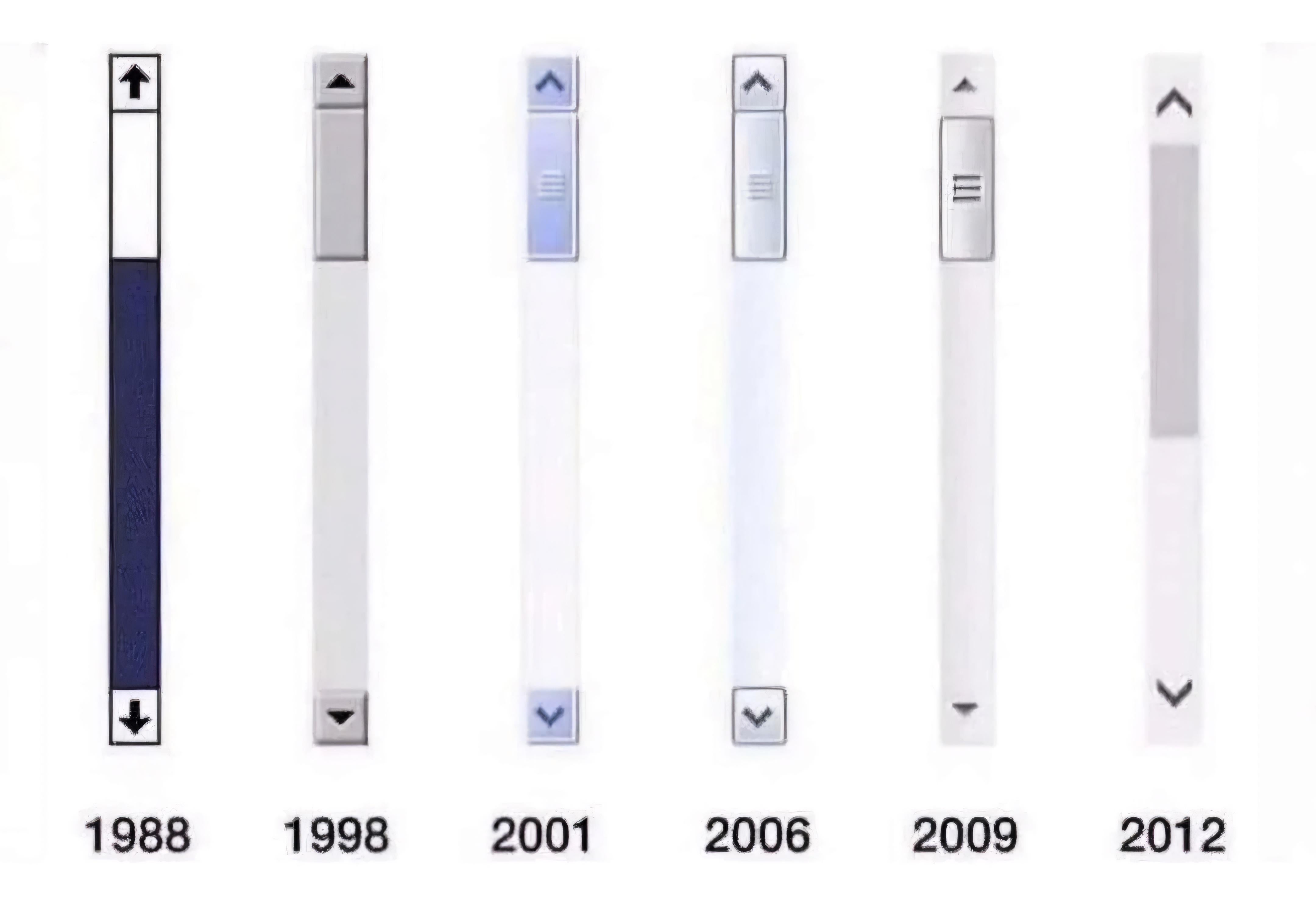
1998 > 2006 > 2001 > 2009 > 2012 > 1988
BanDit49_X
2001 cuz I love Windows XP, it will always remain my favorite OS ever no matter what <3.
nindesk
98 feels like home
RAMChYLD
I’d say 1993. Which is 1998 but bigger and more pixellated.
bagre-agiota
1988
v13ragnarok7
1988: I dont like the reversed colors on the bar. 1998: just gross. 2001: not bad but the blue tint wont match everything. 2006: almost. looks functional. 2009: I dont like how the arrows are not boxed in. 2012: oversimplified, looks cheap.
TheClownOfGod
I like the 1998, 2009 and 2012 scrollbars the most haha maybe the 2001 as well( a little)

26 Comments
2001
1998. OMG give.
The one where its not 2 fucking pixels wide so I can actually click it
2006,9 for me
1998 <3
Scroll bars have gone to shit nowadays. 2 pixel wide, slight gradient difference to show scroll progress and hiding of scrollbar just makes it that much difficult to do what should be done at a glance.
I hate bringing my mouse to right corner just for scroll bar to enlarge and to clearly see where I am in the article.
2001
98
1998 for me
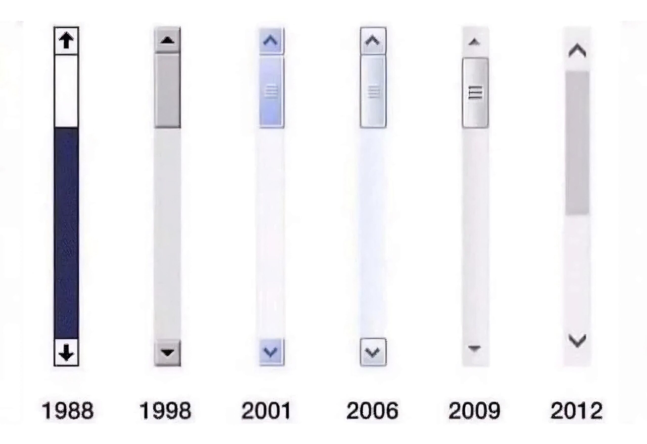
1998 > 2006 > 2001 > 2009 > 2012 > 1988
2001 cuz I love Windows XP, it will always remain my favorite OS ever no matter what <3.
98 feels like home
I’d say 1993. Which is 1998 but bigger and more pixellated.
1988
1988: I dont like the reversed colors on the bar. 1998: just gross. 2001: not bad but the blue tint wont match everything. 2006: almost. looks functional. 2009: I dont like how the arrows are not boxed in. 2012: oversimplified, looks cheap.
I like the 1998, 2009 and 2012 scrollbars the most haha maybe the 2001 as well( a little)
I can’t just pick one HAHA
Man i can feel how that 2009 scroll bar moves
1998 100%, and i wasnt even alive at that time
1988 or 2012 I prefer flatter designs.
1998. Not even close.
2006 is peak
2012
98
Elder Scrolls 6!
I would say about 2 fucking don’t care.
98 and 12