

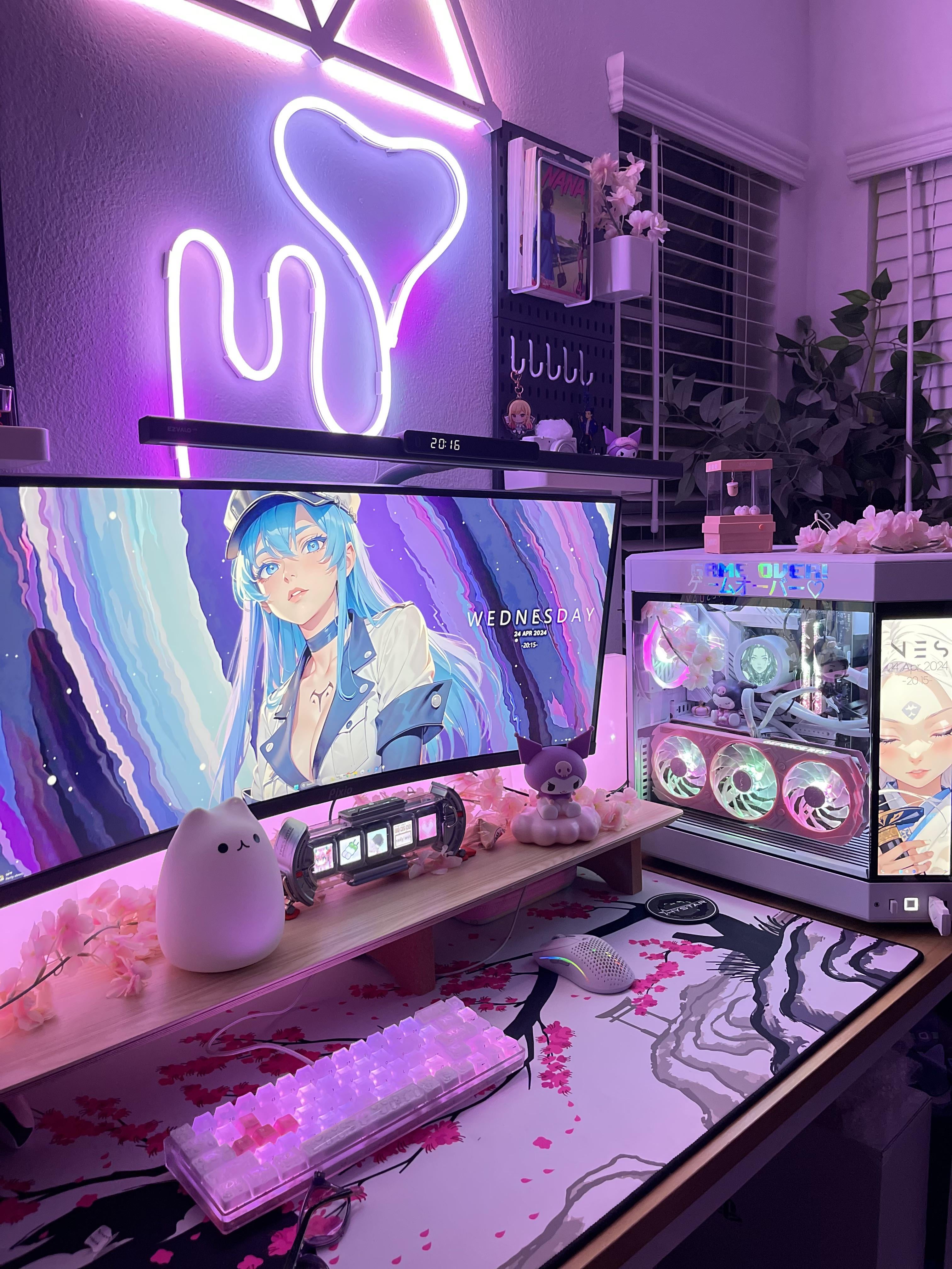
So on another post I asked what would help the top of my area look less empty, and went with one of the suggestions!
I did the pegboard thing but I got it in black with white because I thought the contrast would be interesting!
Well I set it up today and I’m not sure how I feel about the look! One person told me the contrast looks lovely but I’m so unsure. Then I figured oh if it looks awkward maybe I’ll throw in more rgb 💀 so I put nanoleaf lines up ontop of my little rope light and now it looks like this: https://imgur.com/a/CQ7tx2u
I attached more photos to the Imgur link! Can you guys let me know what you think/suggest things to save it? 😅 I fear I flew too close to the sun and fumbled.
by HeyMonicara
5 Comments
I don’t have any advice, but that’s a cozy looking setup. Good work
Looks great
Idk, I kinda like it!
Esdeath wallpaper looks amazing, nice setup!
Only advice would be maybe a bit deeper of a desk. Im on a 42″ C2 and the same case def need the depth lmao. I guess maybe also move the 2 figurines in front of ur monitor down out of the image view (but thats more preference). Gorgeous build!