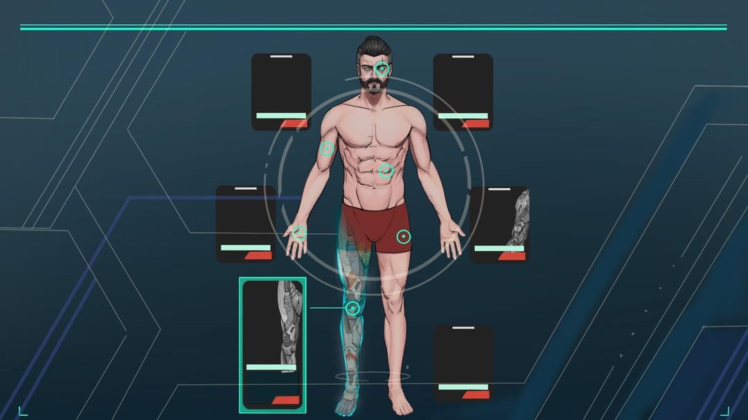
Hello, everyone. I shared the cybernetic improvements in our game Sodaman with you before and you gave great feedback ❤️ Thanks a lot! This time we are a little confused about the cybernetics screen. Which one feels more “cyberpunk” to you?

Hello, everyone. I shared the cybernetic improvements in our game Sodaman with you before and you gave great feedback ❤️ Thanks a lot! This time we are a little confused about the cybernetics screen. Which one feels more “cyberpunk” to you?
9 Comments
First one seems more modern but just generic sci-fi. Second one is interesting and has a good aesthetic but is a little cluttered, and needs a glow on mouse over to let you know what corresponds to what.
You could combine them. Leave the stats on the left, move the guy to the right, keep the second picture’s color scheme and background but the first picture’s floating equip slots.
The font for ‘Cyberware’ is also kinda… Idk. Sunset strip basic bitch?
Brass tax is I would play the game in the second screenshot thinking it was indy, and assume the first screenshot was from some mass market mobile trash and skip it.
What is the overall ‘era’ of the world?
The first one says ‘late 90’s/early 2000’s/pre iPhone modern’ aesthetic.
The second screams ’60’s/70’s/80’s’ aesthetic.
Both look great, but which one would match the tone of the world? Maybe assign different screen types to different vendors, or leave it user customizable?
The first reminds UI of Cyberpunk 2077, the second UI of old RPGs. Thus it’s difficult for me to judge which one is more “cyberpunk-ish”, as both of them somehow refer to Cyberpunk, but give opposite artistic feeling.
Out of two I like second the most.
Not using proper terms here but the first one has a more “medical-cyberpunk” feel and the second a more “arcade-cyberpunk” feel. Personally I like the second one but if the game has a more serious aesthetic the first one.
I like mashing up the hardware windows from 1 with the stat window from 2. One of
My biggest pet peeves with any game is when I’m spending perk points/XP and not getting to see the quantified results. Even in 2077 you get detailed descriptions of things but would have to go to a fully separate page to see a (possibly incomplete? Someone check me…) stat block. Like, neat, but I’d like to see the comparison between these two items *based on their marginal effects on stats*, not just comparing their individual buffs to the stat. Especially if there’s +/- dynamics to the skills/equipment.
It’s minor, but for me it’s like an itchy tag in a shirt during the off times that I notice it again.
I like the second one more. It’s less similar to Cyberpunk 2077.
The second one kinda reminds me of the one from The Syndicate (1993)
I’d say that the look you go with should be whichever blends better with the overall theme/coloring of the rest of the game.
The first looks more “generic modern science fiction,” and the second has a more artistic choice to it that I personally like better.
I will say that the second UI looks so much more detailed and useful. Having related information instantly visible without having to navigate more menus to find the details is something that I definitely notice in a negative way when a game is missing it.
So overall, my “vote” is the second UI with the background/color scheme that works best with the rest of the game.
The second one reminds me of Deus Ex, I like it!