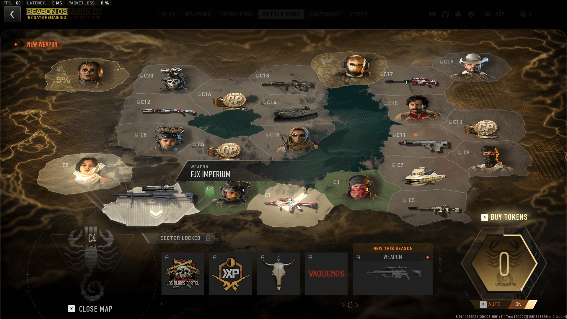
What the actual hell is this UI?? this has to be ugliest change to already a new/complex UI they made for BP. Y is everything STRETCHED, even the operator mugshots on DMZ ready screen????

What the actual hell is this UI?? this has to be ugliest change to already a new/complex UI they made for BP. Y is everything STRETCHED, even the operator mugshots on DMZ ready screen????
11 Comments

It looks like it’s more optimized for phone screens.
Call of duty is going to be creating their own risk game.
It was the first thing I said to myself when I pulled it up. What in the actual fuck are these guys doing? It’s stretched!!
I meaan, this is obviously made for Ultrawide monitors with an aspect ratio of 32:9
Sorry man, but my BP UI doesn’t look like this.
Literally came here looking for this. The whole resolution and scale are way off, its a fucking nightmare.
They flattened the “territories” so when you hover over it the main unlock “floats” in 3D form. It looks horrendous. Whoever is in charge of UI needs to be fired. Somehow the UI gets worse and worse
The ui is so much worse this season, for no reason
Also, if you are on that screen, hitting escape or back just puts the map away, and hitting escape or back again( opens the map. If I wanted to do that, I’d hit the key that’s shown for open and close map, if I hit escape, I want to go back to the play, or home menu like how it worked before.
It also automatically picks a tile to go to, so if you aren’t watching and just click one of the rewards, you might do so in the wrong tile, which isn’t the worst overall, but when you’re trying to get the new sniper as fast as possible, getting a token used in the wrong direction sucks a bit.
Then there’s how awful the menu still looks overall, when picking what you even want to play.
My question is why they cant go back to 100 tiers
Even better, the newest feature makes your secondary guns disappear from your loadouts. These guys are fucking clueless for 3 seasons now.