Ok we all have things about the gameplay we like either more in WZ1 or more in WZ2 but can we at least agree the UI is so bad ?
Just even selecting the mode you want feels so clunky or even your loadout system ???
Please revamp the UI it truly needs it.
Kiplerwow
Mom said it was my turn to post about the bad UI.
Alabrandon
We are.. umm. Y’all are. Almost every other post… wtf..
pitchh19
Was only a matter of time before I came across another post about the UI
6Vibeaholic9
Again?
HatTruck
Every fucking time my Trio game ends, I need to scroll to the right to reselect Trios again. Why isn’t there a play again option? Why?
R_5
We have repeatedly for the last 2 months. Single handedly the worst UI in gaming history and I don’t think there’s much debate over it.
mzulfe
First world problem I know, but scrolling down three rows at the menu, one of them being a bundle and store row, to get into Modern Warfare 2 or any of the main games just irks me
Tim_vdB3
No other UI for any game has been so universally hated.
It actually made me like halo infinite’s UI in comparison as if I treated it to harshly.
rickrollyield
Hitler, Osama bin Ladin, and the COD UI are in a room…and I have a gun with two bullets…I’m shooting the UI twice.
timeboi42
“Can we talk about how…”
Everyone is talking about it. You don’t have to ask lol. It’s all we hear from this subreddit lol.
But yes, you are correct. The UI is ass.
TheTrueAlCapwn
Perfect example of changing a totally functional UI just for the sake of looking different. UI should not change once it has been “solved” for a particular purpose. Waste of resources that could have been put to use elsewhere.
2hotrods
Its not that confusing
Ness_of_Onett
The UI
The game sync
This. That.
Uggh
The_ImposterAndy
oh the new COD interface is horrible.
pen_of_inspiration
UI sucks, 5 clicks from different points gets you the same options.
UI SUCKS, its like im on HTC running jelly bean
SupaflyIRL
I FUCKING HATE that when I boot up the game I don’t know if I have to hit circle or down to play a game. A UI should never do this.
log in five times, hit circle to play five times. Log in 6th time, oops circle puts you back at the splash screen and you have to reconnect.
Dr_Infinite_Ghost
I actually love it how I have to click through several menus after a game to get back into a queue. Takes a nice chunk out of my precious gametime that I couldn’t use better anyway. Genius really.
labpadre-lurker
WZ1s UI was way better…
cekoya
The dumbass who invented multi directional menu should lose its job. Top down or left right menus are the best
oliversl
What do 1 click to play when you can do down scroll, right scroll, and two clicks ?
Hangmeup8
I wouldn’t mind the old drop down menus 🙂
Chiquemund_Freud
Oh jesus yes. It’s the fucking worst.
Nemesis96
I PRAY they fix this. Its horrible. Why do I have to press so many times to queue a game ffs
Careless-Smile-5160
Shits assssssss shmackyyyy
frozenYogurtLover2
Ah, the UI devs from Hulu
lowie07
I hate it, I also hate the new way of looting
Mrcountrygravy
No. UI is fine.
OM_Jesus
The fact that I have to select “quads”, then back out to the menu again, scroll all the way to the right in order to select Solos is just beyond shitty UI/ UX.
At this point I’m literally begging for a new FPS BR to release that will shut Warzone 2 down. These fucking greedy idiots need a competitor to scare them into shape.
Unfortunately, Battlefield is also run by idiots so they royally dropped the ball on one.
beardedbast3rd
The ui is dogshit in so many Godamn ways lol.
The wz playlist makes no sense how it’s ordered.
Mini royale- quads- 3rd person tri- duo-trio-solo
????
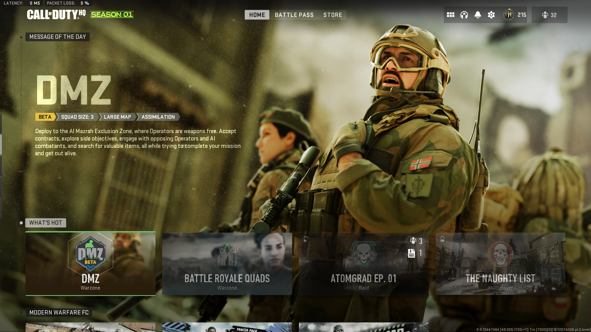
The main screen has a listing on the top left, which looks like it would be the heading for your existing page but is instead a button for the page above it.
Heading actually above the horizontal listings- near the bottom- then under a heading for the lower page. Horrible layout.
The tiles. Why. Good lord why are they so large? We aren’t playing on iPads. We can have small tabs, or small tiles that actually fit on the screen.
The top tabs, home is different depending where you are. But if you’re in the “cod HQ” wouldn’t home be where to select the games and modes? It’s just the main page for the scrolled selection. Or if you’re in a game or mode home becomes main page for that.
What’s hot should just not even exist.
Social menu. More garbage and large tiles for no reason.
Combining vertical and horizontal lists. With tiny vertical tabs, but giant horizontal tabs.
Jesus Christ.
The settings menu. Quick settings and full settings……. Holy fuck just make a setting menu where all settings are accessible. That said, small vertical side tabs, and small horizontal top tabs for settings. The only menu in the game that makes sense aside from half the settings being hidden.
Why is message of the day a giant menu? And not just an overlay like before? At least it doesn’t start there anymore but before people actually saw it. Sure hope no important info ever ends up there.
Tutorials or refreshers for modes like wz and dmz? People have no clue about core mechanics or goals. The loading splash screen doesn’t cut it. Why is there nothing substantial to guide players properly.
In game. Warzone specifically.
Holy fuck, I can understand if I loot a bag or a container unit- and it brings up the container contents, and my bag contents, that clicking will stow stuff. Except sometimes it doesn’t. It’ll equip it. Okay fine, but then why does my existing item drop to the ground instead of moving to my empty bag?
Why does buying a loadout not put it into my slot, where buying streaks and weapons does switch it with what I’ve got equipped?
Sometimes it straight up breaks and I’ll hold the stow button and stuff just drops straight to the floor, cycling with the new item equipped. With an empty bag.
Pings aren’t color coded for the player? Why? Sometimes it gets a colored dot over the mark. But it’s not consistent.
Armor has a black background.
Armor; Blue on black, and purple on black are HORRIBLE design choices. They teach this now in like grade 5 when a kid makes his first PowerPoint for a school assignment.
The visual design of iconography, and menus is just so bad, and controlling them is so unintuitive it absolutely blows my mind.
How many, when the game launched, kept hitting back or escape or whatever to close the message of the day menu, but get sent to the start splash “press (whatever) to continue” screen, and we’re confused until we discovered you had to SCROLL DOWN??!?
I thought it was just a tongue in cheek joke that they hired some Hulu dev to design the ui, but turns out that’s actually what happened? Why? The skillset is transferable, but they just straight up made a ui that mimics a streaming service. That shit doesn’t work.

30 Comments
Ok we all have things about the gameplay we like either more in WZ1 or more in WZ2 but can we at least agree the UI is so bad ?
Just even selecting the mode you want feels so clunky or even your loadout system ???
Please revamp the UI it truly needs it.
Mom said it was my turn to post about the bad UI.
We are.. umm. Y’all are. Almost every other post… wtf..
Was only a matter of time before I came across another post about the UI
Again?
Every fucking time my Trio game ends, I need to scroll to the right to reselect Trios again. Why isn’t there a play again option? Why?
We have repeatedly for the last 2 months. Single handedly the worst UI in gaming history and I don’t think there’s much debate over it.
First world problem I know, but scrolling down three rows at the menu, one of them being a bundle and store row, to get into Modern Warfare 2 or any of the main games just irks me
No other UI for any game has been so universally hated.
It actually made me like halo infinite’s UI in comparison as if I treated it to harshly.
Hitler, Osama bin Ladin, and the COD UI are in a room…and I have a gun with two bullets…I’m shooting the UI twice.
“Can we talk about how…”
Everyone is talking about it. You don’t have to ask lol. It’s all we hear from this subreddit lol.
But yes, you are correct. The UI is ass.
Perfect example of changing a totally functional UI just for the sake of looking different. UI should not change once it has been “solved” for a particular purpose. Waste of resources that could have been put to use elsewhere.
Its not that confusing
The UI
The game sync
This. That.
Uggh
oh the new COD interface is horrible.
UI sucks, 5 clicks from different points gets you the same options.
UI SUCKS, its like im on HTC running jelly bean
I FUCKING HATE that when I boot up the game I don’t know if I have to hit circle or down to play a game. A UI should never do this.
log in five times, hit circle to play five times. Log in 6th time, oops circle puts you back at the splash screen and you have to reconnect.
I actually love it how I have to click through several menus after a game to get back into a queue. Takes a nice chunk out of my precious gametime that I couldn’t use better anyway. Genius really.
WZ1s UI was way better…
The dumbass who invented multi directional menu should lose its job. Top down or left right menus are the best
What do 1 click to play when you can do down scroll, right scroll, and two clicks ?
I wouldn’t mind the old drop down menus 🙂
Oh jesus yes. It’s the fucking worst.
I PRAY they fix this. Its horrible. Why do I have to press so many times to queue a game ffs
Shits assssssss shmackyyyy
Ah, the UI devs from Hulu
I hate it, I also hate the new way of looting
No. UI is fine.
The fact that I have to select “quads”, then back out to the menu again, scroll all the way to the right in order to select Solos is just beyond shitty UI/ UX.
At this point I’m literally begging for a new FPS BR to release that will shut Warzone 2 down. These fucking greedy idiots need a competitor to scare them into shape.
Unfortunately, Battlefield is also run by idiots so they royally dropped the ball on one.
The ui is dogshit in so many Godamn ways lol.
The wz playlist makes no sense how it’s ordered.
Mini royale- quads- 3rd person tri- duo-trio-solo
????
The main screen has a listing on the top left, which looks like it would be the heading for your existing page but is instead a button for the page above it.
Heading actually above the horizontal listings- near the bottom- then under a heading for the lower page. Horrible layout.
The tiles. Why. Good lord why are they so large? We aren’t playing on iPads. We can have small tabs, or small tiles that actually fit on the screen.
The top tabs, home is different depending where you are. But if you’re in the “cod HQ” wouldn’t home be where to select the games and modes? It’s just the main page for the scrolled selection. Or if you’re in a game or mode home becomes main page for that.
What’s hot should just not even exist.
Social menu. More garbage and large tiles for no reason.
Combining vertical and horizontal lists. With tiny vertical tabs, but giant horizontal tabs.
Jesus Christ.
The settings menu. Quick settings and full settings……. Holy fuck just make a setting menu where all settings are accessible. That said, small vertical side tabs, and small horizontal top tabs for settings. The only menu in the game that makes sense aside from half the settings being hidden.
Why is message of the day a giant menu? And not just an overlay like before? At least it doesn’t start there anymore but before people actually saw it. Sure hope no important info ever ends up there.
Tutorials or refreshers for modes like wz and dmz? People have no clue about core mechanics or goals. The loading splash screen doesn’t cut it. Why is there nothing substantial to guide players properly.
In game. Warzone specifically.
Holy fuck, I can understand if I loot a bag or a container unit- and it brings up the container contents, and my bag contents, that clicking will stow stuff. Except sometimes it doesn’t. It’ll equip it. Okay fine, but then why does my existing item drop to the ground instead of moving to my empty bag?
Why does buying a loadout not put it into my slot, where buying streaks and weapons does switch it with what I’ve got equipped?
Sometimes it straight up breaks and I’ll hold the stow button and stuff just drops straight to the floor, cycling with the new item equipped. With an empty bag.
Pings aren’t color coded for the player? Why? Sometimes it gets a colored dot over the mark. But it’s not consistent.
Armor has a black background.
Armor; Blue on black, and purple on black are HORRIBLE design choices. They teach this now in like grade 5 when a kid makes his first PowerPoint for a school assignment.
The visual design of iconography, and menus is just so bad, and controlling them is so unintuitive it absolutely blows my mind.
How many, when the game launched, kept hitting back or escape or whatever to close the message of the day menu, but get sent to the start splash “press (whatever) to continue” screen, and we’re confused until we discovered you had to SCROLL DOWN??!?
I thought it was just a tongue in cheek joke that they hired some Hulu dev to design the ui, but turns out that’s actually what happened? Why? The skillset is transferable, but they just straight up made a ui that mimics a streaming service. That shit doesn’t work.