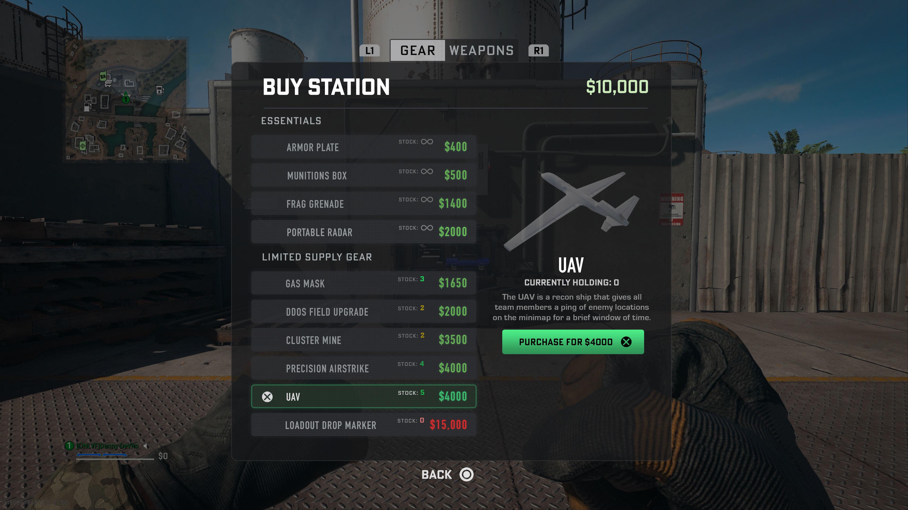
The New Buy Stations were really hard to navigate using only the analog stick, so I redesigned them so you can tab between Gear and Weapons!

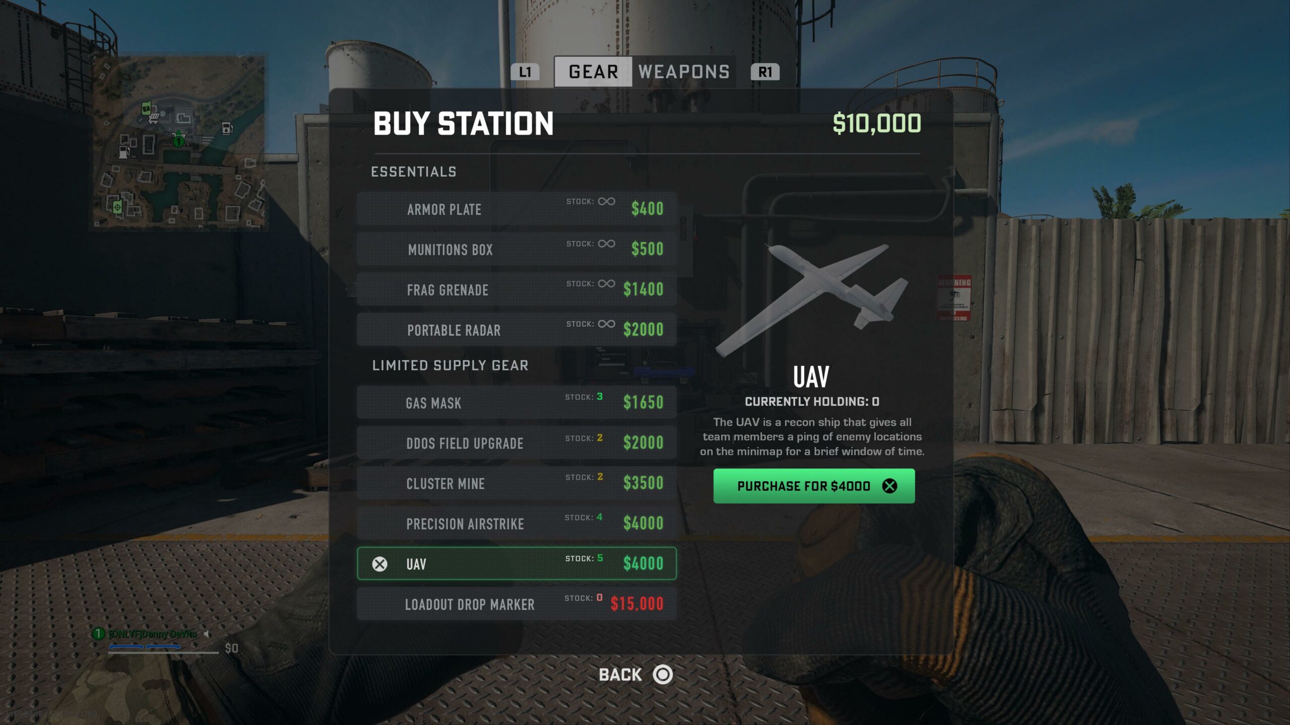
The New Buy Stations were really hard to navigate using only the analog stick, so I redesigned them so you can tab between Gear and Weapons!
15 Comments
Amazing UI/UX 
Lol this is way better
Love it!
Thought this was real since raven works this fast i didn’t even surprised lol looks good tho
Looks good, but wishful thinking with 5 UAVs and a loadout!
Crazy how much better this looks than anything IW has put out lol.
Vertical scrolling lists where you can read everything in one glance > side scrolling fucking boxes.
Some avarage person on reddit has better competens than these devs. They are a joke.
Clean!
How many load outs does a buy stock?
Very nice looking. Well done.
So, basically WZ1 shops. Exactly what we already had…
I use mouse so can’t speak for controller use.
However, I prefer the existing one because there are items icons, wich is faster to identify than names.
In W1 it wasn’t an issue because it was always the same thing in the same order, which isn’t the case here.
Someone pay this person! (By someone I mean COD)
this is the best constructive cod post ive seen in a while. this menu so much easier to read and understand.
Lists will always be better than grids. The entire game’s UI is atrocious