

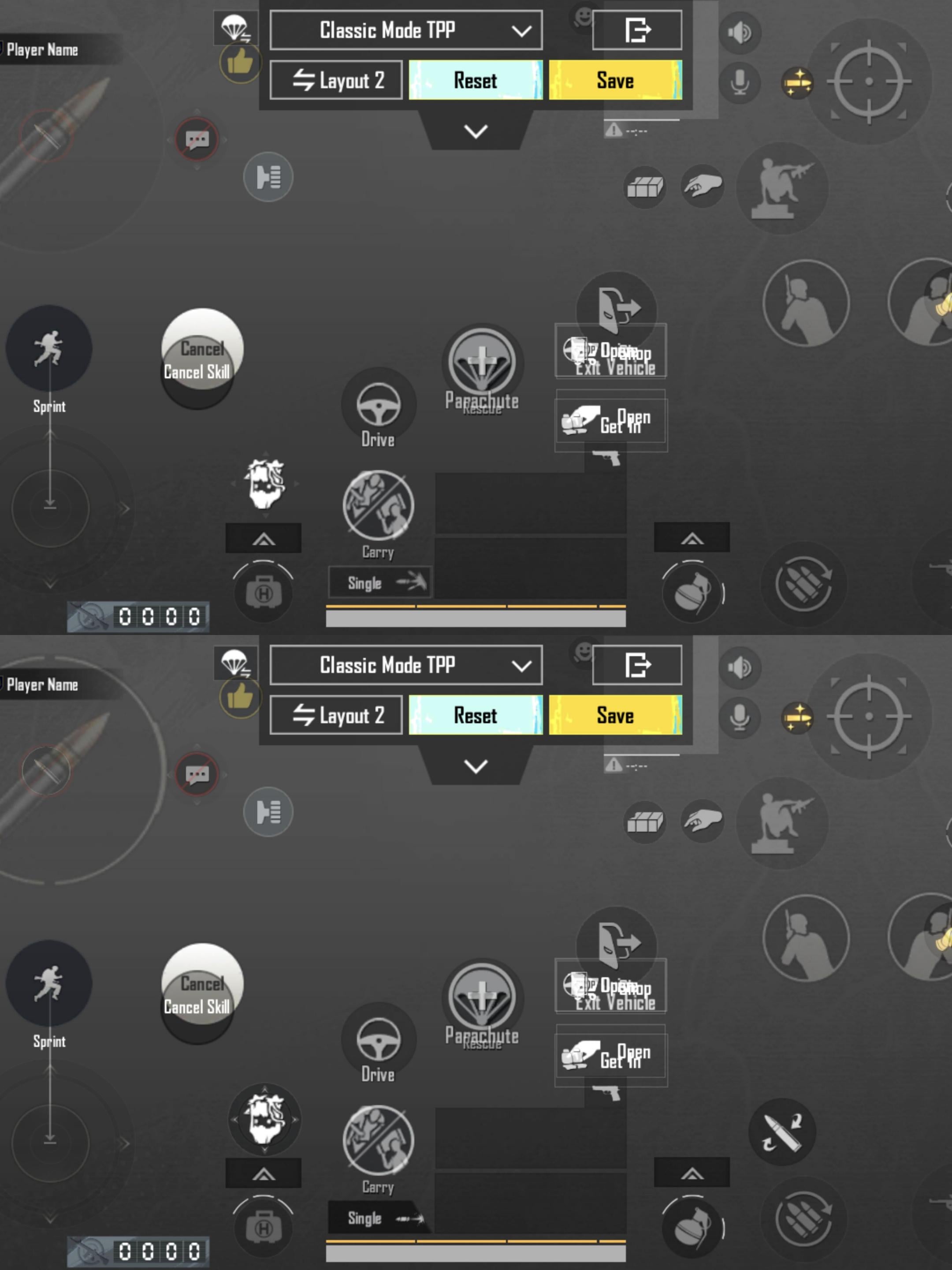
I noticed a clear difference between these two control layouts.
1st layout (top image):
More glassy look
Better transparency
Feels cleaner and more updated
UI blends nicely with the background
2nd layout (bottom image):
Old design
Less transparent
Feels a bit boring and dated
Personally, I really like the first one. It looks modern and easier on the eyes while playing.
What about you guys — which layout do you prefer and why? 👀🎮