
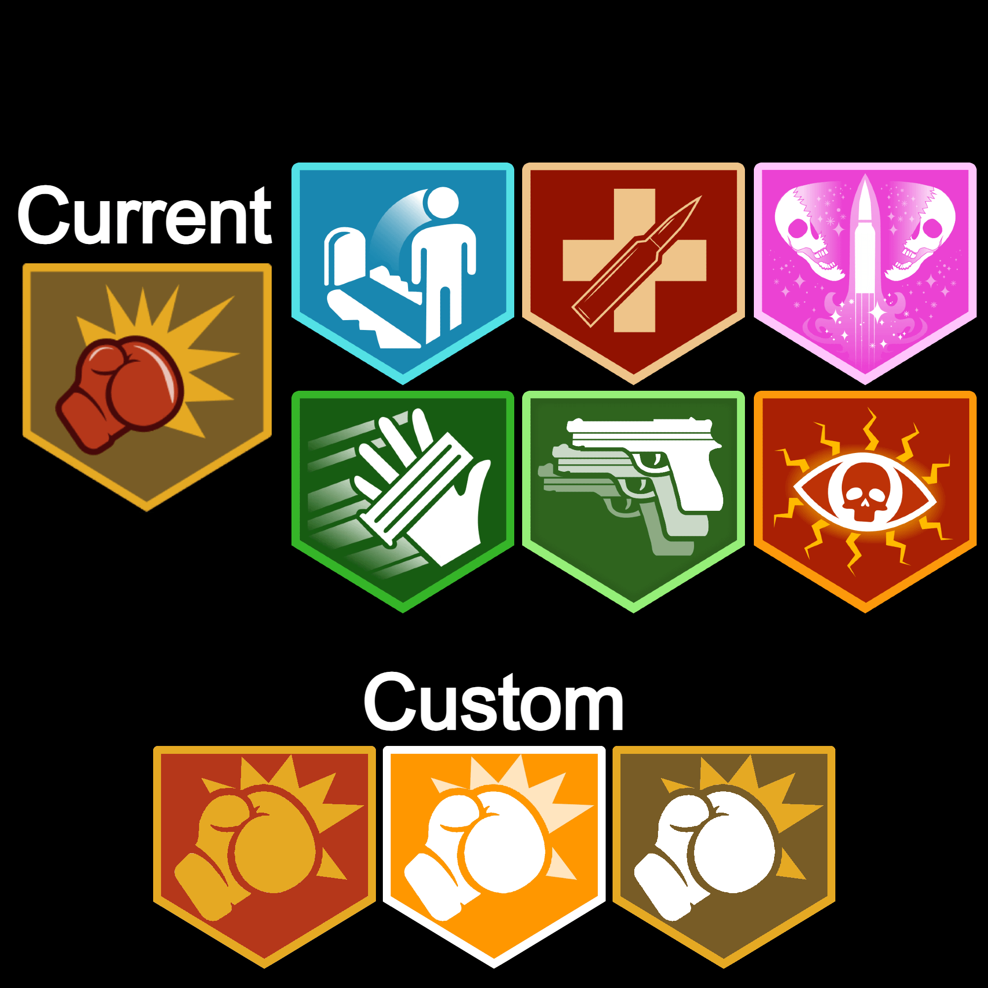
It just bothers me that it's the only icon to have a bold outline and shine in the object/action being portrayed. I thought it looked weird in BO6 and I still think it looks wrong in BO7, so I quickly whipped up a couple custom versions of how I would theme it to be in line with the rest.