
REUPLOAD DUE TO CORRUPTED IMAGES
Hello Everyone,
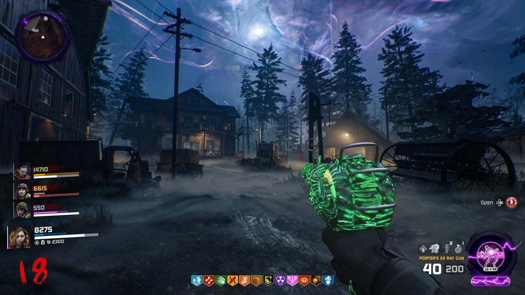
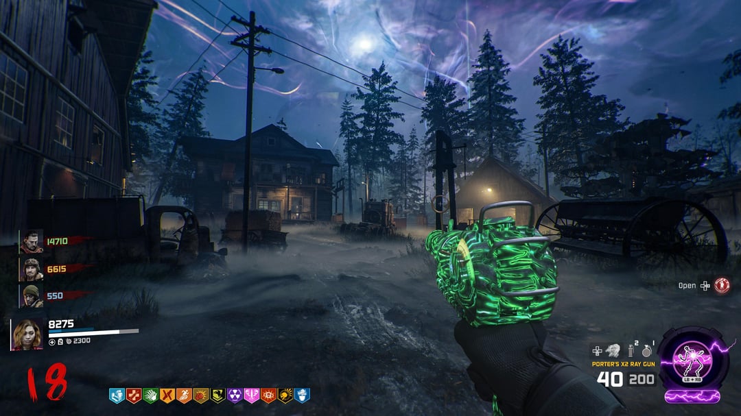
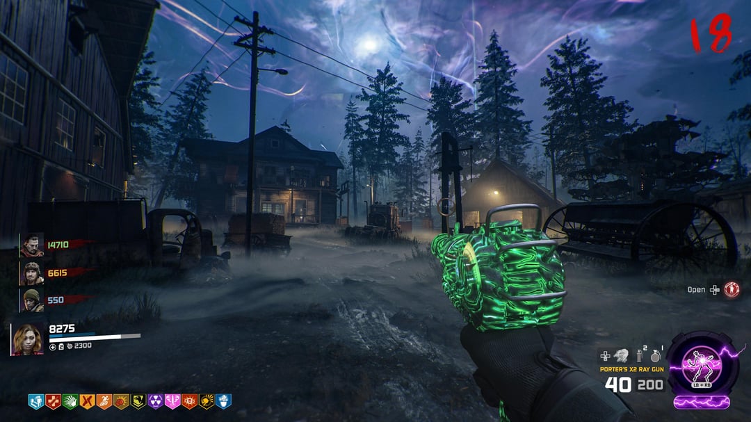
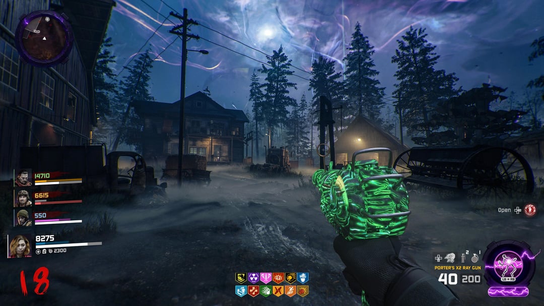
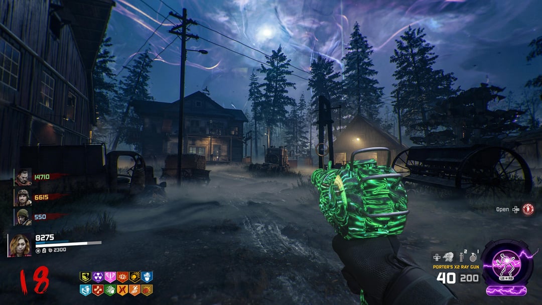
This is my third and final (yes, I actually mean final this time) shot at designing a HUD for Black Ops 7 that mixes a classic feel with a few modern touches. I’d love to hear what you think. YAY or NAY?
Disclaimer: I’m not a graphic designer, and honestly not that great with Photoshop to begin with. If some of the overlays look rough, you’re probably right — good thing I don’t do this for a living 😂. I’m just a Zombies fan having fun with all the HUD discussion lately. This isn’t meant as hate toward Treyarch’s design, just my own take for fun.
For anyone wondering about sizing: Every element is scaled 1:1 with official gameplay footage. The only piece that’s slightly smaller is the armor plate. Everything else matches in-game proportions or is a little larger.
Also, since it’s come up several times before and turned into a heated debate in my last post — If you like seeing teammate health/armor bars, awesome! If not, that’s cool too! Fans can agree to disagree 🤷♂️