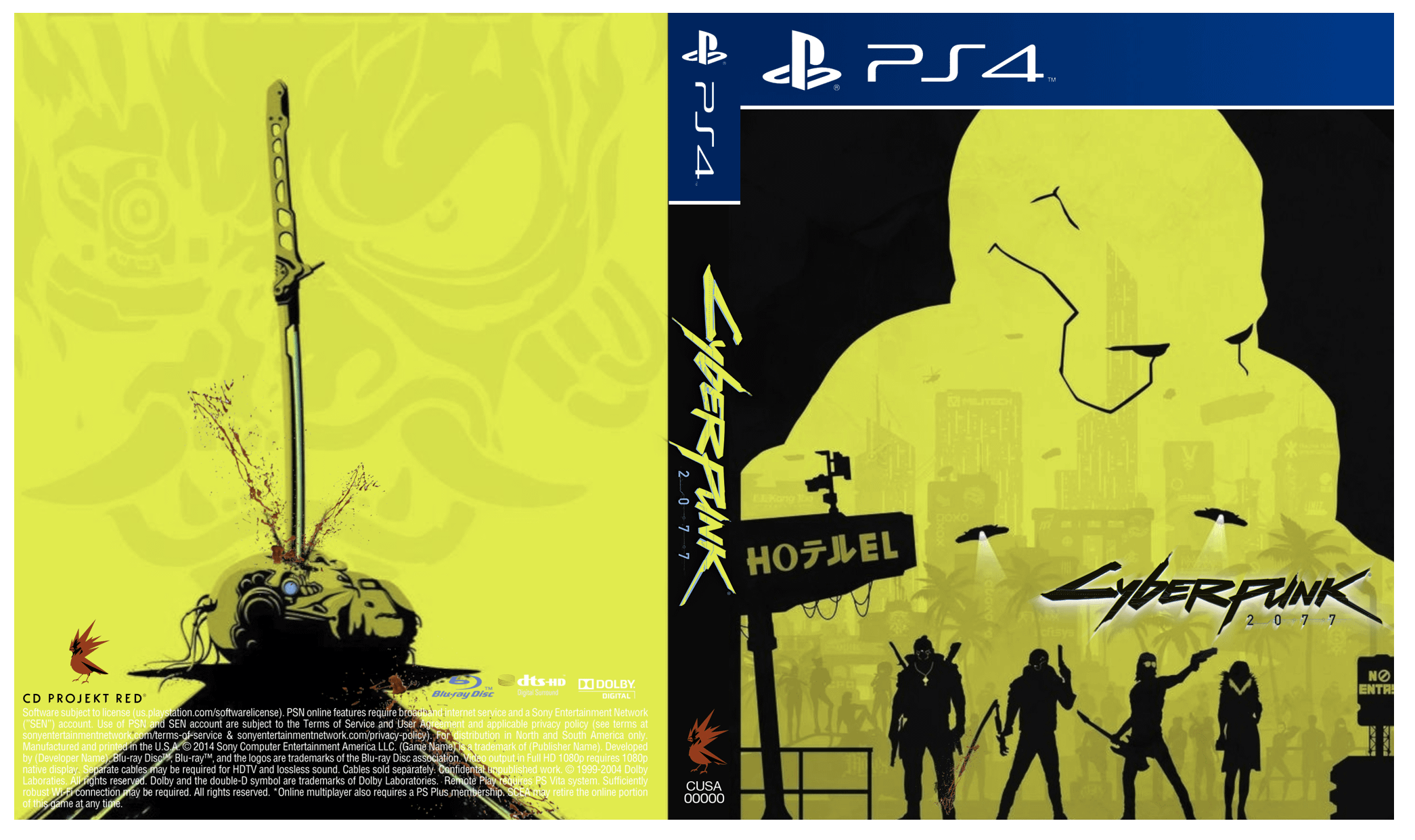
The “EL” on that signboard is superfluous. Unless the hotel is called “Hotel EL”?
nicknamesareconfusng
I think the idea behind them is really cool, but they look way too pale for me to call Cyberpunk. I’m not a Cyberpunk expertise but I always associated it with brighter colors
C0V3RT_KN1GHT
Are those the ships of the technonecromancers from Alpha Centauri?!
Looks pretty good!
Holycrabe
I think it’s nice.
Would lead to a lot more confusion when >!Jackie dies!< and about Johnny’s involvement in the whole thing story which can be quite fun.
Torgons
The back art was taken from Google, i had that immage as wallpaper for a year
One_External_983
the yellow is not yellow enough
EasyKay2084
Cool art, but as a game cover it’s not visually descriptive enough I’d say, makes it look like a coop pve shooter or something. Good form but lower function.
brispower
Should have a not for resale stamped on it 😁
JD_Gameolorian
Honestly, I think it looks fantastic. Much better than the official ones 😎
FunnyColaPanda
Borderlands vibes! Playable characters on the front. I’ll take it!
Repulsive_Branch4305
Kinda gives a borderlands vibe.
Not bad
aarzeekayy
It’s dope.
SeBoss2106
It looks pretty cool!
I get a feeling for technomancer round based strategy rpg, but that’s juat me
Rahios
Pretty preem choom
DragonStreamline
Very abstract great design, love the backside as it hints about the struggle of implants.
BlackBangs
The overall concept is really good, honestly.
However, details-wise, there are a few details here and there that are bothersome. For example, the yellow isn’t as saturated as the original color and it’s missing out on some red elements. The motel sign doesn’t correlate with anything plot wise, and offers a weird balance — it draws the eyes to it rather than the title of the game. And while we are talking about the title, it should definitely be more centered and, of course, bigger. The characters shadows are pretty neat, but I would’ve kept it minimal with only Johnny (as he’s the most relevant character alongside V).
The back is really cool though. I like the Samurai symbol.
Egomania27
Hmm. Generally I like it, but the four characters in the front make it look like a hero shooter with some REALLY annoying characters (Johnny’s silhouette with the guitar and the gun makes me think he is an incredible cringy and obnoxious support character who heals and gives buffs with his guitar),
and the silhouette looming over them is too non-descriptive. Like, who is that supposed to be? Smasher? If so, why is he looming like he’s the big bad behind it all, when he’s barely in the game and could hardly be described as an antagonist with how little interaction we have with him.
Kylonix
Peak
Kahmikazeee
loving it
Willyse
You are a professional, the answer is no. You are an amateur, it’s great.
3rd_eye_light
No
numbarm72
This is cool, I like the Evelyn choice, most would have wanted like rogue or panam, but Evelyn is the catalyst to V’s story
Ill_Item_487
I’d say it would be more fit for coop looter/extraction-shooter game. It still goes hard.
bendit07
Hoteruel? It should just be “Hoテル”
Atomfried92
Nice, but would put Female v inside it too. Maybe Male V as the Background and female V in the foreground or something
Marcinator123
I love the back cover, and even though the front is really cool too (how you made the outline of V) I feel that’s it’s not flashy enough to grab people’s attention when surrounded by other game covers

29 Comments
Honestly, no. Sorry.
I think it is pretty cool.
The “EL” on that signboard is superfluous. Unless the hotel is called “Hotel EL”?
I think the idea behind them is really cool, but they look way too pale for me to call Cyberpunk. I’m not a Cyberpunk expertise but I always associated it with brighter colors
Are those the ships of the technonecromancers from Alpha Centauri?!
Looks pretty good!
I think it’s nice.
Would lead to a lot more confusion when >!Jackie dies!< and about Johnny’s involvement in the whole thing story which can be quite fun.
The back art was taken from Google, i had that immage as wallpaper for a year
the yellow is not yellow enough
Cool art, but as a game cover it’s not visually descriptive enough I’d say, makes it look like a coop pve shooter or something. Good form but lower function.
Should have a not for resale stamped on it 😁
Honestly, I think it looks fantastic. Much better than the official ones 😎
Borderlands vibes! Playable characters on the front. I’ll take it!
Kinda gives a borderlands vibe.
Not bad
It’s dope.
It looks pretty cool!
I get a feeling for technomancer round based strategy rpg, but that’s juat me
Pretty preem choom
Very abstract great design, love the backside as it hints about the struggle of implants.
The overall concept is really good, honestly.
However, details-wise, there are a few details here and there that are bothersome. For example, the yellow isn’t as saturated as the original color and it’s missing out on some red elements. The motel sign doesn’t correlate with anything plot wise, and offers a weird balance — it draws the eyes to it rather than the title of the game. And while we are talking about the title, it should definitely be more centered and, of course, bigger. The characters shadows are pretty neat, but I would’ve kept it minimal with only Johnny (as he’s the most relevant character alongside V).
The back is really cool though. I like the Samurai symbol.
Hmm. Generally I like it, but the four characters in the front make it look like a hero shooter with some REALLY annoying characters (Johnny’s silhouette with the guitar and the gun makes me think he is an incredible cringy and obnoxious support character who heals and gives buffs with his guitar),
and the silhouette looming over them is too non-descriptive. Like, who is that supposed to be? Smasher? If so, why is he looming like he’s the big bad behind it all, when he’s barely in the game and could hardly be described as an antagonist with how little interaction we have with him.
Peak
loving it
You are a professional, the answer is no. You are an amateur, it’s great.
No
This is cool, I like the Evelyn choice, most would have wanted like rogue or panam, but Evelyn is the catalyst to V’s story
I’d say it would be more fit for coop looter/extraction-shooter game. It still goes hard.
Hoteruel? It should just be “Hoテル”
Nice, but would put Female v inside it too. Maybe Male V as the Background and female V in the foreground or something
I love the back cover, and even though the front is really cool too (how you made the outline of V) I feel that’s it’s not flashy enough to grab people’s attention when surrounded by other game covers
This would look so cool in a steel book