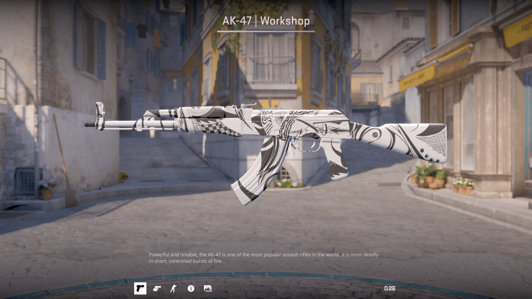
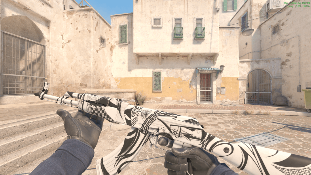
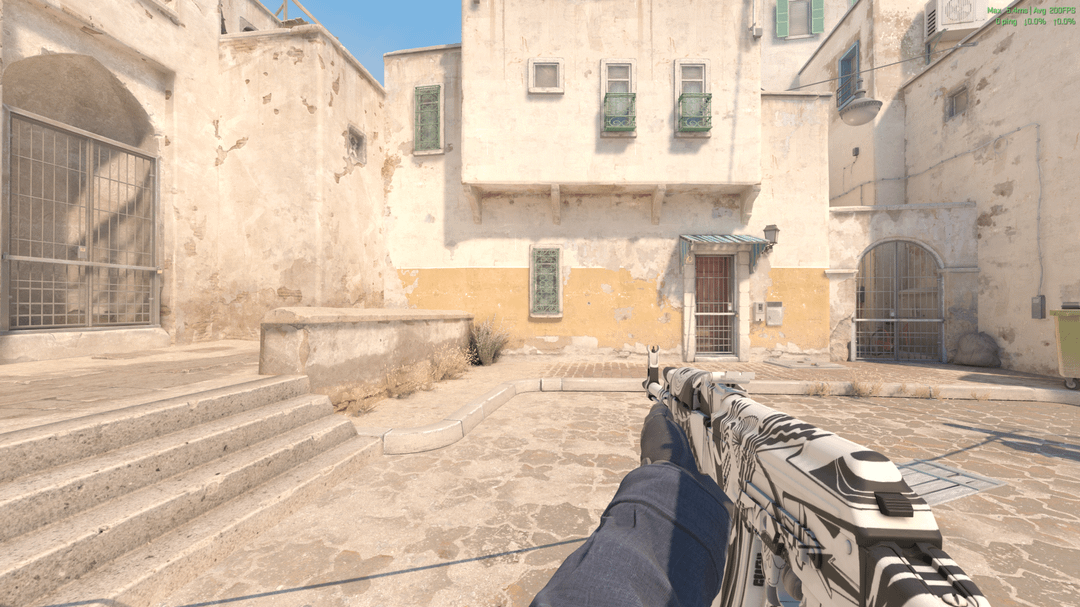
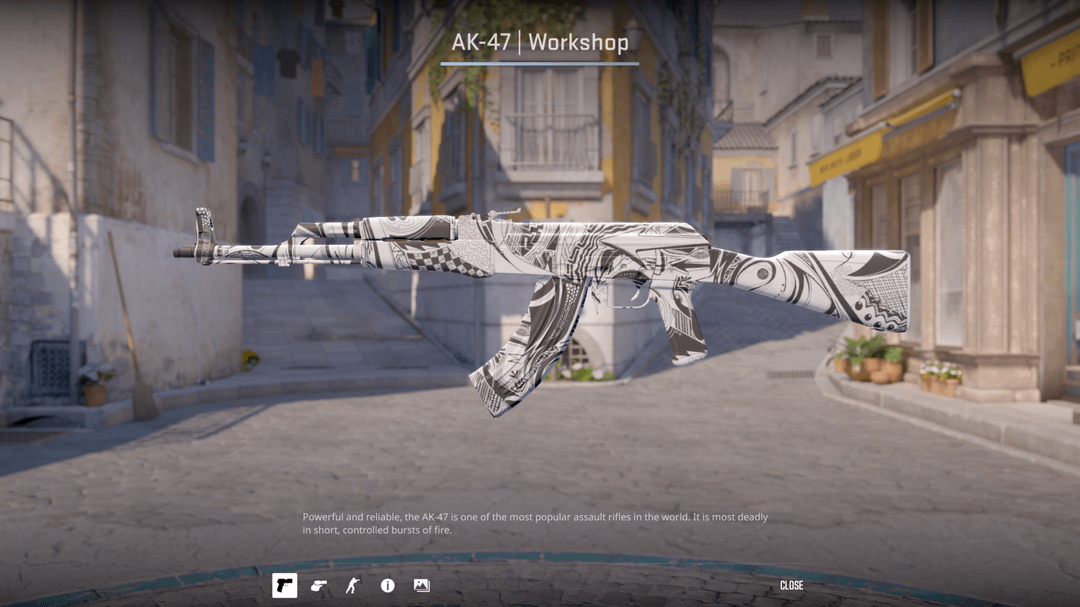
I want to see if this new version is better before i publish it since a lot of people said it was too cluttered. Will also be making one where the handles and stock are made of black wood. first 3 images is new . last image is old

I want to see if this new version is better before i publish it since a lot of people said it was too cluttered. Will also be making one where the handles and stock are made of black wood. first 3 images is new . last image is old
12 Comments
Ño
Valorant ahh skin
I like it, but I think it needs some accents of color. The all white wrap makes it too similar to the hypnotic, and looks a lot like a chaotic prismatic. I’m excited to see the v3 with the black handles to see if it makes a difference.
i love the black and white vibe at the texture A+
Love it
I like it better it’s more readable.
i feel like it might look better if it wasnt matte finish, maybe metalic or something
Reminds me of “dazzle” camouflage for ships in WW2
https://en.m.wikipedia.org/wiki/Dazzle_camouflage
Would love a pattern-based skin with this effect
i would say it does look cleaner (if the first slide is the new version). I would add the design on the mag from v1 to v2.
I wonder what it would look like if the black was gold
First thing I thought was that there were no textures at all.
Going to be a little critical, but this would look much better with a bulls eye pattern than squiggly lines. I like the b & w colors, but I personally feel the pattern doesn’t stand out enough to me as a standalone skin.