You’re onto something here. You have the vision, I can see that. Keep practicing and learning blending techniques. If you’re super passionate about learning graphic design, consider keeping tabs on your progress for your own record (or public) and come back in 3-6 months and make a similar post showcasing your progression at tackling graphic design and critique your work, pat yourself on the back. You’ll notice a ton differences and improvements.
Could be a neat experiment for yourself. Keep at it. I see what you’re going for.
briandemodulated
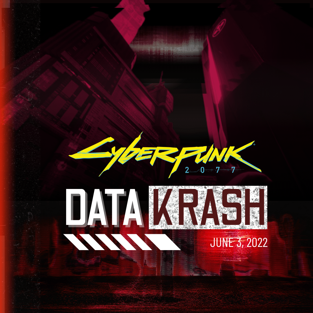
The gaps between those italicized blocks, and the kerning/tracking of the letters, seem inconsistent. It’s a nice design but those gaps are what stood out to me.
AsrielPlay52
It would be funny if you add like a QR like code at the corner with the text saying “Don’t ask God Ask me”, As a reference to Bartmoss’s Net Icon

5 Comments
Looks preem!
The font looks a bit unpolished…
You’re onto something here. You have the vision, I can see that. Keep practicing and learning blending techniques. If you’re super passionate about learning graphic design, consider keeping tabs on your progress for your own record (or public) and come back in 3-6 months and make a similar post showcasing your progression at tackling graphic design and critique your work, pat yourself on the back. You’ll notice a ton differences and improvements.
Could be a neat experiment for yourself. Keep at it. I see what you’re going for.
The gaps between those italicized blocks, and the kerning/tracking of the letters, seem inconsistent. It’s a nice design but those gaps are what stood out to me.
It would be funny if you add like a QR like code at the corner with the text saying “Don’t ask God Ask me”, As a reference to Bartmoss’s Net Icon