
Maybe an unpopular opinion, probably not the first instance of this style, but that's the best on I have encountered.
If something as secondary as the design of a controller scheme makes even one person go:
"wow, that's cool"
I believe it deserves appreciation.
14 Comments
Had to hit the “Ubisoft bad” quota before posting this right?
Dude Valhalla was awesome!
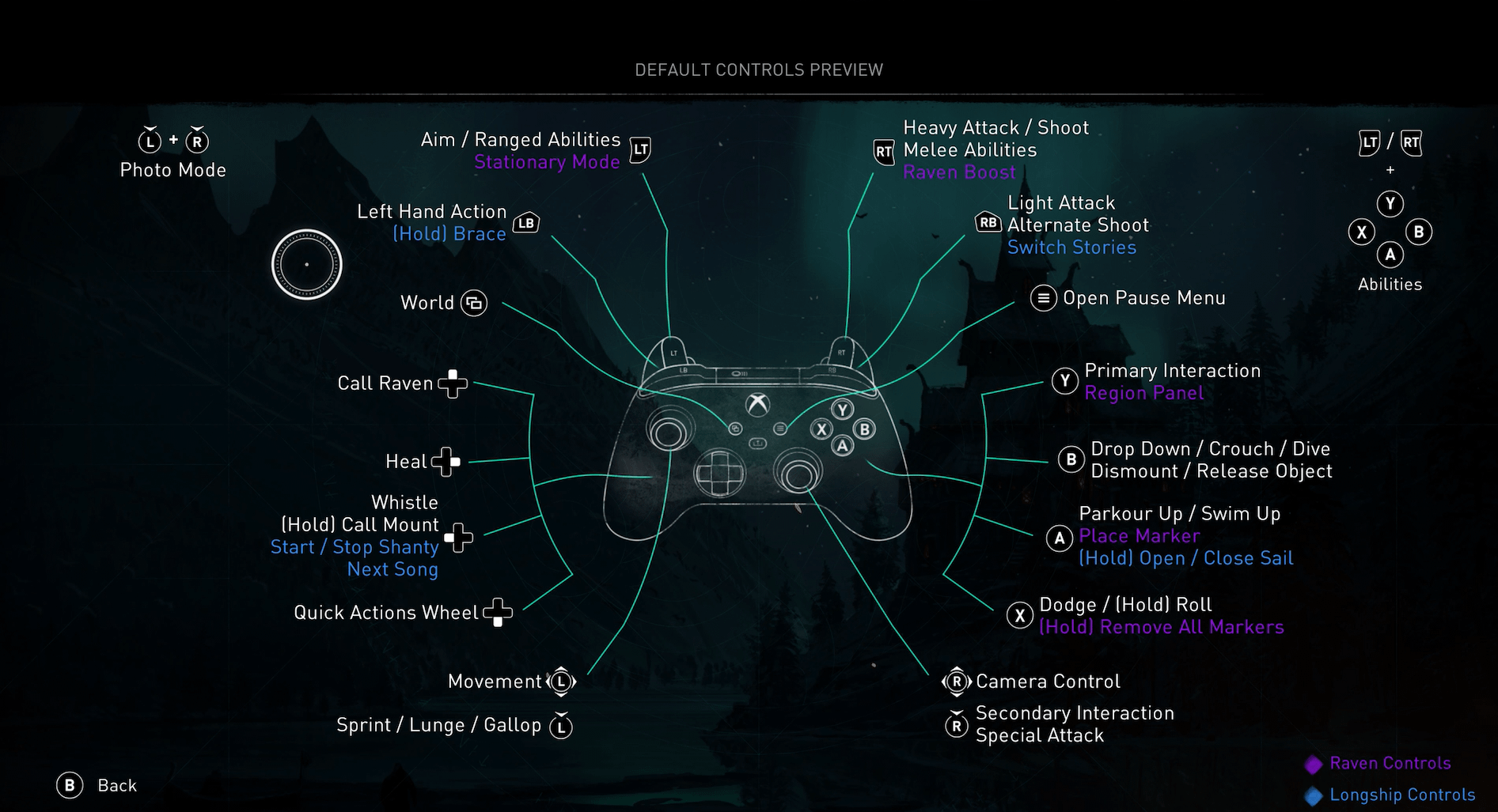
I wonder why the labels for the left stick are placed under the labels for the d-pad.
Was it made with a PS5 controller in mind ?
[deleted]
Valhalla may have been a shitty Assassin’s Creed game, but it was a great Viking game. I think the worst thing about it was the sheer volume of non-varied filler. Likely used as a vehicle to sell those XP boosters.
I enjoy the adventure creed games. The Axe head guy in Valhalla was pretty memorable.
Moving onto Mirage has been pissing me off that the controls changed so much.
The same thing happened moving from Black Flag to Unity.
For all Ubisoft’s faults they do know how to do a good UI
Ok but why do the face buttons get listed clockwise while the Dpad is Up, Right, Left, Down 😡
Great game to fuck around in
The completion shit can piss right off and die, though 😛
I find Ubisoft do far more right than they do wrong.
The Ubisoft hate is wayyy overblown.
So many great games from them I think people spread the hate towards the ex-higher ups at Ubisoft to the quality of their games.
They are also second to maybe PS exclusive titles with their accessibility options
The purple and blue text is not hitting the minimal 4.5:1 contrast ratio though.
there’s nothing extraordinary here lmao and I’d even say it’s done badly. For the xbox gamepad the dpad diagram should be under the left stick diagram. But they probably copied the layout from the playstation gamepad and didn’t adjust it. And also this purple text is barely visible
I Enjoyed battle-rapping those ancient, sucka MC’s.