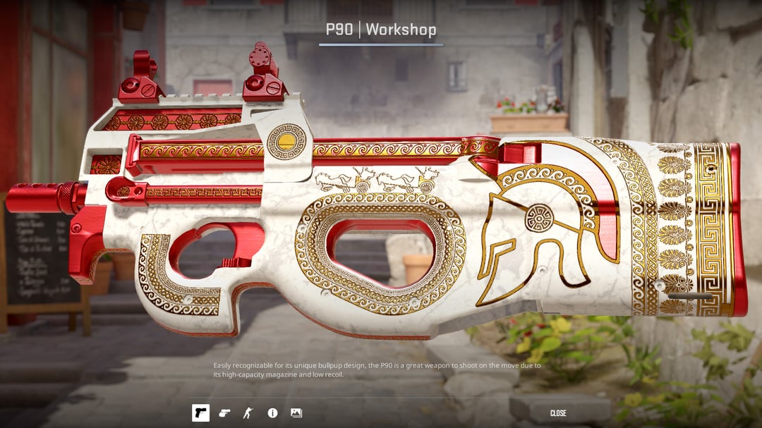
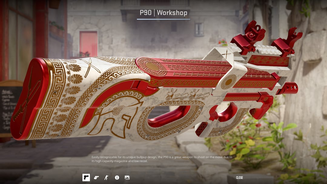
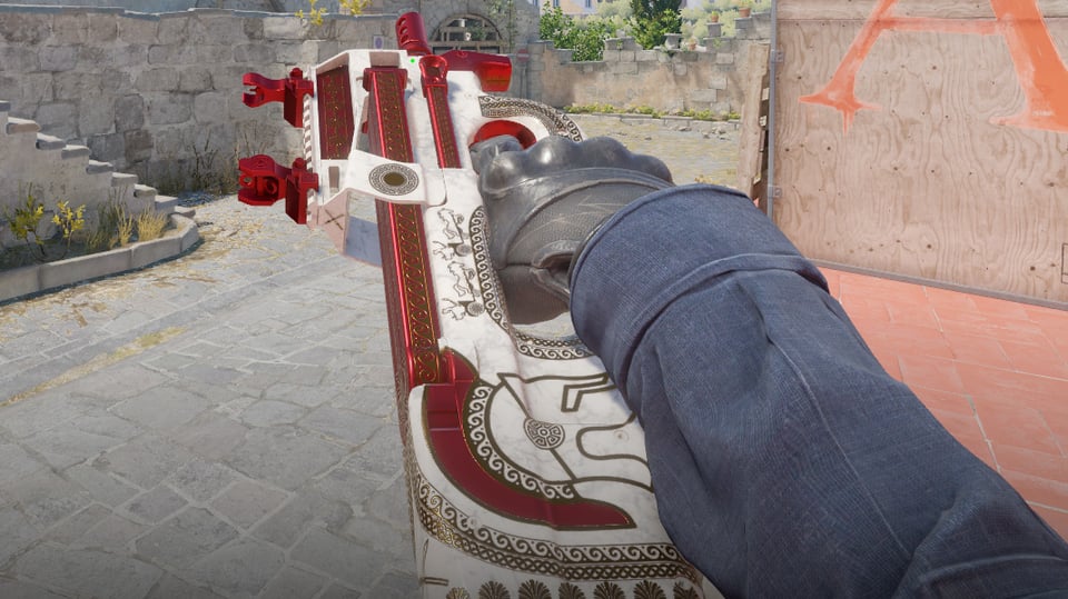
I think the two carriages on top either need to be shrunk or removed but overall I like it. Maybe something should be done about the band on the front grip just ending
Treyce_93
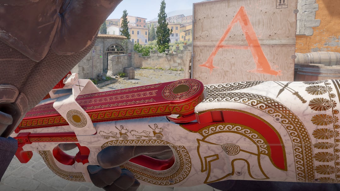
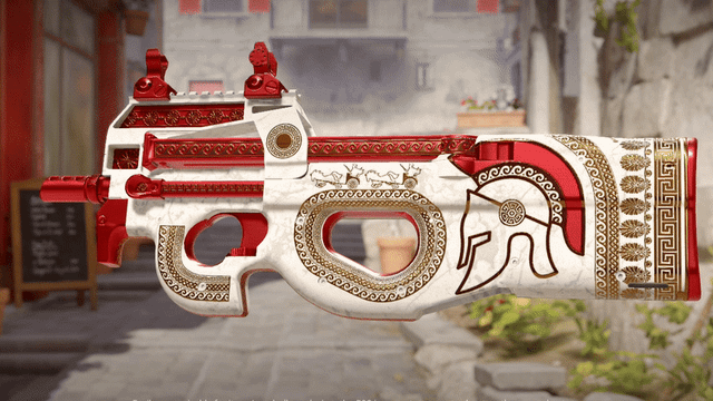
I think the spartan helmet is a bit out of place. I like the idea but there is a lot less detail and texture to the helmet compared to the rest of the skin. Overall this is a cool skin, I like the marble white and the detail in some of the gold accents.
anondude420
i think the style and shade of red can be tweaked. Make the red on the helmet pop more since its the centerpiece of the skin. Maybe make the style of red less shiny around parts of the barrel and sight a bit more flat to make the mag and the helmet shine more as well. It would help contrast with the patterns as well. Could also make the gold accents lighter to bring out the pattern. Also not really a fan of the spear and sword cross on the stock and near the sight. Hope any of this helps. Great skin.
meestazeeno
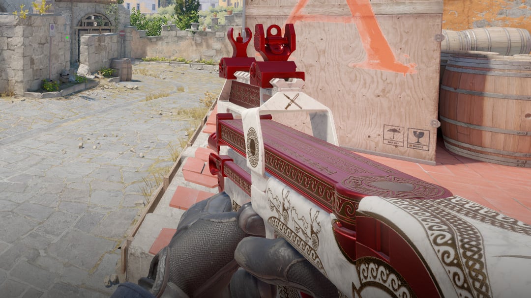
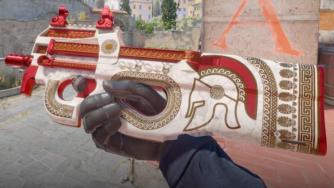
I think the gold could be brighter / shinier. It looks brown in the viewmodel perspective, and it’s especially hard to see the pattern against the red magazine. And the sight looks like a different shade of red and stands out. Otherwise seems sick
baked_tea
It’s a P90
_JMC98
I like it. It might even be nice enough to make me use the P90 sometimes. Maybe
Saw_Good_Man
it looks gorgeous
3_boi
W skin, would buy it
Telefragg
I think there are a lot of small uniform details, they create visual noise together. Also gold patterns with high metalness don’t read well on bright red background, they are blending together. Try reducing metalness to make gold appear brighter, the cubemap reflection makes it look brown at most viewing angles.
phANt0m007
Only criticism is that it is P90
PantyDoppler
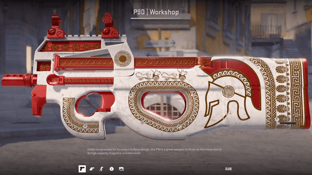
You should make it have a trojan horse and if its BS you see the insides of it
ollie-sx
Should call this Trojan if you haven’t already
aTi_NTC
P90 – Pantheon would go hard ngl, would need clearance with RIOT though
hi0b
GGX Gang
42617a
The kind of L shaped strip by the trigger looks a bit weird, it doesn’t really follow the shape of the trigger, and the sharp end also seems out of place. Other than that I think the design looks great!
Electrical-Duty-1488
the lower handle design can be improven upon, as it looks a but like u j plastered smthing on last minute. the helmet can be made to look a bit better.
otherwise, great skin
TrenchSquire
Red white and gold with sparta is such a cliche.
QueenNiyo2
i love everything about this skin, but i feel like the helmet is out of place. maybe a different image would fit better like a shield design
Nagnas
It’s nice but sadly it’s way to close to the AK nouveau rouge and it might prevent the skin from making it into the game
According-Bonus8681
Shit
bobosherm
First of all, this is an absolute masterpiece.
Some recommendations:
First of all, please add some details to the helmet as it’s the central piece of the artwork. Then maybe you could add something a bit interesting to the sights and play with a few different shades of red. Also I would consider using that wave line texture a bit less or at least consistently (outer line on grip holes but inner line on the stock).
surrender_singh
Majestic
OwerLose
Good gun skin
mrxy2018
Too repetitive looks too much like copy paste
Homerbola92
IMHO the skin is good as it is. No need to keep tweaking it.
BountyIsMineByRight
I think it’s a very good skin.
TawXic
if you can get some interesting specular stuff figured out for the marble i think this would be a winner. shiny albedo, dull in the veins

28 Comments
I think the two carriages on top either need to be shrunk or removed but overall I like it. Maybe something should be done about the band on the front grip just ending
I think the spartan helmet is a bit out of place. I like the idea but there is a lot less detail and texture to the helmet compared to the rest of the skin. Overall this is a cool skin, I like the marble white and the detail in some of the gold accents.
i think the style and shade of red can be tweaked. Make the red on the helmet pop more since its the centerpiece of the skin. Maybe make the style of red less shiny around parts of the barrel and sight a bit more flat to make the mag and the helmet shine more as well. It would help contrast with the patterns as well. Could also make the gold accents lighter to bring out the pattern. Also not really a fan of the spear and sword cross on the stock and near the sight. Hope any of this helps. Great skin.
I think the gold could be brighter / shinier. It looks brown in the viewmodel perspective, and it’s especially hard to see the pattern against the red magazine. And the sight looks like a different shade of red and stands out. Otherwise seems sick
It’s a P90
I like it. It might even be nice enough to make me use the P90 sometimes. Maybe
it looks gorgeous
W skin, would buy it
I think there are a lot of small uniform details, they create visual noise together. Also gold patterns with high metalness don’t read well on bright red background, they are blending together. Try reducing metalness to make gold appear brighter, the cubemap reflection makes it look brown at most viewing angles.
Only criticism is that it is P90
You should make it have a trojan horse and if its BS you see the insides of it
Should call this Trojan if you haven’t already
P90 – Pantheon would go hard ngl, would need clearance with RIOT though
GGX Gang
The kind of L shaped strip by the trigger looks a bit weird, it doesn’t really follow the shape of the trigger, and the sharp end also seems out of place. Other than that I think the design looks great!
the lower handle design can be improven upon, as it looks a but like u j plastered smthing on last minute. the helmet can be made to look a bit better.
otherwise, great skin
Red white and gold with sparta is such a cliche.
i love everything about this skin, but i feel like the helmet is out of place. maybe a different image would fit better like a shield design
It’s nice but sadly it’s way to close to the AK nouveau rouge and it might prevent the skin from making it into the game
Shit
First of all, this is an absolute masterpiece.
Some recommendations:
First of all, please add some details to the helmet as it’s the central piece of the artwork. Then maybe you could add something a bit interesting to the sights and play with a few different shades of red. Also I would consider using that wave line texture a bit less or at least consistently (outer line on grip holes but inner line on the stock).
Majestic
Good gun skin
Too repetitive looks too much like copy paste
IMHO the skin is good as it is. No need to keep tweaking it.
I think it’s a very good skin.
if you can get some interesting specular stuff figured out for the marble i think this would be a winner. shiny albedo, dull in the veins
i like it