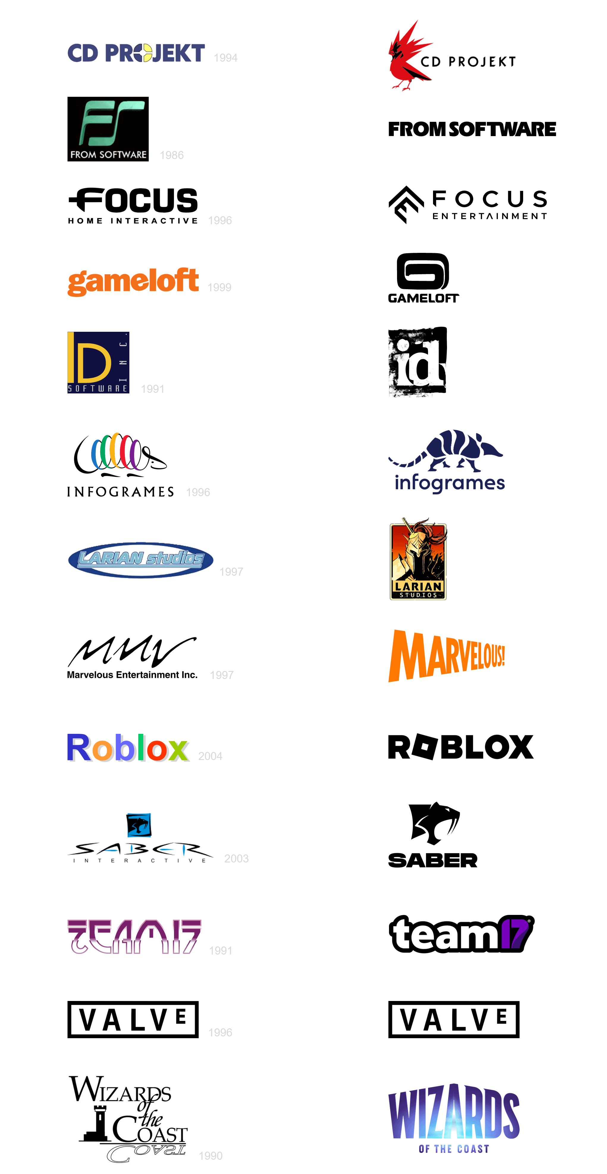
Funny how Wizards and Marvelous went from modern to old school unlike everyone else
karlos_800_krist
I didn’t expect roblox to be on the list, lol.
WasteConstruction704
Good mix of soul to soulless and soulless to soul
TheYokoDono
Valve supremacy
Tyler1349
Honestly I think all of them look better except for Team17
Sad_Wolverine3383
Where’s part 1?
Memfy
Nothing can stand up to Arc System Works
meeyeam
Roblox looks like it used to be a subsidiary of Google.
Heinrick_
infogrames was lit, don’t know why they made this change
Mr_Screwg3
The Larian logo upgrade is fantastic, not many on the list you can say that about
Rushingwar
I’m so glad Larian updated their logo the old one looks bad
OtterPops89
IDK if I like the change with Valve.
prestonpiggy
Sure the minimalistic theme is still there that all brands have adapted. But to be honest I like most of them better, Team17 older logo was cool as f though.
DioriteW
There is no part 1. We were lied to
juliocezarmari
Valve ❤️
trn-
the old team17 logo was peak 80-90s aesthetics. now it looks like a knockoff vat19
DatBoi73
That first ID Software Logo is the most “early 90’s Software Company Graphic Design” thing I’ve ever seen.
Svartrhala
I never even considered how cool and iconic Valve logo looks. They knocked it out of the park on their first attempt
JynsRealityIsBroken
Everyone went from PowerPoint to Professional
nakabra
Infogrames **Devolved.**
MinusBear
At least game studio logos didn’t do the weird corporate minimalist thing so many other brands did.
HeartyMapple
These should have been in part 1. All are top tier game designers
I always call the bird in the CD Projekt logo “FF7 Birb” due to the Cloud Strife hair.
AJfriedRICE
From Software has been around since 1986?!
Alternative_Life8742
I remember when Infogrames made that Godzilla game
WVY
No Sierra?
FORG3DShop
Infogram’s original design was ahead of its time. Kudos to that artist!
SlowAddress3996
Valve logo was ahead of its time lol
OafleyJones
id’s logo hasn’t changed since around Quake 2.
PrecariouslyPeculiar
Wizards should have kept their old one. I think id and Roblox probably have the best updates. Valve, lol. Can’t mess with perfection.
GaeaRage
Infogrames is a downgrade.
ColdheartedCod
Honestly Team17 is the worst one of all. At least the other simplified logos look professional, but the new Team17 logo just looks kinda tacky and cheap compared to the old one.
Truly bringing new standards to “evolving backwards”

")
34 Comments
Funny how Wizards and Marvelous went from modern to old school unlike everyone else
I didn’t expect roblox to be on the list, lol.
Good mix of soul to soulless and soulless to soul
Valve supremacy
Honestly I think all of them look better except for Team17
Where’s part 1?
Nothing can stand up to Arc System Works
Roblox looks like it used to be a subsidiary of Google.
infogrames was lit, don’t know why they made this change
The Larian logo upgrade is fantastic, not many on the list you can say that about
I’m so glad Larian updated their logo the old one looks bad
IDK if I like the change with Valve.
Sure the minimalistic theme is still there that all brands have adapted. But to be honest I like most of them better, Team17 older logo was cool as f though.
There is no part 1. We were lied to
Valve ❤️
the old team17 logo was peak 80-90s aesthetics. now it looks like a knockoff vat19
That first ID Software Logo is the most “early 90’s Software Company Graphic Design” thing I’ve ever seen.
I never even considered how cool and iconic Valve logo looks. They knocked it out of the park on their first attempt
Everyone went from PowerPoint to Professional
Infogrames **Devolved.**
At least game studio logos didn’t do the weird corporate minimalist thing so many other brands did.
These should have been in part 1. All are top tier game designers
Technically [this](https://upload.wikimedia.org/wikipedia/commons/thumb/a/ab/Valve_logo.svg/1920px-Valve_logo.svg.png) is what the Valve logo looks like now (it’s the same shape, but still).
I always call the bird in the CD Projekt logo “FF7 Birb” due to the Cloud Strife hair.
From Software has been around since 1986?!
I remember when Infogrames made that Godzilla game
No Sierra?
Infogram’s original design was ahead of its time. Kudos to that artist!
Valve logo was ahead of its time lol
id’s logo hasn’t changed since around Quake 2.
Wizards should have kept their old one. I think id and Roblox probably have the best updates. Valve, lol. Can’t mess with perfection.
Infogrames is a downgrade.
Honestly Team17 is the worst one of all. At least the other simplified logos look professional, but the new Team17 logo just looks kinda tacky and cheap compared to the old one.
Truly bringing new standards to “evolving backwards”
VALVE is unicorn.