Next you’re gonna tell me the PlayStation logo is a P and a S or something
Dantocks
I was todays years old …
Drivingfinger
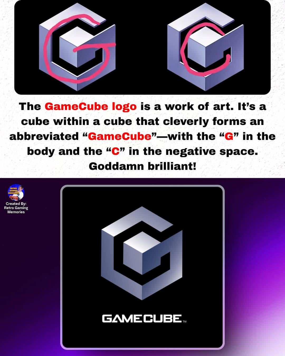
Is now a bad time to point out that the center is a CUBE inside another CUBE.
Sprengles
Yea, like extremely obvious
Unhappy-Manner3854
This was & always has been obvious.
Mackankeso
What else would it be
GrayMech
I mean yeah? I noticed that pretty quick and thought it was the entire point of the logo
nikhkin
If you look closely, you’ll see the Xbox logo has an X hidden in it.
V4_Sleeper
i only realised the G, not the C inside it
AlexGlezS
Not that brilliant I suppose if people needed an explanation 20 years later to discover no one had realized what the logo really is. Like me. 😄😁. Or am I the only one? So obvious and also I never paid attention to what the logo could actually mean.
But yeah, it really is brilliant. Also the unfold animation of the logo itself when booting up the console was genius.
Godofgoats90
Yes
null-interlinked
The negative space looks closer to a G though due to the imbalance. Not sure as a designer if this was intended to be a C. Minimalistic G letters look more like this in typography.
squeakynickles
>I never noticed
Have you learned the alphabet?
ImpossibleMood2810
Every ten years I learn a thing about this logo. 10 years ago it was the G, now the C. Let’s cut the chase, What’s next ?
IGPUgamer99
I knew about the letter G but never even noticed that the blank space formed a C lol
Scared-Gamer
Welp, guess I’m an idiot, cuz I didn’t know that
Kiflaam
I mean, if you ignore some extra parts, then yeah sure
It’s a C with a unicorn horn.
Vasarto
I actually did not know this. I thought it was just made to look like the cube.
Some_Sandman
No, to me it was called the gamecube because its a cube that can play games
duntlef
“Gamer discovers INSANE fact about the GameCube symbol 20 YEARS after release”
Dicyanoacetylene
I saw the G, but I missed the C.
AnotherCornemuse
“to do do do do do do do do toom”
Historical_Tennis494
Wait until OP finds out the N64 logo has 64 sides
hlloyge
Well, yeah.
LumiNoomy
I didn’t know the C
VeryOddNaw
Kinda
Oculicious42
Dammn people really do not notice shit huh?
MrSparky69
Yes.
Very.
PrinceDusk
I got the G, and there’s certainly a cube shape in the middle, I thought it was [ G(amecube)+cube ] (as well as the larger cube that is the whole shape/symbol.
Basically, I didn’t take the empty space as a C, but the rest sure was obvious
BluehibiscusEmpire
Actually it’s game G and a actual cube. The extra negative c is a bonus.
fourleggedostrich
Wait until you find out that the M on Mario’s hat stands for “Mario”.
Your jaw will hit the floor.
JARDIS
This is almost as wild as when I found out that the N64 N-cube logo actually has 64 faces. Very clever.
scaryfunny39
Everyone acting like it was extremely obvious… I was pretty young when game cube came out but I never noticed until years later.
PhoolCat
No, I always saw is as a G for Game and a cube for Cube
astorj
Oh stop let OP admire the logo
Cdesese
Shut the front door
Distinct-Feedback235
The G, yes. But not the C.
Will-Evaporate-Thx
“He was a G. She was a C. Can it get anymore obvious!”
Alpuka
I mean, it’s alright – pretty standard design stuff
legato_gelato
Sorry, but yes this was obvious to everybody..
sendmebirds
I got the cube in the cube as a kid, never realized it also spelled g and c
astrielx
I think it was obvious to just about anyone who had ever seen the logo before. Next you’re gonna tell me the X on the Xbox power button isn’t a coincidence.

45 Comments
I thought it was obvious to everyone
Next you’re gonna tell me the PlayStation logo is a P and a S or something
I was todays years old …
Is now a bad time to point out that the center is a CUBE inside another CUBE.
Yea, like extremely obvious
This was & always has been obvious.
What else would it be
I mean yeah? I noticed that pretty quick and thought it was the entire point of the logo
If you look closely, you’ll see the Xbox logo has an X hidden in it.
i only realised the G, not the C inside it
Not that brilliant I suppose if people needed an explanation 20 years later to discover no one had realized what the logo really is. Like me. 😄😁. Or am I the only one? So obvious and also I never paid attention to what the logo could actually mean.
But yeah, it really is brilliant. Also the unfold animation of the logo itself when booting up the console was genius.
Yes
The negative space looks closer to a G though due to the imbalance. Not sure as a designer if this was intended to be a C. Minimalistic G letters look more like this in typography.
>I never noticed
Have you learned the alphabet?
Every ten years I learn a thing about this logo. 10 years ago it was the G, now the C. Let’s cut the chase, What’s next ?
I knew about the letter G but never even noticed that the blank space formed a C lol
Welp, guess I’m an idiot, cuz I didn’t know that
I mean, if you ignore some extra parts, then yeah sure
It’s a C with a unicorn horn.
I actually did not know this. I thought it was just made to look like the cube.
No, to me it was called the gamecube because its a cube that can play games
“Gamer discovers INSANE fact about the GameCube symbol 20 YEARS after release”
I saw the G, but I missed the C.
“to do do do do do do do do toom”
Wait until OP finds out the N64 logo has 64 sides
Well, yeah.
I didn’t know the C
Kinda
Dammn people really do not notice shit huh?
Yes.
Very.
I got the G, and there’s certainly a cube shape in the middle, I thought it was [ G(amecube)+cube ] (as well as the larger cube that is the whole shape/symbol.
Basically, I didn’t take the empty space as a C, but the rest sure was obvious
Actually it’s game G and a actual cube. The extra negative c is a bonus.
Wait until you find out that the M on Mario’s hat stands for “Mario”.
Your jaw will hit the floor.
This is almost as wild as when I found out that the N64 N-cube logo actually has 64 faces. Very clever.
Everyone acting like it was extremely obvious… I was pretty young when game cube came out but I never noticed until years later.
No, I always saw is as a G for Game and a cube for Cube
Oh stop let OP admire the logo
Shut the front door
The G, yes. But not the C.
“He was a G. She was a C. Can it get anymore obvious!”
I mean, it’s alright – pretty standard design stuff
Sorry, but yes this was obvious to everybody..
I got the cube in the cube as a kid, never realized it also spelled g and c
I think it was obvious to just about anyone who had ever seen the logo before. Next you’re gonna tell me the X on the Xbox power button isn’t a coincidence.
I never thought that hard about it
Dududu-
Bukepedu-
Bapadupidu-
Badada-
Dubidu-
Bukepedu-
Bapadu-
peh-
DU!