
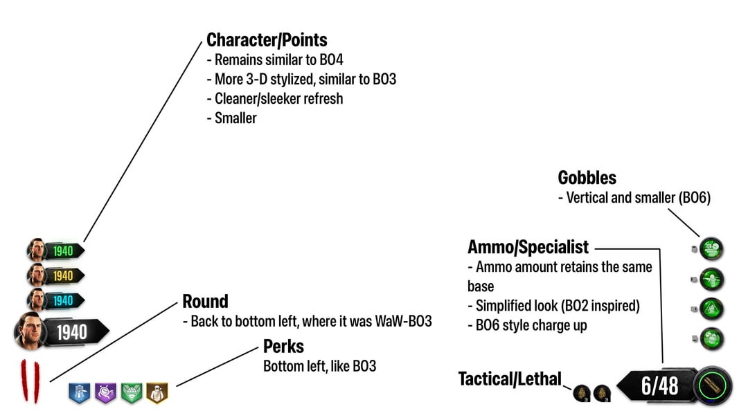
Was watching Afterlife’s newest podcast video about BO4. Got me thinking of some changes I would make to the BO4 HUD, which has always had this clunky, overcrowded feel. I added some elements/positions that I prefer from the other zombies game HUDs. Let me know what you think!
12 Comments
Forgot to mention – I didn’t put any locations in the HUD. I’m not a huge fan of the location titles bc I always just make them up myself lmao
Wish it was like this in bo4 in general
What about the gun diagram?! /j
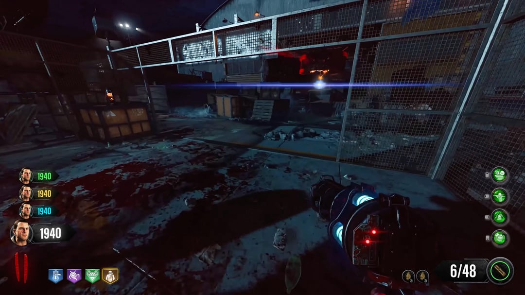
This HUD makes the game look so much more better
I actually like it. Would love for this to be on BO6 honestly.
Love it removes the overwhelming hud that bo4 has and still gives important information.
I swear the HUD was what always drove me away from BO4. The maps really are amazing, zombies are a little too random but the hud was awful and took a lot of the fun. Same with cold war. Wish there was a HUD Mod for bo4 pc at least
Looks good. Personally I think it’d look a bit better if the Gobblegums were oriented in a d-pad shape.
I never really minded BO4’s HUD, but this is a pretty clean remake. Feels a little too shrunken, like I set my HUD to 80% size, but otherwise, pretty good. The fewer words especially look nicer.
Imo elixirs should should fade way and only appear d-pad is pressed. In bo4 (and new era zombies) hud is the opposite of the famous quote ”Perfection is achieved, not when there is nothing more to add, but when there is nothing left to take away”
Pretty good, only thing I’d change is maybe having the elixirs be smaller and be around the special weapon in a d-pad shape like the gobblegum, shield and equipment were in previous games and having the tactical/lethal above the ammo counter.
Besides the tactical and lethal being small this looks incredible