My text keeps getting removed so I have to write this in a comment.
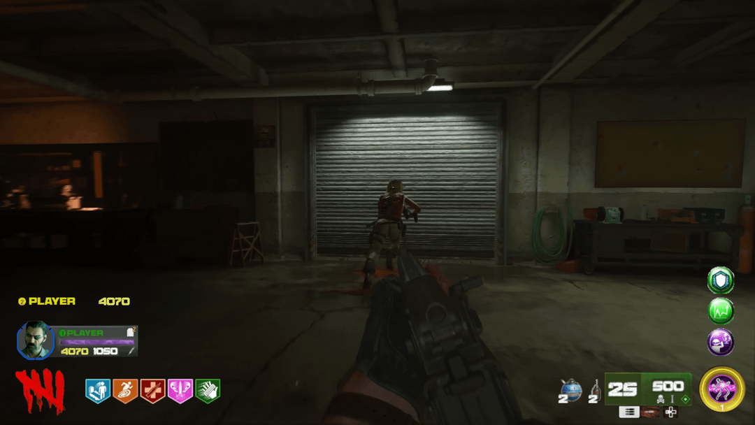
Firstly, I’m not a graphic designer so it’s pretty rough. Secondly, I’m not hating on Treyarch I just did this for fun. Thirdly, due to me not having any experience with graphic design I pretty much just ripped bits from various people’s gameplay and screenshots.
Also, upon looking at it again the scaling of all the HUD elements look a bit too big.
Personally, I think that the changes to player 1’s information and the font makes it look a lot more “zombies”. If I was more skilled I would probably change the solid colour for the weapon rarity for something more subtle.
Design choices:
I wanted to keep all of the vital information and remove/shrink the less important stuff. That ended up with me removing the button icons (except the switch firing mode one, whoops) since it’s only really helpful for a week at most, getting rid of some of the boxes and enlarging what remains.
I wanted to change the font because it is super basic, so I used the font from the Black Ops 6 zombies logo (or at least one that is pretty close to it). I think it works for the ammo and throwable numbers but I’m not sure about points, salvage and player names.
I thought that the health block thing that you get once you use the mutant injection was cool so I shortened it and made the points and salvage counters larger. I was originally going to leave the salvage counter for the scoreboard but there was space for it so I just added it anyway. I wanted to remove the connection to warzone with the armour so I took a page from WW2 zombies and made it a circle around the portrait. I didn’t really care about the plates and self revives so I just put them where they fit. I also got rid of the salvage and point icons because I thought that most people will figure out which is which within a few minutes of starting the game and the icons would remain in the scoreboard,
I based my design of the bottom right on Cold War since I think it made more sense to me so that ended up with me moving the AAT and PaP tier to below the reserve ammo and putting the throwables next to the ammo. The boxes around the Gobblegums seemed like a waste of space so I removed them and made the icons larger (not sure how I feel about it though, I wanted to minimize them to tabs on the side of the screen but I’m not sure how that would work gameplay wise when activating them).
The largest change that I think that I made was to the other player’s info. It never made sense on why I need to see their health or armour, if they are dying they will tell me and it doesn’t take long to ask “you have any plates?”. So I removed most of it and pretty much made it how it was in classic zombies, the only part I kept was the player name because I hate asking “who’s white” for the entire game.
The only other things I changed were the perks and round counter and that was just for the classic feel, even though I don’t mind it in the top corner.
In this HUD, there would be no point pop ups at all so non in the middle of the screen and non next to the point counter. They do add flare to the point counter but from a utility POV I pretty much never see anyone using them. Also, while there is no minimap there would be the full map for people who need it.
Ramble over, I’m not planning on doing anymore since this took me about 5 hours but I am curious if people have feedback, Feel free to roast my skills and design choices.
Fickle_Relative1531
It looks great. I love what u did with the gobblegums!
ResidentBlood4518
so much better than the official hud
Zestyclose_Pop_5907
good, now add a dlc where everything is ultra horny and pornographic and ill buy it for 150
kent416
I like it a lot more. I don’t get why the mangler hud isn’t the main hud
Walmart_Bag_2042
Personally I’d make the tacticals and lethals stack instead of using a number. I would also remove your teammate’s points counter since you can already see them on the scoreboard. And finally, I would make the armor plates stack too, as the number is too small to see rn
PO_Nukes
Honestly, I think the way they have perks is the only thing they did better than you.
Kyle-Sith
I dig this. Well done!
microwavesauce
Looks nice
OVNIPatagonico
Take that flying face off the screen, why tf would anyone want that?
Chicken769
Fucking awesome
FeaturedPro
Everything is popping out with bright colors and bold shapes, so to me there’s just no visual hierarchy and that looks confusing on first glance.
But then again, they keep adding stuff to the game, which makes it necessary to display more stuff. So, we need an expert here to suggest improvements 💀
Not bad tho, I low-key might prefer this (if tweaked) over the current one.
MrRedRice
defo an improvement, the icons for lethals and tacticals are kinda big tho. just a little nitpick.
ChewyWolf64
It’s decent, I don’t like that how much it reminds me of IW zombies though
Helix3501
I prefer the offical one, no offensive but this is just alot more cluttered and displeasing to look at, its probably the blockiness and size of everything but its just a eyesore

15 Comments
My text keeps getting removed so I have to write this in a comment.
Firstly, I’m not a graphic designer so it’s pretty rough. Secondly, I’m not hating on Treyarch I just did this for fun. Thirdly, due to me not having any experience with graphic design I pretty much just ripped bits from various people’s gameplay and screenshots.
Also, upon looking at it again the scaling of all the HUD elements look a bit too big.
Personally, I think that the changes to player 1’s information and the font makes it look a lot more “zombies”. If I was more skilled I would probably change the solid colour for the weapon rarity for something more subtle.
Design choices:
I wanted to keep all of the vital information and remove/shrink the less important stuff. That ended up with me removing the button icons (except the switch firing mode one, whoops) since it’s only really helpful for a week at most, getting rid of some of the boxes and enlarging what remains.
I wanted to change the font because it is super basic, so I used the font from the Black Ops 6 zombies logo (or at least one that is pretty close to it). I think it works for the ammo and throwable numbers but I’m not sure about points, salvage and player names.
I thought that the health block thing that you get once you use the mutant injection was cool so I shortened it and made the points and salvage counters larger. I was originally going to leave the salvage counter for the scoreboard but there was space for it so I just added it anyway. I wanted to remove the connection to warzone with the armour so I took a page from WW2 zombies and made it a circle around the portrait. I didn’t really care about the plates and self revives so I just put them where they fit. I also got rid of the salvage and point icons because I thought that most people will figure out which is which within a few minutes of starting the game and the icons would remain in the scoreboard,
I based my design of the bottom right on Cold War since I think it made more sense to me so that ended up with me moving the AAT and PaP tier to below the reserve ammo and putting the throwables next to the ammo. The boxes around the Gobblegums seemed like a waste of space so I removed them and made the icons larger (not sure how I feel about it though, I wanted to minimize them to tabs on the side of the screen but I’m not sure how that would work gameplay wise when activating them).
The largest change that I think that I made was to the other player’s info. It never made sense on why I need to see their health or armour, if they are dying they will tell me and it doesn’t take long to ask “you have any plates?”. So I removed most of it and pretty much made it how it was in classic zombies, the only part I kept was the player name because I hate asking “who’s white” for the entire game.
The only other things I changed were the perks and round counter and that was just for the classic feel, even though I don’t mind it in the top corner.
In this HUD, there would be no point pop ups at all so non in the middle of the screen and non next to the point counter. They do add flare to the point counter but from a utility POV I pretty much never see anyone using them. Also, while there is no minimap there would be the full map for people who need it.
Ramble over, I’m not planning on doing anymore since this took me about 5 hours but I am curious if people have feedback, Feel free to roast my skills and design choices.
It looks great. I love what u did with the gobblegums!
so much better than the official hud
good, now add a dlc where everything is ultra horny and pornographic and ill buy it for 150
I like it a lot more. I don’t get why the mangler hud isn’t the main hud
Personally I’d make the tacticals and lethals stack instead of using a number. I would also remove your teammate’s points counter since you can already see them on the scoreboard. And finally, I would make the armor plates stack too, as the number is too small to see rn
Honestly, I think the way they have perks is the only thing they did better than you.
I dig this. Well done!
Looks nice
Take that flying face off the screen, why tf would anyone want that?
Fucking awesome
Everything is popping out with bright colors and bold shapes, so to me there’s just no visual hierarchy and that looks confusing on first glance.
But then again, they keep adding stuff to the game, which makes it necessary to display more stuff. So, we need an expert here to suggest improvements 💀
Not bad tho, I low-key might prefer this (if tweaked) over the current one.
defo an improvement, the icons for lethals and tacticals are kinda big tho. just a little nitpick.
It’s decent, I don’t like that how much it reminds me of IW zombies though
I prefer the offical one, no offensive but this is just alot more cluttered and displeasing to look at, its probably the blockiness and size of everything but its just a eyesore