
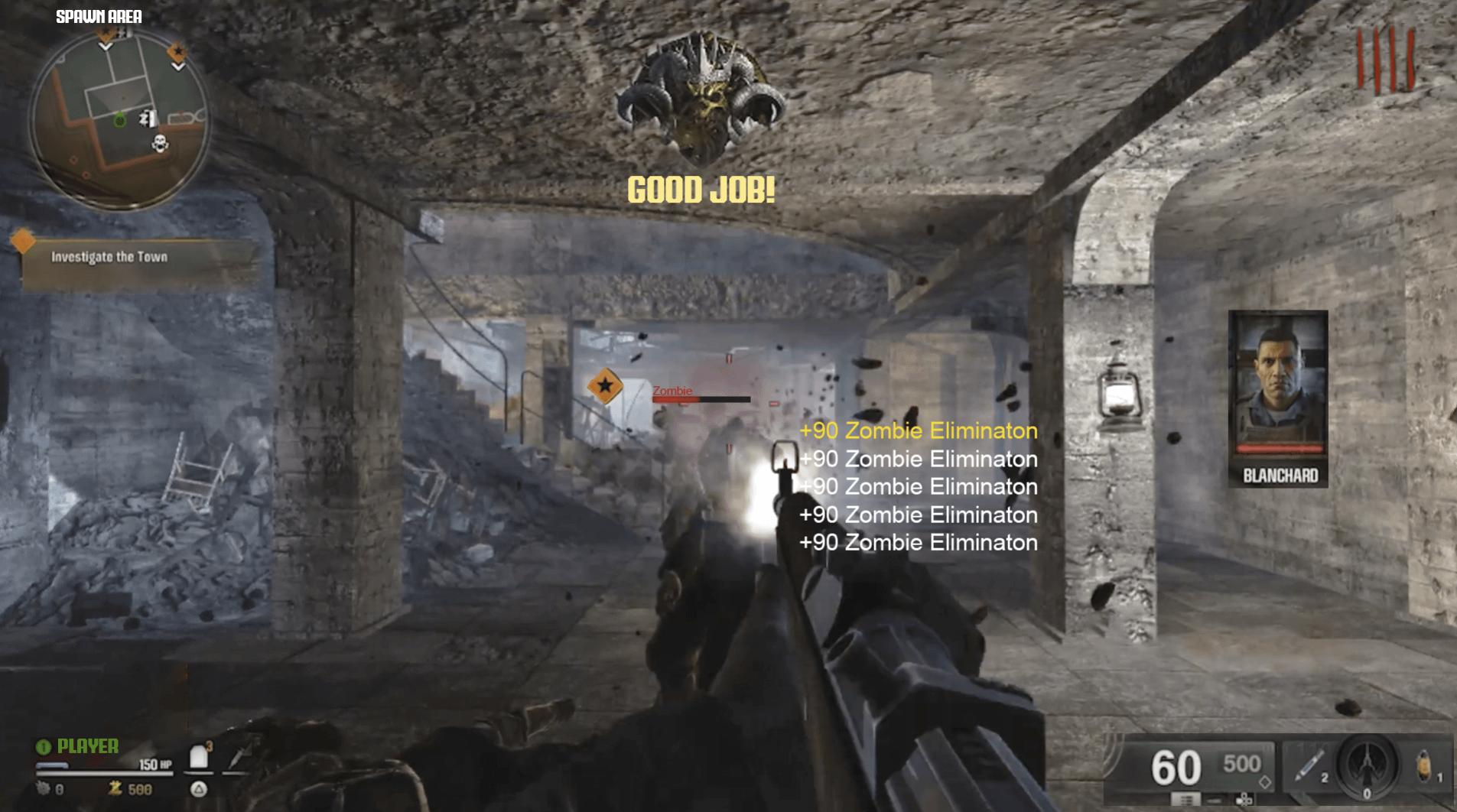
Been seeing a lot of examples as of late but I think Nacht, more than any other map demonstrates how a HUD can impact a map. I think that with a better HUD Liberty Falls will look about 50% better. The lighting & colour grading still aren’t great tho : /
27 Comments
I know this is a joke but the “GOOD JOB!” medal made me smile so hard
I’d be thrilled to be playing zombies and then having a pop-up come up saying “GOOD JOB!” Itd probably be the first time Id heard it in a week
The ”good job” medal made me chuckle a bit 😂
You’re right though, this HUD on Nacht completely eliminates the horror elements.
Good perspective. It definitely changes how the map feels.
#GOOD JOB!
The hud and lighting/colors are really the big issues for me, like just adding some light fog and more vibrant colors would make the atmosphere so much better. And I honestly didn’t mind the CW hud, I wish they’d just stuck with that instead
I’m going to get shit for this, but it looks fine, I don’t care about the UI, its just a minor part of the game for me
“Good job little timmy”
No, you don’t understand, the medals and point counters are important. The yellow text appearing makes me feel good. I _NEED_ that dopamine hit to feel like I’ve accomplished anything at all ever. And the medals, holy fuck I know the Good job is a joke, but that needs to be a thing. The game needs actual compliments instead of medals for when you do shit, always saying “Well done!” or “I’m proud!” ^(or “Good girl!”)
Can’t tell if I’m joking or not? Good, I can’t either lol
I’ll be honest this looks better to me
atp they need to add subway surfers in the corner as well
This picture is bleach on my eyes. I’m about to die what a blaspheme
While I agree this HUD would instantly turn me off of waw I want to wait before I make a larger assumption since you can turn off things like the “zombie elimination” text to get more of a pre cold war feel. But we don’t know how much more can be turned off
Wow I literally thought this was a die maschine screenshot until I noticed the kar98k. It’s crazy how the warzone hud completely detracts the “zombies” feel from the game
Did hear that the HUD is decently customizable (please god let the “zombie killed” pop up be)
TURN OFF THE DAMN HUD IF YOU DON’T LIKE IT why is this so difficult to understand
It looks fucking hideous
Oh my god this is ugly 😂 the huge GOOD JOB this game is for 5 year olds omg
The plates on the left side in zombies is just disgusting, like whenever I see it I go “eww”. They could might as well delete jugg, bring back the rapid fire attachment and there goes Double Tap… not that we would have that now, indtead we have the stupid rarity system, self-revive kit to field upgrade and no more quick revive, fast mags attachment and bye bye speed cola… Also, why did they created Death perception when we already had Vulture Aid! And that was even good at doing its job.
Mfs saying “just turn off the hud” are glazing out their ass holy shit. Waw, bo1, 2, 3, 4 have had this simple little thing down since 2008. 4 years of development for a mobile game ui and some of yall don’t see the issue.
The thing is with the bo6 hud it can all be turned off if you want it like that
People on here are acting like it’s forced to be on
I really want Treyarch to zombie-fie the HUD, even just a bit. I loved cold war, but the multiplayer/wz influence kills the atmosphere. I think gameplay wise, bo6 will be fire, though.
I’m going to be honest. Only the raido talk box that is not on the side looks bad. Everything else looks perfectly fine. When it comes to a HUD, I prefer more information, so i know what’s going on and don’t have to do any guesswork on things like my hp. so i prefer the More information hud than a simple hud that tells me nothing like bo1 and 2 (with 2 especially with almost no way to tell sheld hp). If you want to make it more zombies. just change the blacks fade and white with red and oranges (beside ammo).
if this is what Nacht was upon release, Zombies would have been awful. It’s insane how Treyarch cannot see this.
The guy calling on the right should’ve been John pork
Its feel like those shorts with subway surfers or other shit just to focus kids minds lmao. The more on the screen the more they use brain.
‘Investigate Upstairs’ would have been gold lol.
Good job metal is hilarious 😂