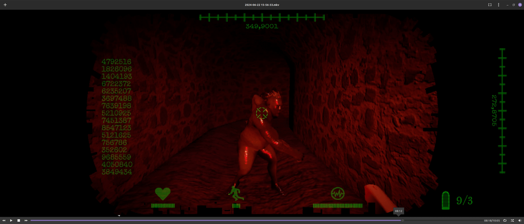
Share Facebook Twitter Pinterest LinkedIn Which HUD do you think looks more futuristic or better? 1 or 2? CyberpunkCyberpunk MemesHigh TechLow Life. 5 Comments rambozo6 2 years ago They both look great but I will say I like the first one better than the second TheLostExpedition 2 years ago One. Two is cleaner but one looks arguably better. MaddMax92 2 years ago Do all the numbers mean anything? TLDR2D2 2 years ago I lean toward two with some tweaks. On either, I’d get rid of all the extraneous numbers. Don’t hog your players’ screen with useless visual noise. Otherwise-Ad6555 2 years ago I loved two Write A CommentYou must be logged in to post a comment.
TLDR2D2 2 years ago I lean toward two with some tweaks. On either, I’d get rid of all the extraneous numbers. Don’t hog your players’ screen with useless visual noise.

5 Comments
They both look great but I will say I like the first one better than the second
One. Two is cleaner but one looks arguably better.
Do all the numbers mean anything?
I lean toward two with some tweaks.
On either, I’d get rid of all the extraneous numbers. Don’t hog your players’ screen with useless visual noise.
I loved two