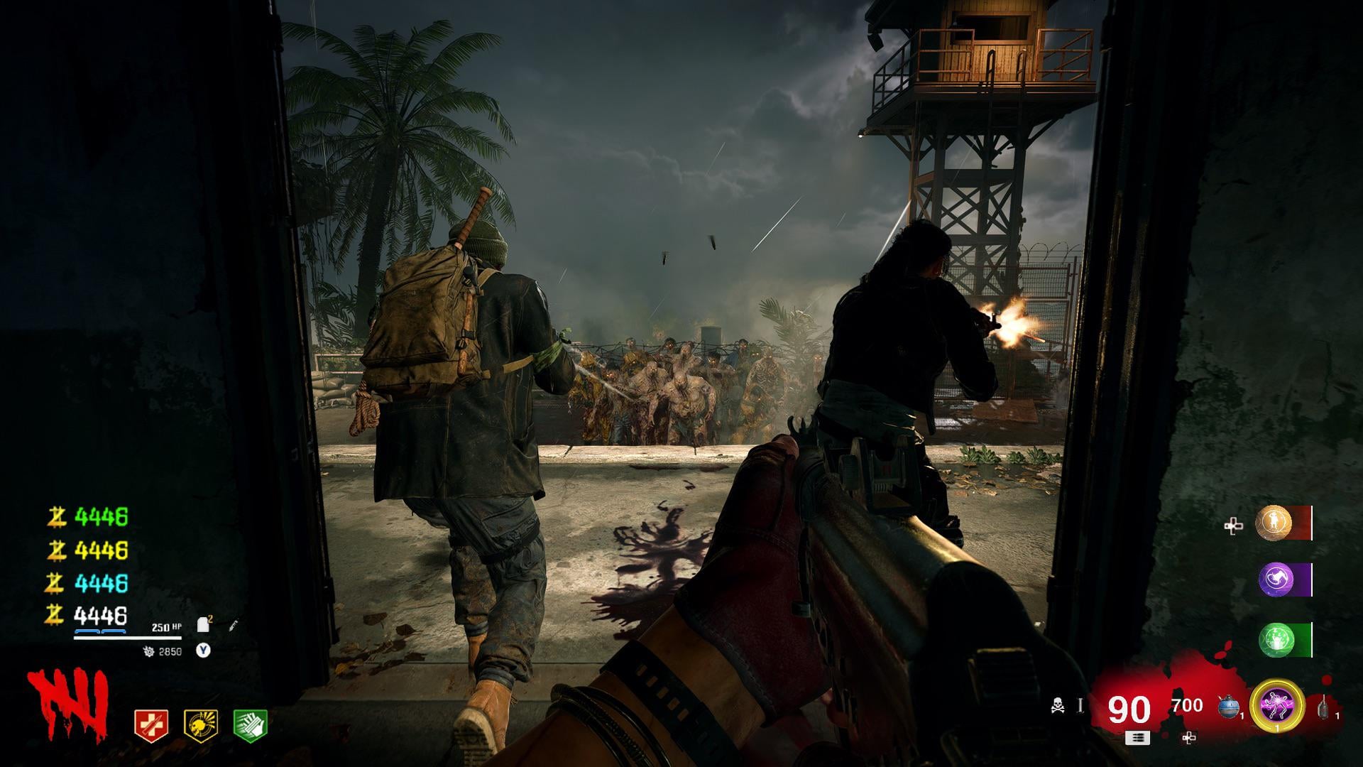
I know I’m in the minority here, but I am perfectly happy with how the HUD looks in BO6. It’s clean, out of the way, and I can remove stuff like the Mini map and Compass.
Sure, does it have that SoE flair everyone likes to bring up? No. But It does what any great huds should do. Conveys information concisely and keeps out of the way.
r9shift
looks good i just wish something could be done about the health bar & armor plates section
kent416
It’s kinda like a combination of the best parts of all the previous huds. I really like it
Lupercal-_-
This one is just too big and colourful. Too distracting.
Kuro2712
Still looks a bit too sterile for me.
spartan9362
Why is the background of the ammo count solid red? Atleast make it transparent? Kind males that whole part of the Hud a blind spot.

7 Comments
I know I’m in the minority here, but I am perfectly happy with how the HUD looks in BO6. It’s clean, out of the way, and I can remove stuff like the Mini map and Compass.
Sure, does it have that SoE flair everyone likes to bring up? No. But It does what any great huds should do. Conveys information concisely and keeps out of the way.
looks good i just wish something could be done about the health bar & armor plates section
It’s kinda like a combination of the best parts of all the previous huds. I really like it
This one is just too big and colourful. Too distracting.
Still looks a bit too sterile for me.
Why is the background of the ammo count solid red? Atleast make it transparent? Kind males that whole part of the Hud a blind spot.
This looks kinda shit to be honest