Looks exactly the same as CW, lmao they just copied and pasted CW game, 4 years of development for this shit 🤣🤣😭
CrispyYummyKong
You can also put the compass around the map even more clean
[deleted]
[deleted]
[deleted]
[deleted]
hb99em
Not that bad , just wish it had some more zombie personality…
+Seeing armour hurts my soul, we want shields back..
ImmaDoMahThing
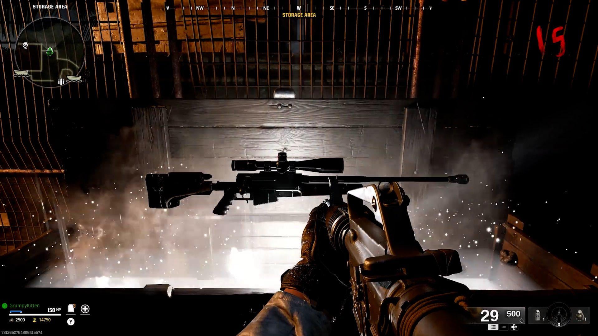
This look good. Only thing I’d remove is the mini map and the health bar. I’m assuming we can do that.
MonsterHunter6353
Not that it’s an actual issue. But why do we have to use Jpegs for grenades and stuff? It looks much nicer having the white flat versions that are easy to read than just having a screenshot of the grenade itself on the screen
mcerror0101
i really glad the ammo ui box being green was just because of weapon rarity
looks pretty good ngl really compacted
Gravy-0
Minimap is nice if it has markers for everything on it, but I’d rather just have a map available to toggle.
ParadoxInRaindrops
Let me turn off the map, and maybe scale some of the HUD elements & it’s honestly perfect. But seriously this look good, and I wouldn’t mind running this if this is the default UI.
Forgotten1Ne
Bro this is literally the best hud to have idk what people think zombies has been. Look at waw and bo1,bo4 this hud is on par if not better
ZXKeyr324XZ
Lack of identity and personality aside, I think the only real complaint I have here is that points and salvage are incredibly small
JuggerClutch
I wonder why no one is complaining about how small the points are. Points are a thing that you have to immediately see when you glance to the left. Its one of the most important aspects of the mode and now you need a microscope to see them.
WrumGapper
THIS is what everyone is complaining about? It’s clean AF, non intrusive and perfectly readable.
Just goes to show this game is going to be awesome if people need to manufacture issues to complain about.
Aggravating-Pilot583
I hope I can adjust the size. If it was double what is shown here that’s too much but just a fuzz more would be perfect.

16 Comments
Niceeeee
Looks exactly the same as CW, lmao they just copied and pasted CW game, 4 years of development for this shit 🤣🤣😭
You can also put the compass around the map even more clean
[deleted]
[deleted]
Not that bad , just wish it had some more zombie personality…
+Seeing armour hurts my soul, we want shields back..
This look good. Only thing I’d remove is the mini map and the health bar. I’m assuming we can do that.
Not that it’s an actual issue. But why do we have to use Jpegs for grenades and stuff? It looks much nicer having the white flat versions that are easy to read than just having a screenshot of the grenade itself on the screen
i really glad the ammo ui box being green was just because of weapon rarity
looks pretty good ngl really compacted
Minimap is nice if it has markers for everything on it, but I’d rather just have a map available to toggle.
Let me turn off the map, and maybe scale some of the HUD elements & it’s honestly perfect. But seriously this look good, and I wouldn’t mind running this if this is the default UI.
Bro this is literally the best hud to have idk what people think zombies has been. Look at waw and bo1,bo4 this hud is on par if not better
Lack of identity and personality aside, I think the only real complaint I have here is that points and salvage are incredibly small
I wonder why no one is complaining about how small the points are. Points are a thing that you have to immediately see when you glance to the left. Its one of the most important aspects of the mode and now you need a microscope to see them.
THIS is what everyone is complaining about? It’s clean AF, non intrusive and perfectly readable.
Just goes to show this game is going to be awesome if people need to manufacture issues to complain about.
I hope I can adjust the size. If it was double what is shown here that’s too much but just a fuzz more would be perfect.