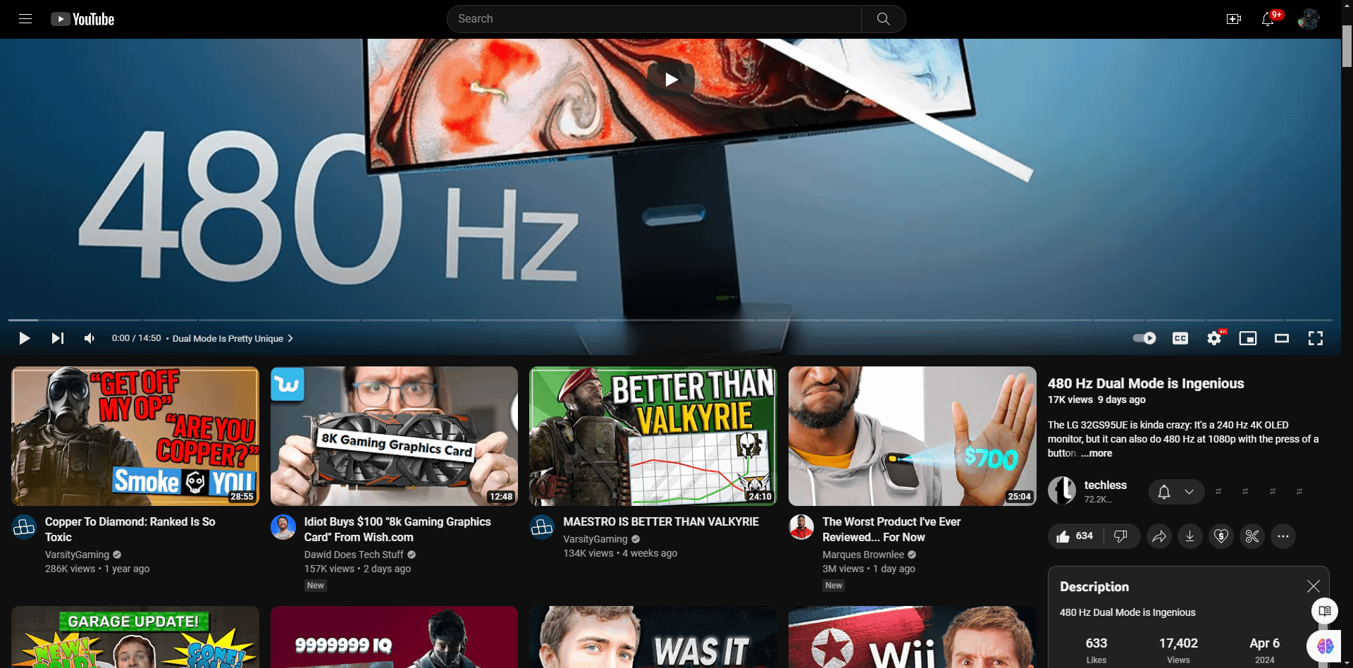
What I mean is the thumbnails under the video instead of on the side, drives me crazy to constantly see flashy thumbnails under the video whenever I’m not in Fullscreen.
blkmgk533
I just run Classic Youtube Design extension and it puts it all back on the side where it belongs IMO.
Dylan_Is_Gay_lol
I run it in Firefox, and get the old UI.
danivus
Enhancer for YouTube.
It’s an extension that adds a bunch of stuff and also happens to fix the ui.
MtnNerd
Click the squares at the bottom right of the video for different view options. This is just theater mode
RaisedByArseholes420
It is indeed fucking awful. I wonder how much the clown that thought of this idea got paid.
lxnch50
It is terrible, but I imagine it has to do with getting more impressions. Each video thumbnail you see is considered an impression and now you get 4 columns of them. I just got an add-on to fix this. I hate the comments being so tiny and all this noise from all these thumbnails.
_gadgetFreak
~~Can’t believe so many shitting on YouTube when it’s OP’s mistake.~~
~~edit: OP is in “Cinema mode” view, it will be back to normal if they change the view to “Default view”~~
Well, I stand corrected, it is indeed a new UI
darkscyde
I always find it funny the amount of people trying to get back to an old UI design that people hated when it first came out
TxM_2404
Why do websites think it’s a good idea to push these ugly mobile designs on desktop?
Nobody wants to use them. Wikipedia, Reddit and now even YouTube all have reduced their usablility with the latest updates to their site.
boybrushdRED
I’m still seeing the regular one on Chrome on a Win10 PC. Maybe the update hasn’t rolled out wordwide yet.
OddNovel565
What the *fuck* is this and how do I get rid of it?
720-187
oh dear…that is atrocious
stinkypoopybaby2008
A bit off-topic but: how to make the YouTube logo gray (like in your screenshot) instead of red?
stikstonks13
i havent done anything and i still have the original, am i a wizard?
HighSpeedDoggo
The mawfuccers at YouTube probably is experimenting some shit to dish out more content.
The current layout is like 20% of your screen for recommended videos. It’s also much more distracting to the eyes which diverts your attention from the video you are watching compared to the old one.
Whereas to the old layout, recommended videos are somewhat 5%, you can clearly see the comments below, not ever distracting you.
Edit: I guess this may be their way to balance out the adblocker users? Dish out more content on the layout to compensate for the ads blocked? Either way this is all bullshit, I am also using Enhancer for YouTube rn
TheHairyMess
what the fuck did they do???
Boundish91
Is this a US thing? I’ve seen people complaining a lot lately, but i still have the old UI.
h3ron
I run Piped on my homelab
DoctorRyanAA
Luckily my UI has not changed yet. Wonder how badly this is going to hurt the content creators.
The_Dung_Beetle
Wtf are they smoking lol
falsworth
Yt-dlp
NuclearReactions
I didn’t even notice due to some extension i guess. That’s really terrible design, i can’t even remember last time youtube improved anything. This is just optimizing the UI to get more revenue.
Skyyblaze
Is there anything for Firefox ESR? Enhancer for Youtube doesn’t work in the ESR version.
bobylon77
Install the old version
Cermmi
Yep, I got it last week also… Already gave feedback to google but I know it will not change shit… Its just to make you consume more content that generates money. When you are going thru comments you are not watching ads. Biggest joke is the “expand” button in comments – it will not in fact expand comment section
jake6501
Another day, another complaint about how everything doesn’t always stay the same!
fraazali123
They need to hire a good visual of UI, but unfortunately they pick lazy and prefer money over UI and things. Sad in this worldly chase to money that’s it
Nguujuk
Bad youtube is ded now worse youtube is here.
Say-Hai-To-The-Fly
Off topic. But I see you’re a Dawid does tech stuff enjoyer. You clearly have a great taste.

32 Comments
What I mean is the thumbnails under the video instead of on the side, drives me crazy to constantly see flashy thumbnails under the video whenever I’m not in Fullscreen.
I just run Classic Youtube Design extension and it puts it all back on the side where it belongs IMO.
I run it in Firefox, and get the old UI.
Enhancer for YouTube.
It’s an extension that adds a bunch of stuff and also happens to fix the ui.
Click the squares at the bottom right of the video for different view options. This is just theater mode
It is indeed fucking awful. I wonder how much the clown that thought of this idea got paid.
It is terrible, but I imagine it has to do with getting more impressions. Each video thumbnail you see is considered an impression and now you get 4 columns of them. I just got an add-on to fix this. I hate the comments being so tiny and all this noise from all these thumbnails.
~~Can’t believe so many shitting on YouTube when it’s OP’s mistake.~~
~~edit: OP is in “Cinema mode” view, it will be back to normal if they change the view to “Default view”~~
Well, I stand corrected, it is indeed a new UI
I always find it funny the amount of people trying to get back to an old UI design that people hated when it first came out
Why do websites think it’s a good idea to push these ugly mobile designs on desktop?
Nobody wants to use them. Wikipedia, Reddit and now even YouTube all have reduced their usablility with the latest updates to their site.
I’m still seeing the regular one on Chrome on a Win10 PC. Maybe the update hasn’t rolled out wordwide yet.
What the *fuck* is this and how do I get rid of it?
oh dear…that is atrocious
A bit off-topic but: how to make the YouTube logo gray (like in your screenshot) instead of red?
i havent done anything and i still have the original, am i a wizard?
The mawfuccers at YouTube probably is experimenting some shit to dish out more content.
The current layout is like 20% of your screen for recommended videos. It’s also much more distracting to the eyes which diverts your attention from the video you are watching compared to the old one.
Whereas to the old layout, recommended videos are somewhat 5%, you can clearly see the comments below, not ever distracting you.
Edit: I guess this may be their way to balance out the adblocker users? Dish out more content on the layout to compensate for the ads blocked? Either way this is all bullshit, I am also using Enhancer for YouTube rn
what the fuck did they do???
Is this a US thing? I’ve seen people complaining a lot lately, but i still have the old UI.
I run Piped on my homelab
Luckily my UI has not changed yet. Wonder how badly this is going to hurt the content creators.
Wtf are they smoking lol
Yt-dlp
I didn’t even notice due to some extension i guess. That’s really terrible design, i can’t even remember last time youtube improved anything. This is just optimizing the UI to get more revenue.
Is there anything for Firefox ESR? Enhancer for Youtube doesn’t work in the ESR version.
Install the old version
Yep, I got it last week also… Already gave feedback to google but I know it will not change shit… Its just to make you consume more content that generates money. When you are going thru comments you are not watching ads. Biggest joke is the “expand” button in comments – it will not in fact expand comment section
Another day, another complaint about how everything doesn’t always stay the same!
They need to hire a good visual of UI, but unfortunately they pick lazy and prefer money over UI and things. Sad in this worldly chase to money that’s it
Bad youtube is ded now worse youtube is here.
Off topic. But I see you’re a Dawid does tech stuff enjoyer. You clearly have a great taste.
Unrelated, but W for subbing to varsity
Holy shit who designed this lmaoooo