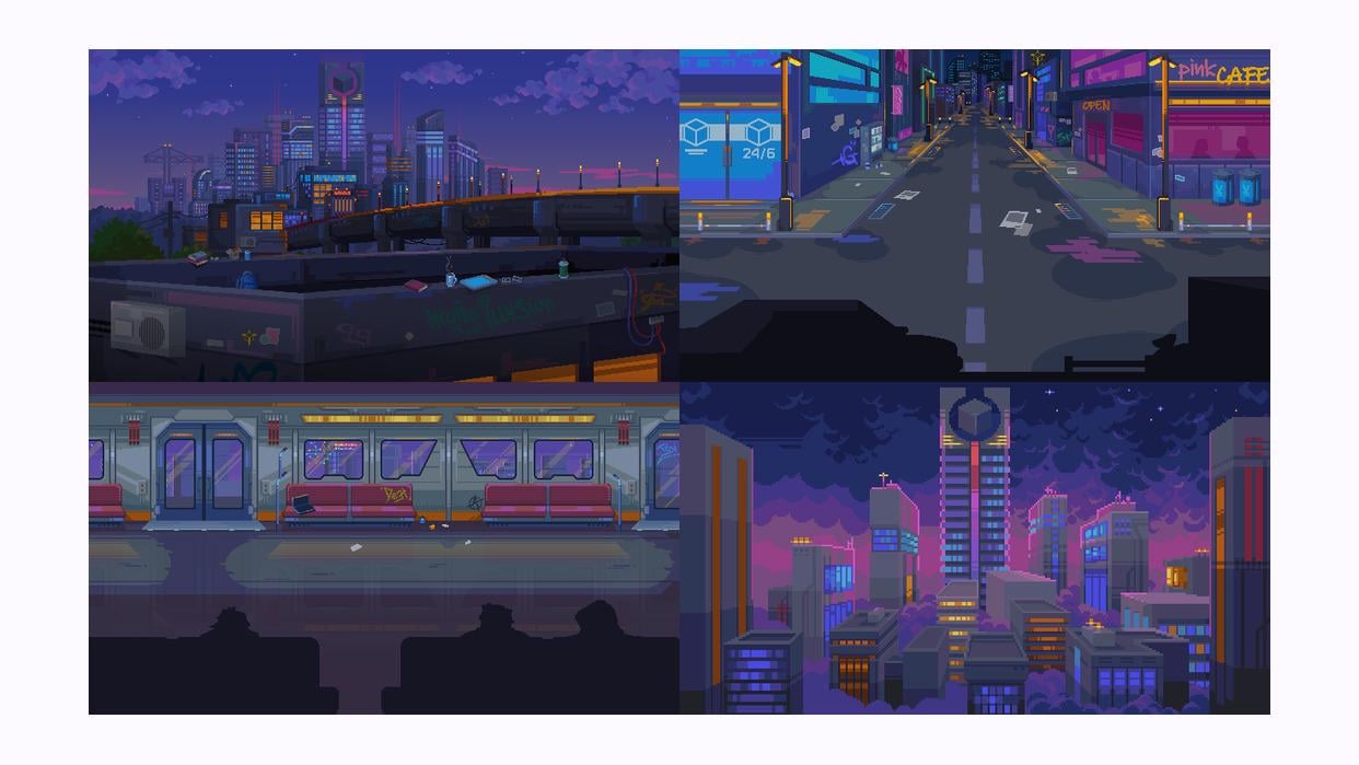
I’m creating a game in a cyberpunk setting, but L feel like it doesn’t quite look cyberpunk. How would you name this setting?

I’m creating a game in a cyberpunk setting, but L feel like it doesn’t quite look cyberpunk. How would you name this setting?
20 Comments
its missing neon signs and wires out the wazoo
It definitely looks Cyberpunk to me, but maybe it lacks that hostility that most cyberpunk worlds share. The in-your-face ads, the hard contrasts, the neon colors. This is cozier because it’s mostly held in soft colors without much contrast. But it looks great!
I call it Lazy Larry meets pink twilight style.
You could round off the street corners, and add more clutter near the building facades, and a bit less on the road.
As in you gave up on trying to make it more cyberpunk when you asked about it here last time, and want to come up with a new setting for it instead?
Maybe “neo-noir” or “dystopian tech”? Cyberpunk is very specific, but these could capture the same vibe while giving you more creative freedom.
I’d say neo-tokyo/neo-noir. more lights
It’s missing contrast in the hues. As it is, it looks a lot like a 80s now York setting than cyberpunk. Somehow it reminds me of the movie The Warriors.
more pixely and more saturation
Pixel punk
Colorpunk?
I have a hard time nailing this stuff down, but, uh… I think it kinda looks like Katana ZERO? That game called its style “Neo Noir.”
Definitely needs rain ☔
For some reason, there’s always this idea of what cyberpunk “should” look like. Consequently, most of the stuff ends up looking like the same unoriginal ripoff of Blade Runner aesthetics. There should be no template for cyberpunk visuals. It’s whatever you make it, the key lies in the right atmosphere. I think this has a unique and distinctive style. Also, I really like the consistency of the color scheme!
What kind of game are you going for?
Its missing a lot of ads, neons, smoke, wetness, in general needs the lights.
Not enough contrast between the brights and darks imo
Roku tv background
I like the color palette!
I think it lacks the busyness of the place. Like crowds of people, cars, smog,etc.
The architecture and colors are fine…it just looks to calm
Corpopunk. Not the harshness of cyberpunk but a hint of rebellion boiling underneath. Everyone keeps things clean because that makes life better, but no one is liking the system they live in.
Cyberpastel.