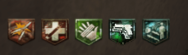
I knew the bo2 perk symbols were bad before buried, but i didn’t know it was THAT bad. And of course it has to be the mulekick logo lmao

I knew the bo2 perk symbols were bad before buried, but i didn’t know it was THAT bad. And of course it has to be the mulekick logo lmao
8 Comments
Just to follow up, this is on die rise on PC. I honestly cant remember if it looked this bad on console as a kid but if it did…. wow.
Bad? They were my favorite version of the symbols, lol.
I was playing on rca cables back then, so I didn’t really notice lmao
I always wondered why the mukekick looks so pixelated
i honestly did not realize Double Tap was different because of how horrible it looked. It took me playing to realize my sniper shot two bullets while hip-firing.
I did notice they were different, but I never noticed the jump in resolution between the two. I still like them though, tbh. That dirty look is my favorite look for perks.
I kinda wish you could customize the HUD and change the perk symbols to the ones from different games.
These are goated imo
Bad these were my favorite