This makes a good plot for a show. Aesthetic is spot on.
my__name__is
These are fantastic
ThePortableSCRPN
The only thing I’m missing here for completeness’ sake are the 80’s monospaced console fonts you’d find in DOS instead of the more modern looking Arial(like) ones used here.
Other than that the aesthetic and the feel are badass.
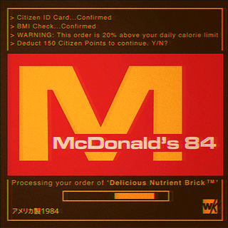
150 Citizen Points for a McBrick™? When did they stop doing the 2 for 275 deal?
(I love this, OP.)
khwarizmi69
the McDonalds calorie one is actually a pretty good thing tbh
gatewayy
Love that monitor refresh!
idkpotatoiguess
Looks cool!
ConfusionAccurate
Good find!
meepmeepthebeep
Nintendo one is throwing me off because my first thought is “Nintendo 64”
esesci
Completely unrealistic, McDonalds would never warn you about excess calories.
THE_BIG_SAD3
HAAAAAAAAANK
DONT ABBREVIATE CITIZEN POINTS HANK
HAAAAAAAAANK
smedium5
r/loadingicon
Sundeiru
I appreciate the extra detail that Nintendo’s dystopian nightmare is labeled as made in Japan. The others say “アメリカ製1984” while the last one is instead “日本製1984年”. It’s a nice touch.
SecretAgentVampire
Damn. I wish someone else would count calories for me for free. Be easy as hell to stay within weight. Sign me up.
FF_dork
I love the “Don’t be Evil”
ollee
Ugh, I always get Josh as my NSA Overseer on Mondays, I swear this shit is rigged.
Xothga
These are fantastic
Clayh5
Damn I’m already almost over my daily calorie limit but I still haven’t reached my Coca Cola Patriot Quota…
Kinetic-Turtle
I love this. If I want to do this for a webapp or website, what should I learn?
irritatedellipses
Well. Looks like I have a bunch of new icons for my StreamDeck
takingastep
Suitably dystopian.
aftershock311
Google has removed their “Don’t be evil” clause so they can build A.I. drones for the US military
graemeknows
These are great!
Strottman
Also Nintendo 84: We’re shutting down your smash tournaments lol stop playing our game

31 Comments
This makes a good plot for a show. Aesthetic is spot on.
These are fantastic
The only thing I’m missing here for completeness’ sake are the 80’s monospaced console fonts you’d find in DOS instead of the more modern looking Arial(like) ones used here.
Other than that the aesthetic and the feel are badass.
Source :
https://at.tumblr.com/warakami-vaporwave/eqhv2tkg2uwp
Literally 1984
150 Citizen Points for a McBrick™? When did they stop doing the 2 for 275 deal?
(I love this, OP.)
the McDonalds calorie one is actually a pretty good thing tbh
Love that monitor refresh!
Looks cool!
Good find!
Nintendo one is throwing me off because my first thought is “Nintendo 64”
Completely unrealistic, McDonalds would never warn you about excess calories.
HAAAAAAAAANK
DONT ABBREVIATE CITIZEN POINTS HANK
HAAAAAAAAANK
r/loadingicon
I appreciate the extra detail that Nintendo’s dystopian nightmare is labeled as made in Japan. The others say “アメリカ製1984” while the last one is instead “日本製1984年”. It’s a nice touch.
Damn. I wish someone else would count calories for me for free. Be easy as hell to stay within weight. Sign me up.
I love the “Don’t be Evil”
Ugh, I always get Josh as my NSA Overseer on Mondays, I swear this shit is rigged.
These are fantastic
Damn I’m already almost over my daily calorie limit but I still haven’t reached my Coca Cola Patriot Quota…
I love this. If I want to do this for a webapp or website, what should I learn?
Well. Looks like I have a bunch of new icons for my StreamDeck
Suitably dystopian.
Google has removed their “Don’t be evil” clause so they can build A.I. drones for the US military
These are great!
Also Nintendo 84: We’re shutting down your smash tournaments lol stop playing our game
https://www.youtube.com/watch?v=H8P2r036jwE
I love and hate this in equal measures.
This is incredible
I’d use Lynx a lot more if it did rad shit like this.
mmmm…. nutritious brick