This needs to be upvoted to oblivion so the devs see. Great job!
ThorstiBoi
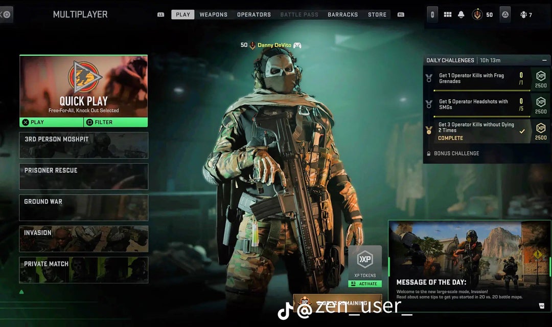
When a single person can **design** a better looking UI than activision
Notice how I said design, programming its functions is another beast
CheckAccording8014
Not even comparable. I cannot tell you how many times I have gone back to the main menu because I could not tell if I was in multiplayer or not
CheckAccording8014
Also, honestly, while the devs are at it, get rid of the rotating character models. BO3 did it best. Keep it simple with some cool stationary artwork and have the players name on the side.
hypocritical124
this is actually genuinely beautiful, it baffles me as to why IW went with the *infinite warfare* loadout UI, of all games!
RogueDeadGuyBP2
Absolutely
Fun-Solid-8228
Looks perfect why could it not be like this
itsRobbie_
Yeeeeeeep.
chaznieto1313
This is beautiful 🥲 too bad the devs don’t care about this game enough to implement 😂
Edwinccosta
UPVOTE THIS POST
MRichards18
Once people realize the UI wasn’t built for the function of gaming, but simply for the store/marketing then you’ll realize why it’s shit and why it won’t ever be fixed.
Chun--Chun2
You guys think the menu is not designed like that intentionally? It’s designed like that to give you all the chances possible to end up in the store to buy some of those skins…
slimeboy401
This looks confusing after using the current mw2 UI for months
PashAK47
This is just warzone 1 ui
AuxquellesRad
Holy shit, this is a million times better, so much better
Dro_dude
Someone there thinks they did something good with their Menu… typical change stuff that’s working and don’t fix stuff people hate.
Taheer1209
Vertical > horizontal
RenanBan
thats cool nice job
Ingrown_inkling
Not the most important issue at hand but sure lol
blue_ninja808
Couldn’t agree more, the current menu is a nightmare to navigate. Never seen so many tabs, hidden screens and sub-menus. Of course the store is usually easy to get to lmao.
dfox5
You forgot the Messi/Neymar/Pogba skins that we will need to scroll through in order to play anything
fletcherwyla
Honestly, I could handle the dogshit UI of the menu if it didn’t pull me out of whatever screen I’m looking at every time the party leader switches pages.
FondOfOwls_
All you losers complaining about a UI….
MansMyth
I believe the current one was built to translate directly to mobile. I think they know the vertical is best, but it makes it too small for touchscreen mobile, so they can’t keep same resources between WZ mobile and CoD mobile. It’s a real shame, but mobile is where the money boom is.
robotman5lol
for sure
RegardedUser
Without 40% of the screen being taken up by an ad for POBGA, MESSI, WHOEVER?
​
They’d never bite on that.
ABizarreFireGod
Don’t give me hope.😭
beckytrash
This is looking at the old model of the navigation menu from WZ1.
While I 100% agree that the WZ1 is 1000% better than the MW2/WZ2 menu, I still think it’s UX could be optimised. Take the best of WZ1 menu and the best of WZ2 menu. I mean… okay, scrap that. WZ2 menu is really bad but what they tried to do once you click on MW2 item is better than WZ1 menu because it shows you all options you have and I think this is it.
Currently, you have to choose between WZ, DMZ or MULTIPLAYER and then go into their own options. And while this was fine with WZ1 when we had those huges main menu without these Messi skin pack and other bullshit to be prompted to our faces, I think we could benefit from having all sub-options from WZ, DMZ and multiplayer into the same screen.
This would also help the Devs to maintain a non-buggy navigation because they wouldn’t have to QA 20+ screens and navigation combinations but only one.
But hey, who am I? Just a player recommending something 🤷♂️
_Conqueeftador
The game would instantly become twice as better than now with this simple change..
DaftDrummer
Lured some friends into playing WZ with me for their first time.
We had a blast, but their single biggest complaint was the menu.
Correct_Employ6343
I would pay money for this upgrade. It looks sooooo much better.
Mononym_Music
Who is “we”?
Why do all these threads in the word “We” like the OP speaks for everyone? Seems like the new click bait headlines.
RedEye-55
Finally. A good content post that’s not an annoying whine and complaint

36 Comments
Repost
Show shotgun attachments plz
This needs to be upvoted to oblivion so the devs see. Great job!
When a single person can **design** a better looking UI than activision
Notice how I said design, programming its functions is another beast
Not even comparable. I cannot tell you how many times I have gone back to the main menu because I could not tell if I was in multiplayer or not
Also, honestly, while the devs are at it, get rid of the rotating character models. BO3 did it best. Keep it simple with some cool stationary artwork and have the players name on the side.
this is actually genuinely beautiful, it baffles me as to why IW went with the *infinite warfare* loadout UI, of all games!
Absolutely
Looks perfect why could it not be like this
Yeeeeeeep.
This is beautiful 🥲 too bad the devs don’t care about this game enough to implement 😂
UPVOTE THIS POST
Once people realize the UI wasn’t built for the function of gaming, but simply for the store/marketing then you’ll realize why it’s shit and why it won’t ever be fixed.
You guys think the menu is not designed like that intentionally? It’s designed like that to give you all the chances possible to end up in the store to buy some of those skins…
This looks confusing after using the current mw2 UI for months
This is just warzone 1 ui
Holy shit, this is a million times better, so much better
Someone there thinks they did something good with their Menu… typical change stuff that’s working and don’t fix stuff people hate.
Vertical > horizontal
thats cool nice job
Not the most important issue at hand but sure lol
Couldn’t agree more, the current menu is a nightmare to navigate. Never seen so many tabs, hidden screens and sub-menus. Of course the store is usually easy to get to lmao.
You forgot the Messi/Neymar/Pogba skins that we will need to scroll through in order to play anything
Honestly, I could handle the dogshit UI of the menu if it didn’t pull me out of whatever screen I’m looking at every time the party leader switches pages.
All you losers complaining about a UI….
I believe the current one was built to translate directly to mobile. I think they know the vertical is best, but it makes it too small for touchscreen mobile, so they can’t keep same resources between WZ mobile and CoD mobile. It’s a real shame, but mobile is where the money boom is.
for sure
Without 40% of the screen being taken up by an ad for POBGA, MESSI, WHOEVER?
​
They’d never bite on that.
Don’t give me hope.😭
This is looking at the old model of the navigation menu from WZ1.
While I 100% agree that the WZ1 is 1000% better than the MW2/WZ2 menu, I still think it’s UX could be optimised. Take the best of WZ1 menu and the best of WZ2 menu. I mean… okay, scrap that. WZ2 menu is really bad but what they tried to do once you click on MW2 item is better than WZ1 menu because it shows you all options you have and I think this is it.
Currently, you have to choose between WZ, DMZ or MULTIPLAYER and then go into their own options. And while this was fine with WZ1 when we had those huges main menu without these Messi skin pack and other bullshit to be prompted to our faces, I think we could benefit from having all sub-options from WZ, DMZ and multiplayer into the same screen.
This would also help the Devs to maintain a non-buggy navigation because they wouldn’t have to QA 20+ screens and navigation combinations but only one.
But hey, who am I? Just a player recommending something 🤷♂️
The game would instantly become twice as better than now with this simple change..
Lured some friends into playing WZ with me for their first time.
We had a blast, but their single biggest complaint was the menu.
I would pay money for this upgrade. It looks sooooo much better.
Who is “we”?
Why do all these threads in the word “We” like the OP speaks for everyone? Seems like the new click bait headlines.
Finally. A good content post that’s not an annoying whine and complaint
Defund horizontal lists