
North America
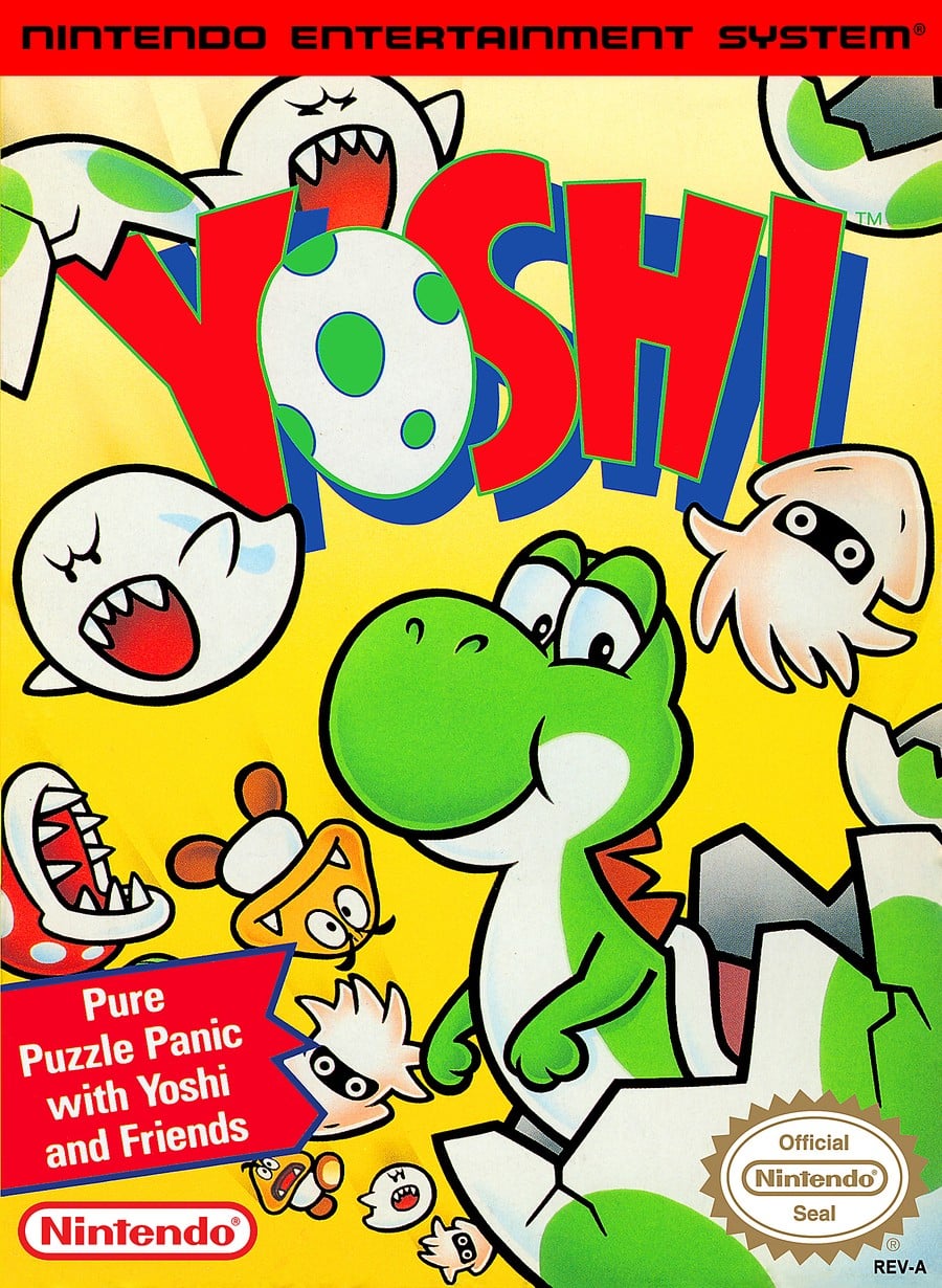 Image: Nintendo / Launchbox
We’ve got to give it to the North American design, this really is rather sweet. We’ve got a smiling little Yoshi cracking out of his egg, surrounded by a cascade of falling enemies and eggshell. It’s simple, but it’s charming.
Europe
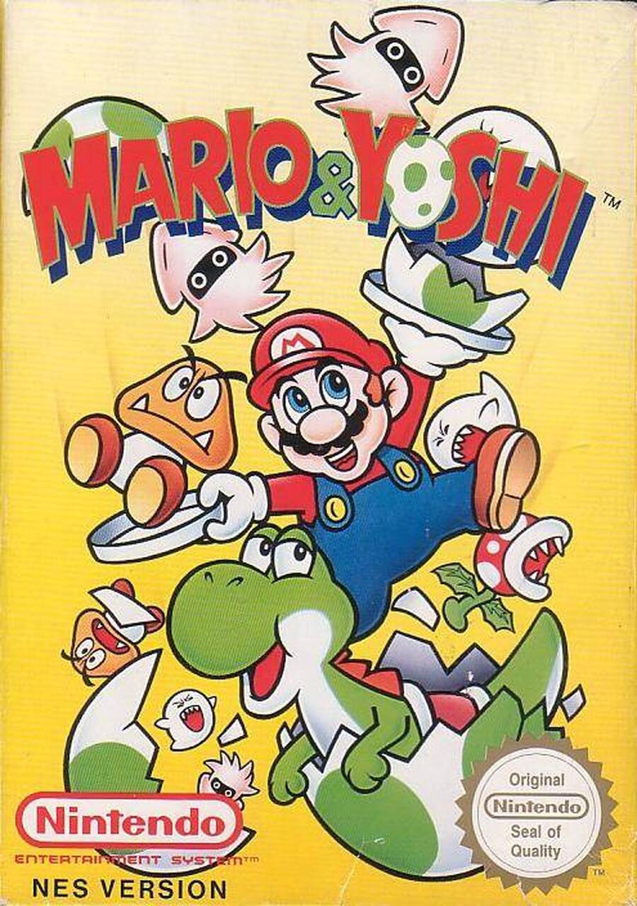 Image: Nintendo / Launchbox
Crowbarring the prized plumber in there to reflect the regional name change, Mario & Yoshi’s European design is similar to its NA counterpart, but with added Mario. Yoshi is still cracking out of his egg, and enemies are still falling around him, but Mario’s there this time, plates in hand, to… help? Hey, whatever it takes to up the brand recognition, we suppose.
Japan
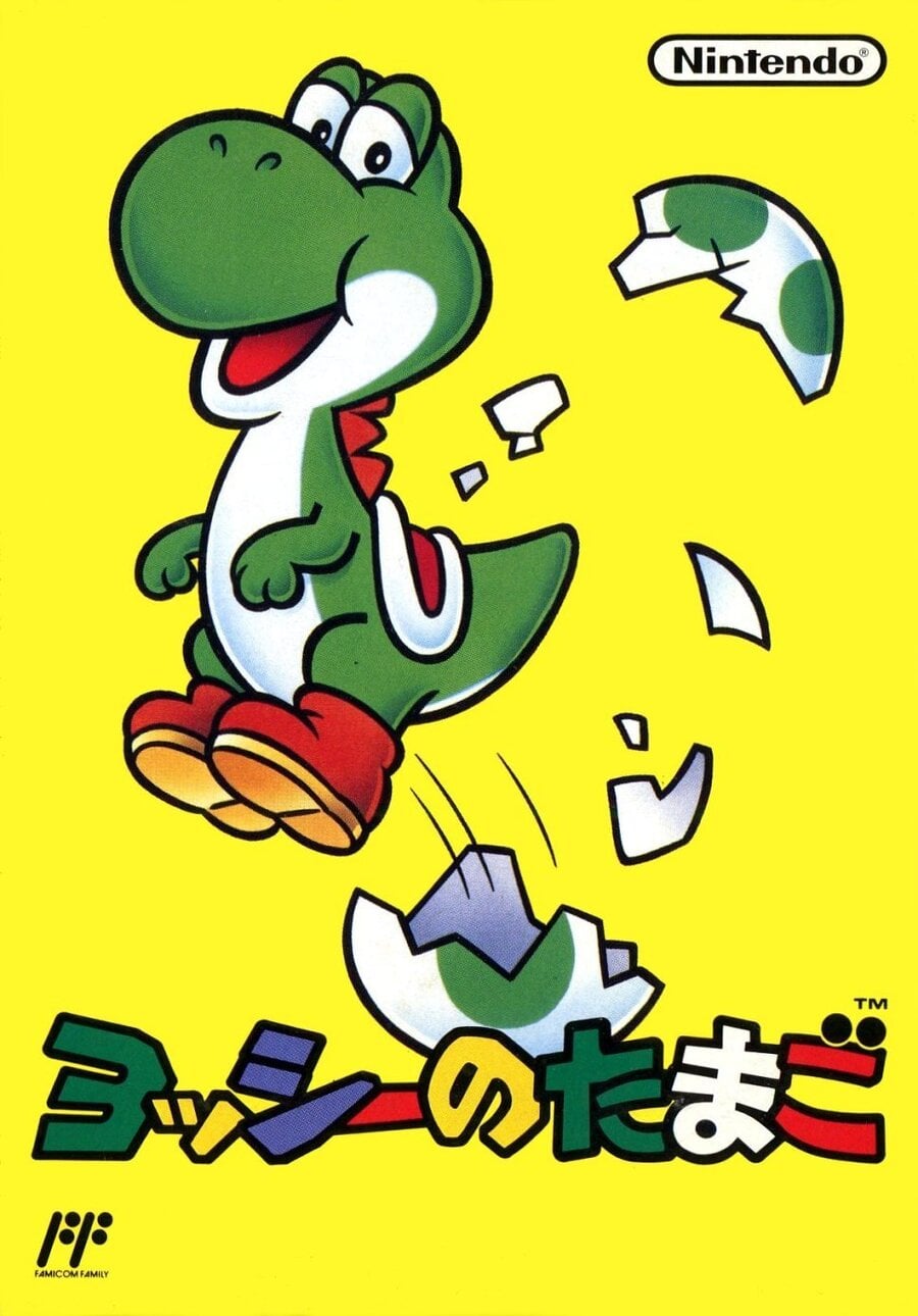 Image: Nintendo / Launchbox
Things are much more simplistic in the Japanese cover, dropping the falling enemies to focus solely on Yoshi’s egg cracking — which makes sense, given the Yoshi’s Egg title change in the region. We like how the titular dino is positively springing from his eggy casing in this one, with a big old smile on his face.
Which region got the best Yoshi (NES) box art? (441 votes)

North America33%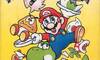
Europe55%
Japan13%
Thank you for voting! We’ll see you next week for another edition of Box Art Brawl!
Related Games
See Also