
To the officials, regarding the 4.3 version update, I find the lobby UI and the Customize Button UI have been redesigned terribly. As a player of over 8 years, this makes me extremely uncomfortable!
The lobby UI was horribly changed to a blinding white, though it has since been reverted to black and is now fine. But why haven’t you changed the Customize Button UI back to the original?
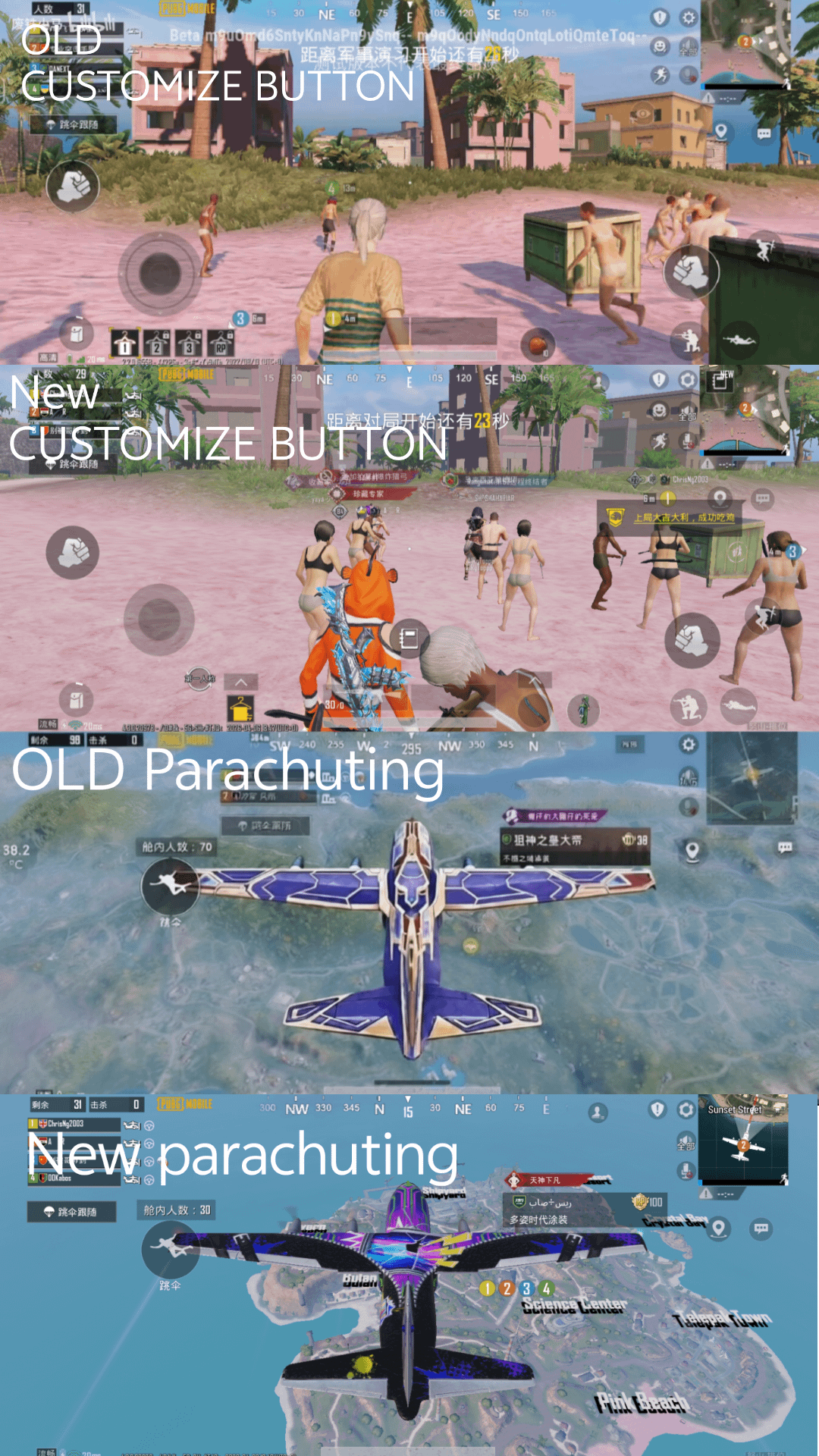
The new icons have severely worsened my in-game feel and heavily impacted my gaming experience. This no longer feels like playing PUBGM! 💀
The original UI had a metallic texture around the circular buttons. The movement joystick, inventory icons, parachute button, shoot button, and bullet graphics were highly realistic and satisfying to press. The jump, crouch, and prone buttons with small character icons would light up when tapped, giving a warm, polished feel. The backpack interface and other UI elements created an immersive battlefield atmosphere
Now the new version has replaced all these detailed textures entirely. What is with that toy-like bullet icon? It looks completely fake! None of the other icons light up anymore, making everything feel lazy and cheap, like a bootleg game. It’s awful.
The backpack interface, once clean and simple, has become overly complicated and obstructive to vision.
The Customize Button UI never needed changing — the original version was excellent and unmatched by many other FPS games. You have abandoned your own strengths. I am considering quitting the game.
I have two demands:
Either revert the old UI icons back in the next update,
OR add a toggle for players to freely switch between the old and new UIs.
Otherwise, I will no longer support this game 😔
#BringBackTheOldUI