
The UI after the update has become smoother. but, the colors they put were a bad decision.
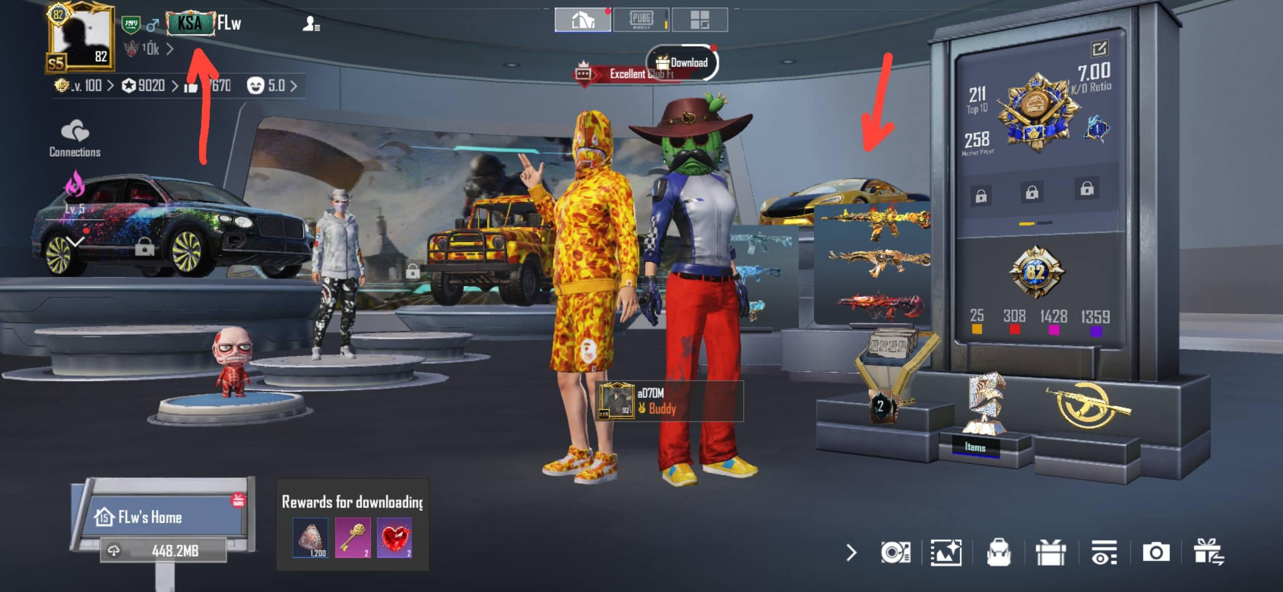
For example in the player profile, the third car at the top is now barely visible because the weapons are covering it. And my partner is covering my 3 weapons behind him. In addition, the color of the "Popularity battle Tag " changed to black instead of white ?! which makes it much harder to see.
I really hope they focus more on improving the colors and contrast than just smoothing the interface, as that's what's important.