


Though it’s seen as the black sheep of the series today, the very first Street Fighter was widely successful for Capcom. There was actually no reason for Capcom to innovate with the sequel, Street Fighter 2: The World Warrior. However, in doing so, they transformed the fighting game genre into what it is today.
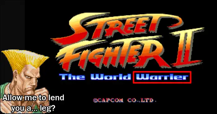
Funnily enough, Akira Nishitani, designer for Street Fighter 2: The World Warrior, noticed a typo just three days before the arcade units were to be shipped out. Somehow, the team had managed a typo with the game’s logo. It was incorrectly being referred to as Street Fighter 2: The World “Warrier.”
At first, it might seem like it’d be a simple solution to simply replace the “e” with an “o” in order to correctly spell “Warrior.” Unfortunately, things wouldn’t be that simple as the sprites had already been finalized for the arcade rom units.
To remedy this, Nishitani opted to take the sprites that formed the “Wo” part of “World” and placed it over the “e” in the misspelled word. Due to the font in which the developers used, using only part of the “W” made it seemed like a lowercased “L.”
Of course, this alone wasn’t enough to form the World Warrior logo. They still needed to form the dot of the lowercased “i” as it would look weird otherwise.
Fortunately for the developers, one of the sprites for Guile had a tile that was dedicated to just one pixel of Guile’s leg. It was at least easy enough to recolor the pixel to fit in with the rest of the logo. This tile was used to separate part of the “l” to create the dot needed in “World Warrior.”
JRH recently created a video that talks about all of this in more detail. Check it all out below: