
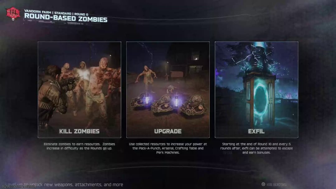
Right now, when starting a match of Zombies in BO7 the Loading Screen displays a dynamic "Fly Through" of the selected map, with an Objective Overview of the mode and a sort of holographic interface surrounding the screen that's a holdover of the "C-Link" stuff in Campaign/MP. I saw a lot of people express that this wasn't what they wanted from a Zombies Loading Screen.
Although this style has existed since BOCW, Vanguard proved that unique and thematically appropriate Loading Screens can still happen. The brilliance of previous Loading Screens was that they were packed full with details, whether that be some kind of stylized Blueprint/Map that gave you a brief glimpse of the setting, or a mysterious Comic Book that are just really fun to look at and decipher. Even having some sort of Key Art was enough to draw your interest and set the tone. Since this is a screen you'll be staring at frequently, it should work to be visually appealing and draw your interest. With matches fading in from black, we also need something to fade in from to make the effect work properly.
Issues:
- Having a Fly Through is pretty much irrelevant to a Player because you'll be seeing these locations in-game regardless. Even more so after your first few playthrough where you've already seen the Map by discovering locations organically.
- The C-Link border, with that hazy purple effect, is awful on the eyes and has zero reason to exist in Zombies whatsoever. It's not good in MP either, but it's worse here.
- An Objective Overview runs into the same problem of only helping first time Players. It can be toggled off, but it's something you manually have to do each time which becomes tedious.
Potential Solution:
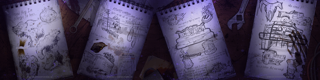
- As Zombies Week ramped up, Treyarch teased Ashes of the Damned with Notes left by survivors in the Dark Aether. If you lined up their background, it looked like they were all part of the same image. This led people to believe this was the actual Loading Screen, reminiscent of TranZit's postcards or Mob of the Dead's sketches. Seeing how Treyarch pretty much have a Loading Screen ready made, I'd love if they went with this style instead. Each Note gives information about the POIs and things you could expect to see on the Map, all in a way that naturally fit the Zombies aesthetic. The only adjustment you'd need is to uncrop the top/bottom so it'd fit the right aspect ratio.
- Similarly, another set of teasers played sounds from Ol' Tessie's radio. Most notably, "Lovesong for a Deadman". With Ashes of the Damned being a spiritual successor to TranZit, it'd make so much sense for this to be our Loading Music.
- In terms of the Objective Overview, I do think there is a usefulness in them for new Players, but this shouldn't come at the detriment of recurring ones. I think it would work better if this, and things like the Pack-A-Punch Objective Markers, were toggled in the Settings. If Treyarch want, they can be On by default, so long as we can turn them Off permanently.
I'm aware these issues may seem minute, but it's the little things that really do add up. Treyarch are close to getting it right this time, so I hope they're really really listening to what fans are telling them. There's a lot of discussion going on right now to that effect, so I'll relink my two previous posts since they're relevant to that whole conversation.
Previous Posts: