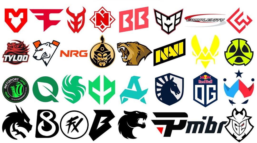
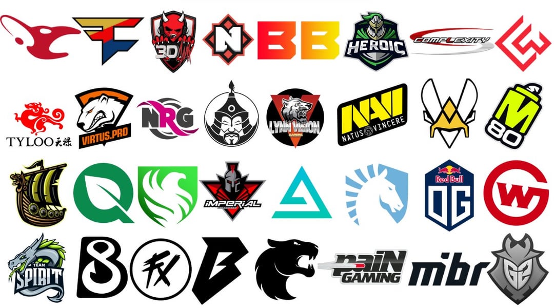
I know VP and 3DMAX have even older versions, but I felt like the two I put are the more recognizable ones for the CS community, which is why I added them!
old Tyloo logo was so fire, I had no idea they were balling like that
shuijikou
Wait, saw is old Aurora?
fujiwaradriftporn
Mouz fumbled the bag so hard on their new logo. Same with M80 imo.
[deleted]
[deleted]
lycanpoke1
Why m80 changed just why
G_O_O_G_A_S
So many downgrades 🙁
Skellington876
I feel like Im the only one who misses the old NRG logo. The pink was just such a rare color to see on the scene
segfaulting
all of them looked so much better… think Lynn Vision is the only improvement
QueefPuncher9000
Who pissed off the Mongolz logo
Pyry132
Wildcard and spirit had pretty good upgrades. I’m just not fan of this ”We have good logo, lets make it minimalistic and bland”. Yes, it works well when your logo is random stock image from 2004 with text, but most of the time it just makes the logo look soulless and boring
godzillamegadoomsday
Minimalism should be considered a sin (although a couple like wildcard and pain do look better than the old ones)
Also the Mouz stingray was so goated, I hate that we have this sad looking heart instead
raesungss
i don’t see the old OG logo (but i guess they never had a CS team with the old logo)
Bobby_Knuckles_
Most of the new ones are worse but a few are actually solid upgrades in my opinion. I think the old 3DMax logo is absolute dogshit. I would consider spirit, Lynn vision and imperial to be upgrades too. They don’t look bad in isolation but a lot of the detail is lost when zoomed out, which is how you’re gonna be seeing the logo a lot of the time.

21 Comments
Metizport stickers are gonna be so fire
A lot of downgrades…Fk minimalism
old Tyloo logo was so fire, I had no idea they were balling like that
Wait, saw is old Aurora?
Mouz fumbled the bag so hard on their new logo. Same with M80 imo.
[deleted]
Why m80 changed just why
So many downgrades 🙁
I feel like Im the only one who misses the old NRG logo. The pink was just such a rare color to see on the scene
all of them looked so much better… think Lynn Vision is the only improvement
Who pissed off the Mongolz logo
Wildcard and spirit had pretty good upgrades. I’m just not fan of this ”We have good logo, lets make it minimalistic and bland”. Yes, it works well when your logo is random stock image from 2004 with text, but most of the time it just makes the logo look soulless and boring
Minimalism should be considered a sin (although a couple like wildcard and pain do look better than the old ones)
Also the Mouz stingray was so goated, I hate that we have this sad looking heart instead
i don’t see the old OG logo (but i guess they never had a CS team with the old logo)
Most of the new ones are worse but a few are actually solid upgrades in my opinion. I think the old 3DMax logo is absolute dogshit. I would consider spirit, Lynn vision and imperial to be upgrades too. They don’t look bad in isolation but a lot of the detail is lost when zoomed out, which is how you’re gonna be seeing the logo a lot of the time.
[These are the old FlyQuest logos](https://imgur.com/a/5Zols1t) 💀
The swoops to the faze logo is so ass. One of the most iconic logos in gaming and they changed it just enough to just be a bad version of the old one
Wildcard is the only team who has a significantly upgraded logo in my opinion
Funny how Complexity went full circle
Some of these new ones are absolutely dogshit lmao. Respect to the organization that kept their OG’s though
The old ones had a lot more personality and detail to them….
curse this stupid simplistic/minimalistic trend going on in company logos… so damn ugly.