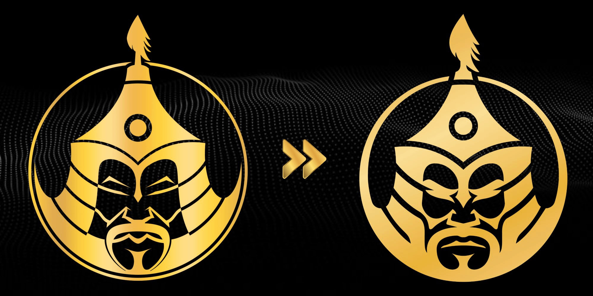
The MongolZ’s logo changed Counter strikecounter strike global offensivecs:goGlobal offensive 16 Comments afk420k 2 years ago old one was better ThatLazyFinnishGuy 2 years ago Little bit less detailed, I like it. The circle looks a bit like ENCE’s logo’s circle being thicker around the bottom but thinner at the top. jeffjeff97 2 years ago Upgrade Fuzzolio 2 years ago Obv I know they did it for better visibility on stickers but still, old better MrCraftLP 2 years ago He angy Den_dar_Alex 2 years ago Don’t mind it honestly, not like the MOUZ or Nip one boiledeggman 2 years ago racist fituica 2 years ago clean Whompa 2 years ago More graphic. Nice Garou-7 2 years ago I prefer the old one but both r fine. awildshardul 2 years ago I like the new tone Alkahzane 2 years ago Overall upgrade, hopefully they make the major, nice design. ZaXhHD 2 years ago Do yall think they changed it because it could be deemed as offensive ? t_thegoodguy 2 years ago Turned from Khan to his cousin Informal_Courage_444 2 years ago Patch notes: *Updated the mustache to look less like testicles* rizkreddit 2 years ago They did it for political correctness, or just wishing to not offend anyoneWrite A CommentYou must be logged in to post a comment.
ThatLazyFinnishGuy 2 years ago Little bit less detailed, I like it. The circle looks a bit like ENCE’s logo’s circle being thicker around the bottom but thinner at the top.

16 Comments
old one was better
Little bit less detailed, I like it. The circle looks a bit like ENCE’s logo’s circle being thicker around the bottom but thinner at the top.
Upgrade
Obv I know they did it for better visibility on stickers but still, old better
He angy
Don’t mind it honestly, not like the MOUZ or Nip one
racist
clean
More graphic. Nice
I prefer the old one but both r fine.
I like the new tone
Overall upgrade, hopefully they make the major, nice design.
Do yall think they changed it because it could be deemed as offensive ?
Turned from Khan to his cousin
Patch notes:
*Updated the mustache to look less like testicles*
They did it for political correctness, or just wishing to not offend anyone