

North America
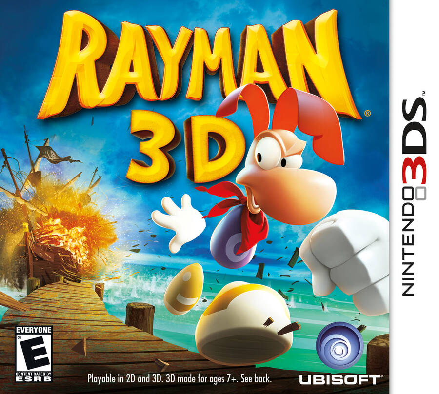 Image: Ubisoft / LaunchBox
While Mr. Ray himself might look a little uncanny in the North American cover, there’s no denying that this homage to the Rayman 2 original art has some cool composition at play. The hair overlapping the title? Cool. The splintering walkway? Cool. The giant exploding ship in the background? Cool. Overall, pretty cool.
Europe
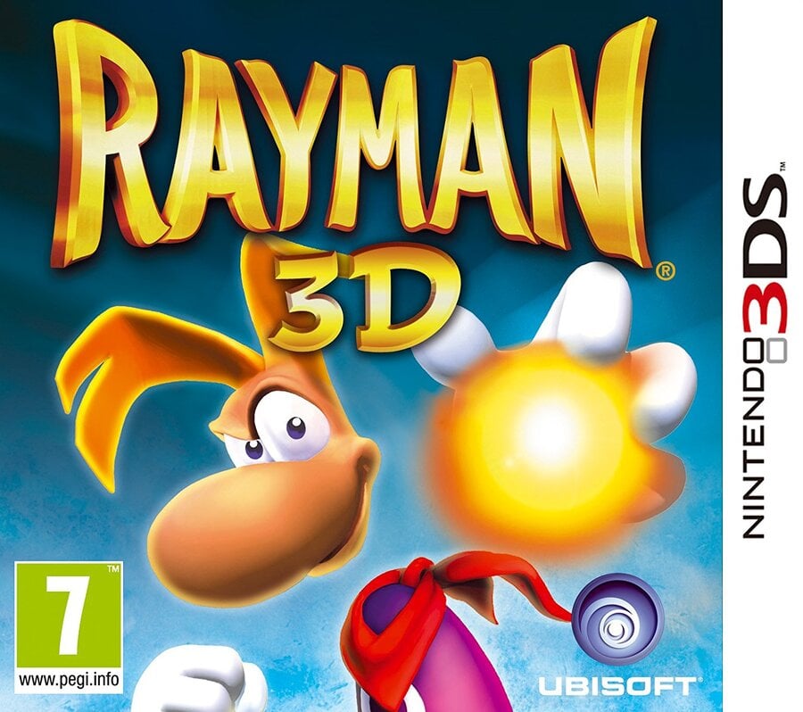 Image: Ubisoft / LaunchBox
The European design is… not as cool. Rayman himself looks much better, but all of the action and drama of the NA cover has been replaced by simplicity. We’ve got a plain blue backdrop and a singular Lum. That’s it. Hey, at least the title font is a little cleaner.
Which region got the best Rayman 3D box art? (757 votes)
North America75%
Europe25%
Thank you for voting! We’ll see you next week for another edition of Box Art Brawl!
Related Games
See Also