
I’ve been obsessed with the intersection of "functional utility" and the Cyberpunk aesthetic lately. I’m building a project, and I wanted the UI to feel like something you’d see on a terminal in a high-density sprawl; lots of deep violets, neon magenta accents, and heavy dark modes. I also want it to feel otherworldly. My late brother who passed a few months ago was obsessed with cyberpunk and outer space/astronomy. It’s a tribute to him, really.
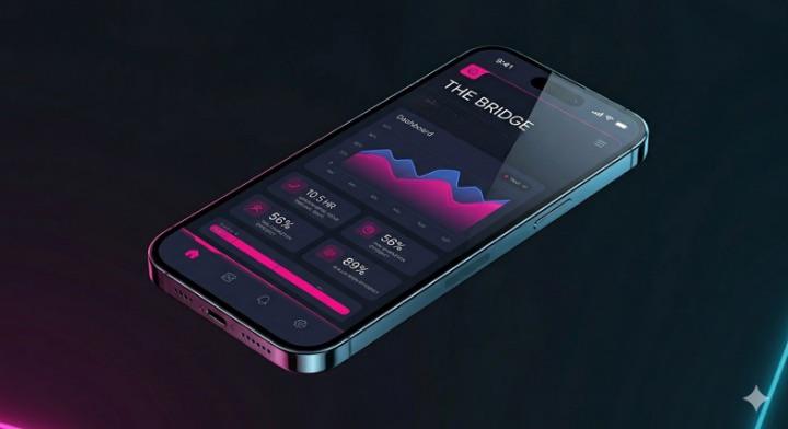
The image here is The Bridge, which sets the visual tone for the rest of the app. Side note: The bridge isn’t included in the 5 screen prototype. It’s part of the full app. I just like to use it as an example because it’s an image you can actually visualize on your phone.
I’m currently testing a lean, 5-screen V1 prototype to see if this aesthetic actually holds up during real use or if it’s just eye candy.
I’d love your thoughts on:
• The Palette: Is the magenta/violet combo hitting the right note, or is it leaning too "synthwave"?
• Legibility: For those of you who live in dark mode, does the glow look clean or does it bleed too much for actual reading?
I have the interactive prototype link ready if anyone wants to actually "step inside" and click through the flow, but I’m only sending it via DM to interested people. I’m in stealth mode right now and very cautious with what I say and who I say it to. I hope that’s understandable. I would really love any feedback though.